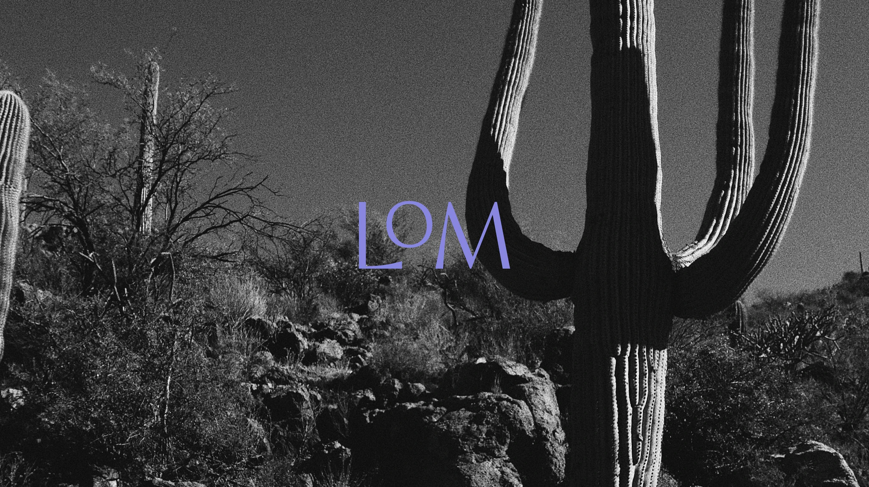
Nipapanha.
The People Of The Rocks.
Team
Client – Nipapanha Community
Brand Identity, Art Direction, Website Design,
Illustration – Studio Home
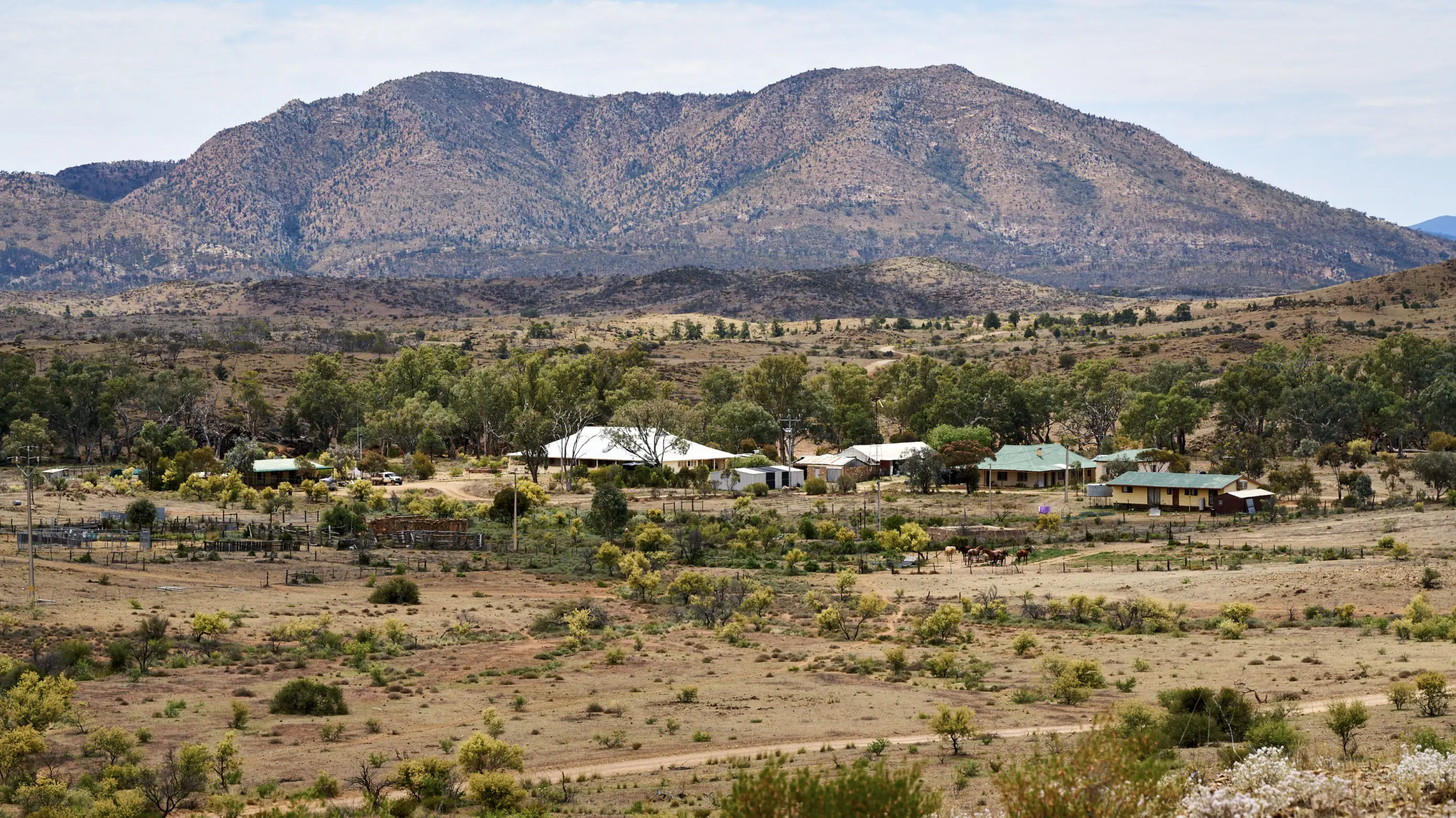
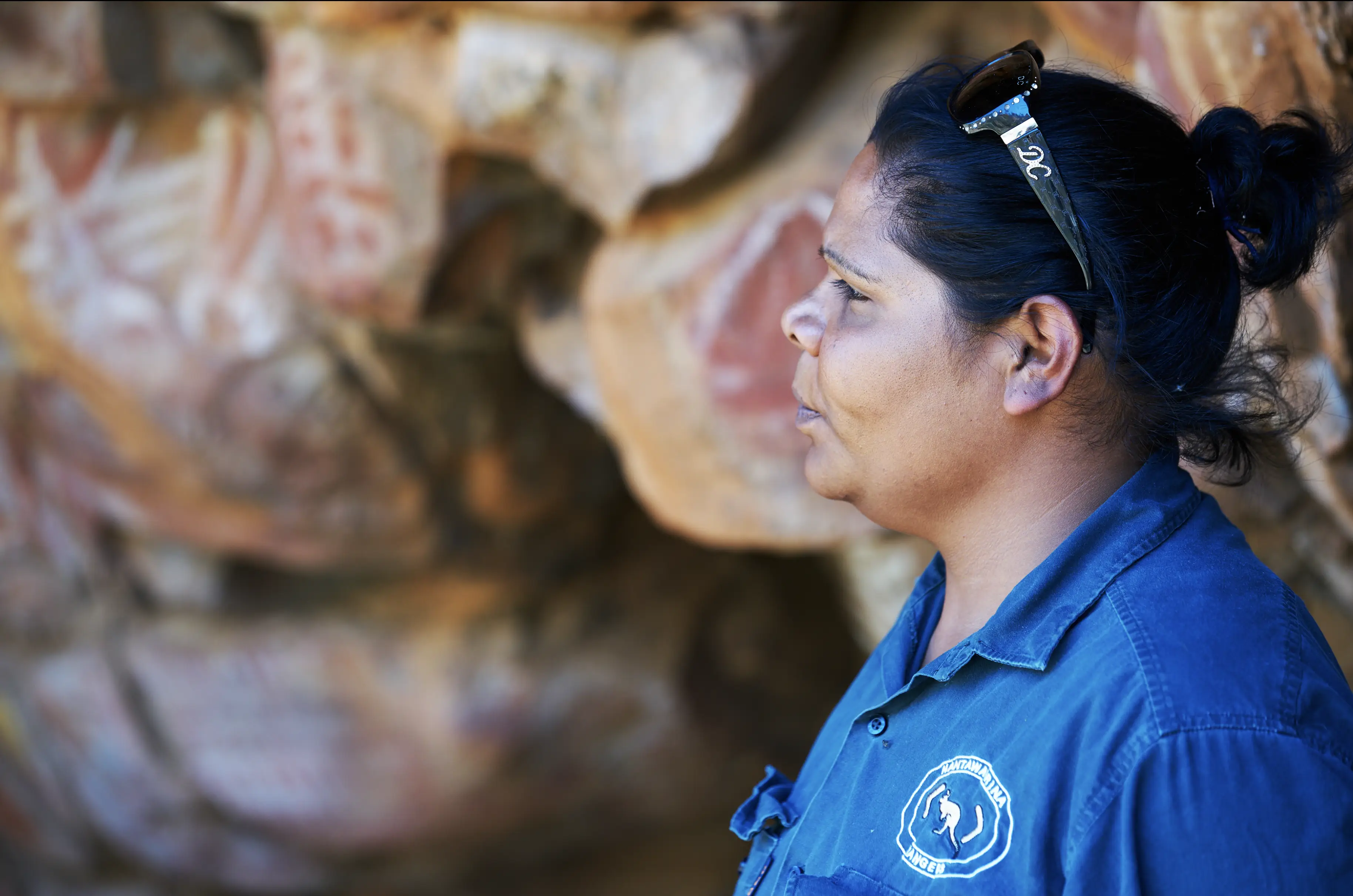
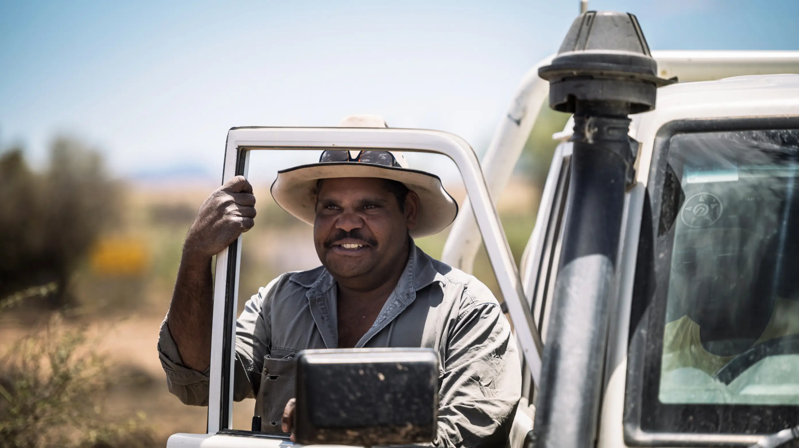
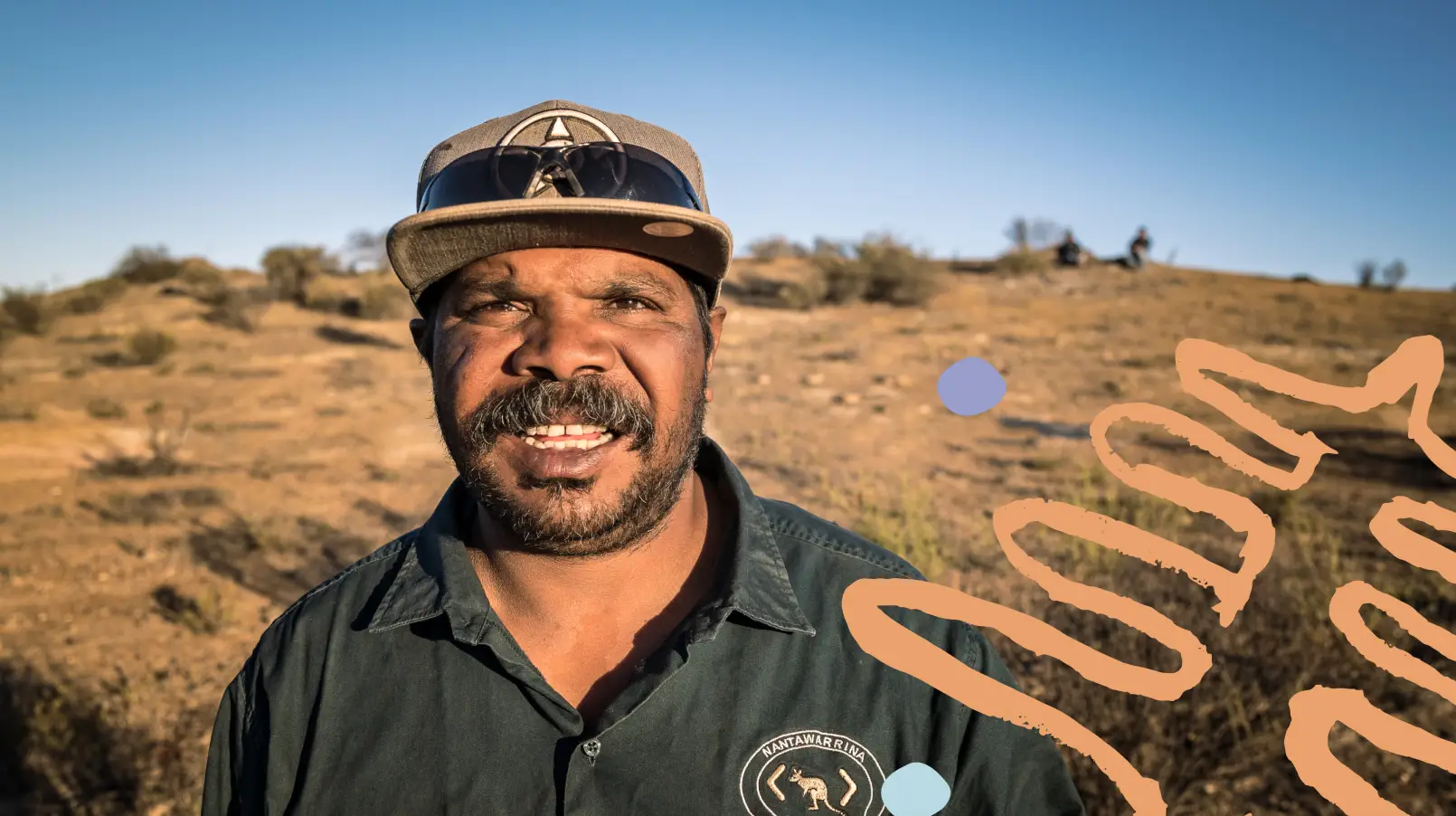
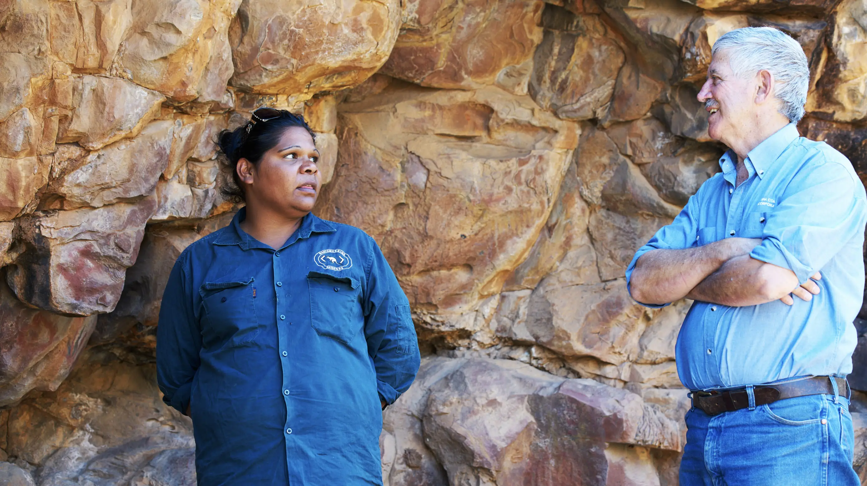
Nipapanha is an Aboriginal community, deep in the Flinders Ranges. Home to the Adnyamathanha (ad-nya-mut-na) people. “Adnya” means “rock” and “matha” means “group” or “group of people”. Their people used to roam throughout this country from the Northern Flinders South to Port Augusta and as far east as Broken Hill.
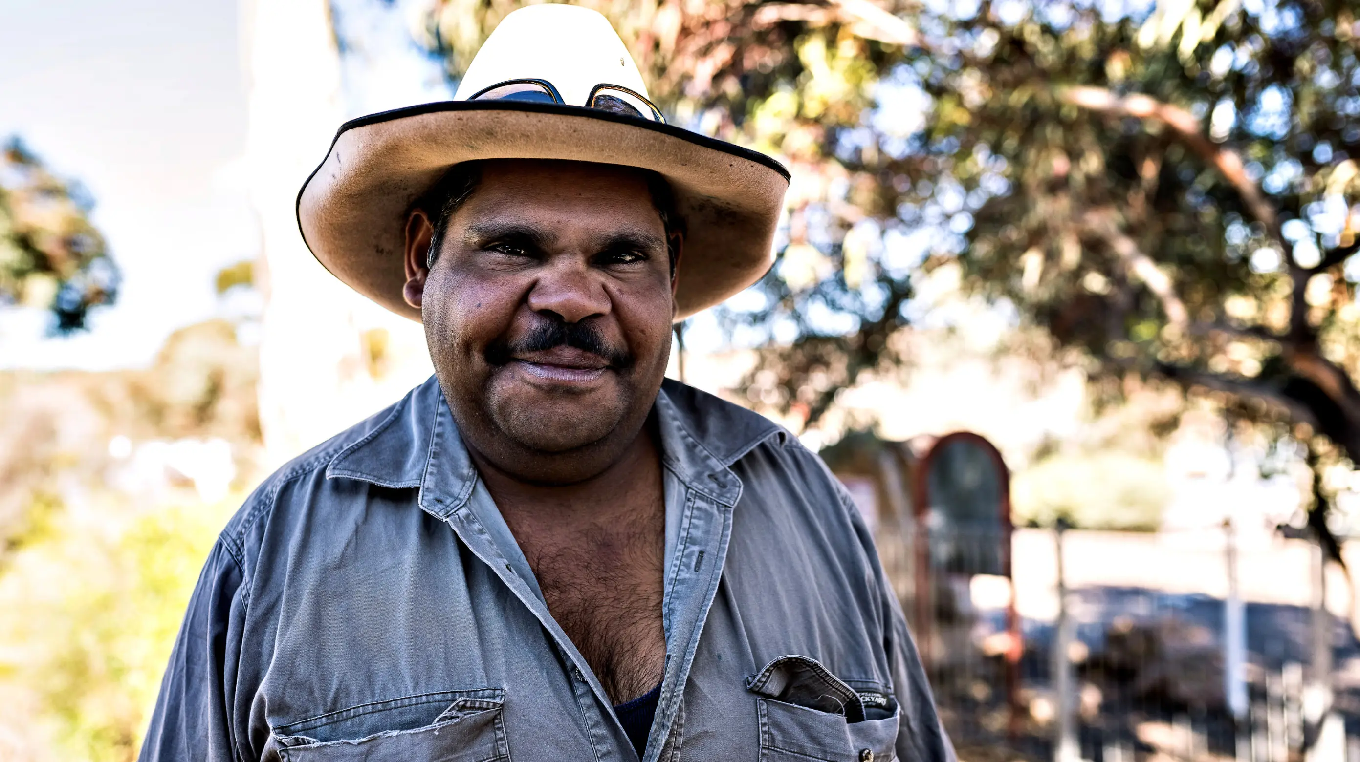
The community tasked us with creating a brand identity that would reflect the vibrant people and pay respect to the historic landscape.
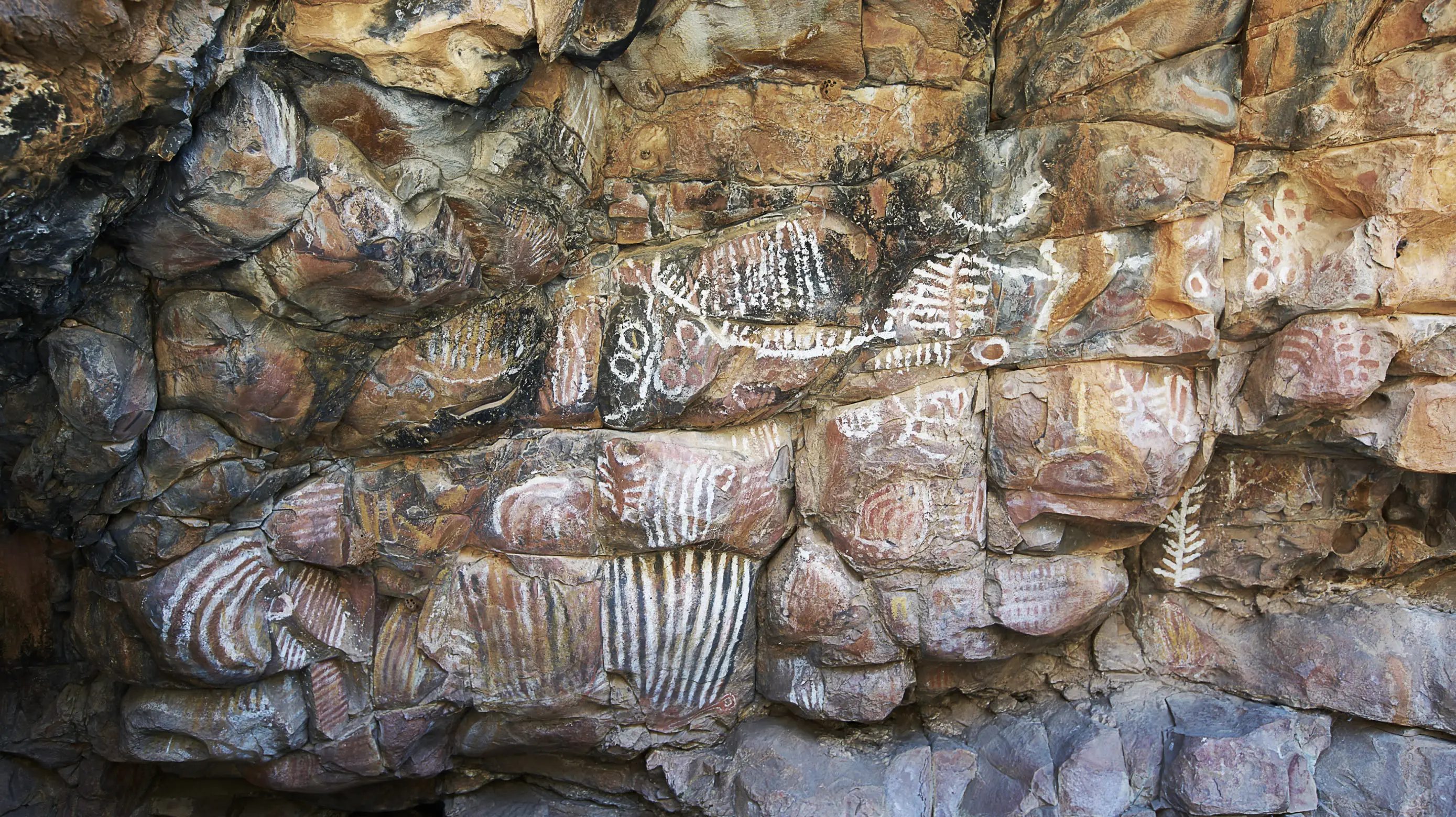
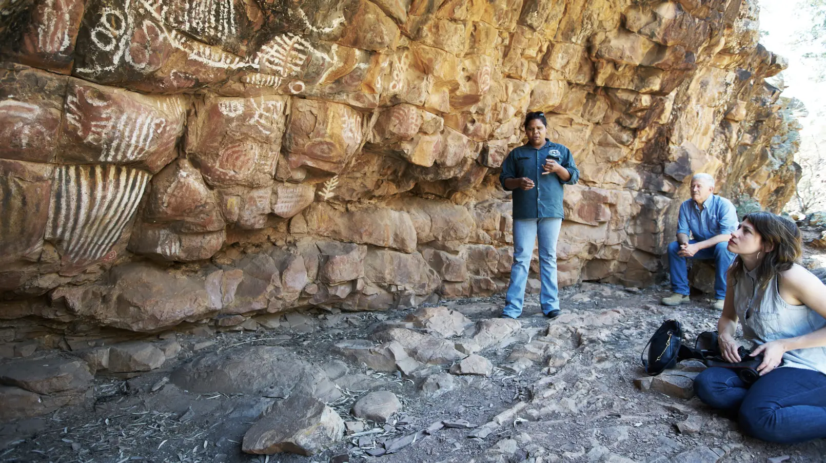
We were incredibly humbled to be welcomed into this warm and proud community. From ancient sites with 300,000 year old cave paintings, to the majestic landscape, this immersive experience and related workshops, paved the way for the creative process.
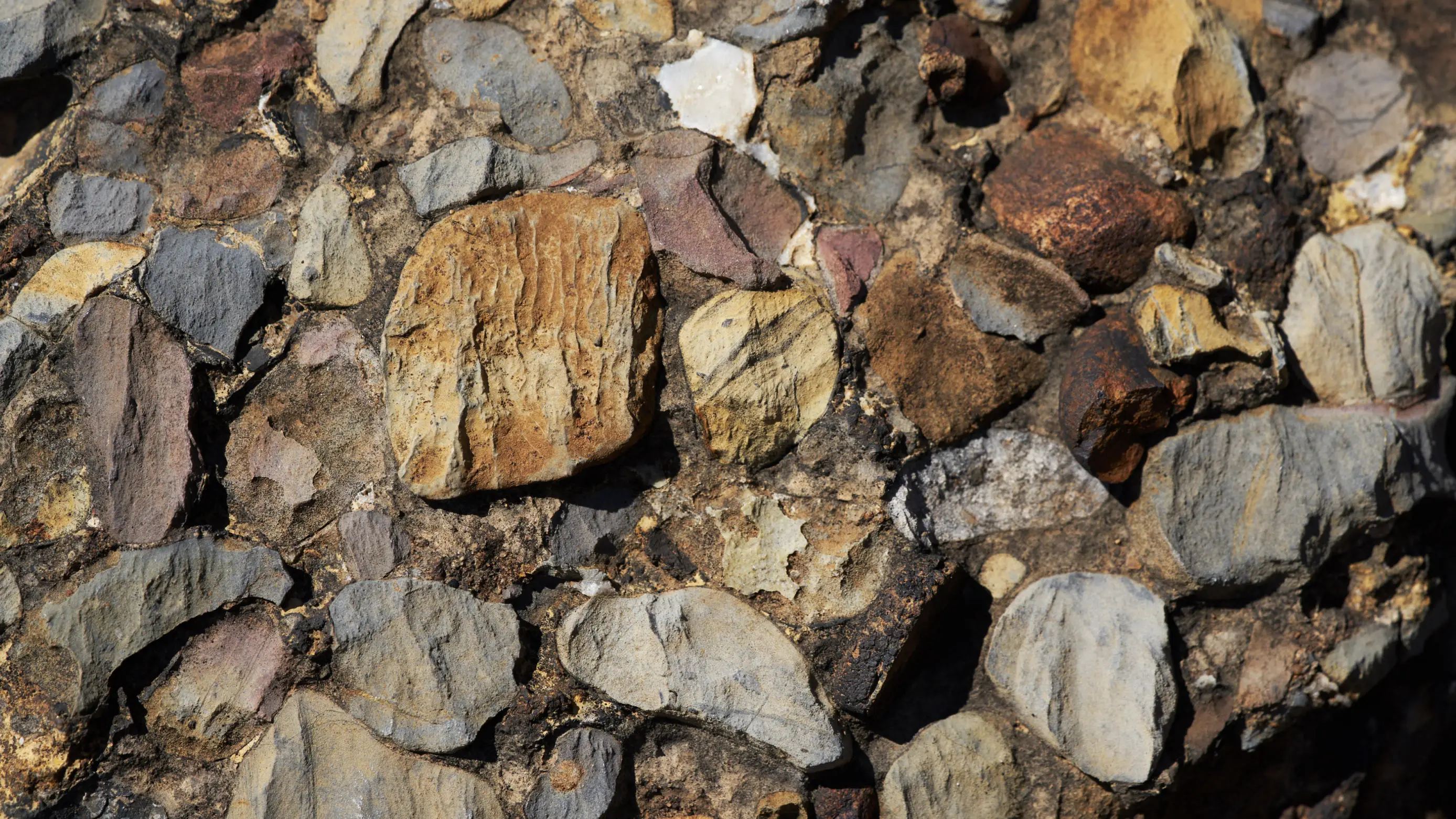
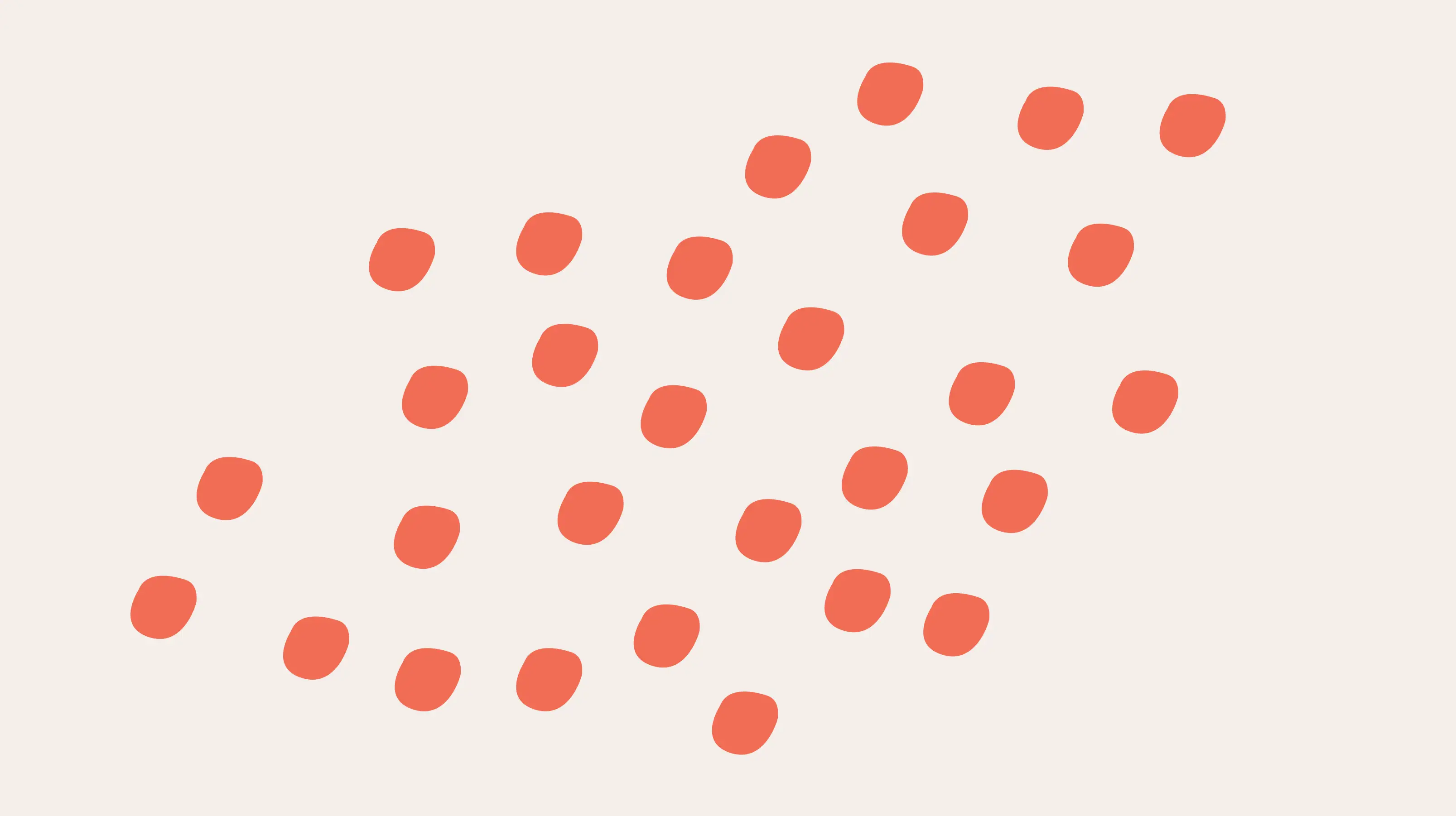
We started by creating a suite of abstract, illustrative elements, directly inspired by the landscape.
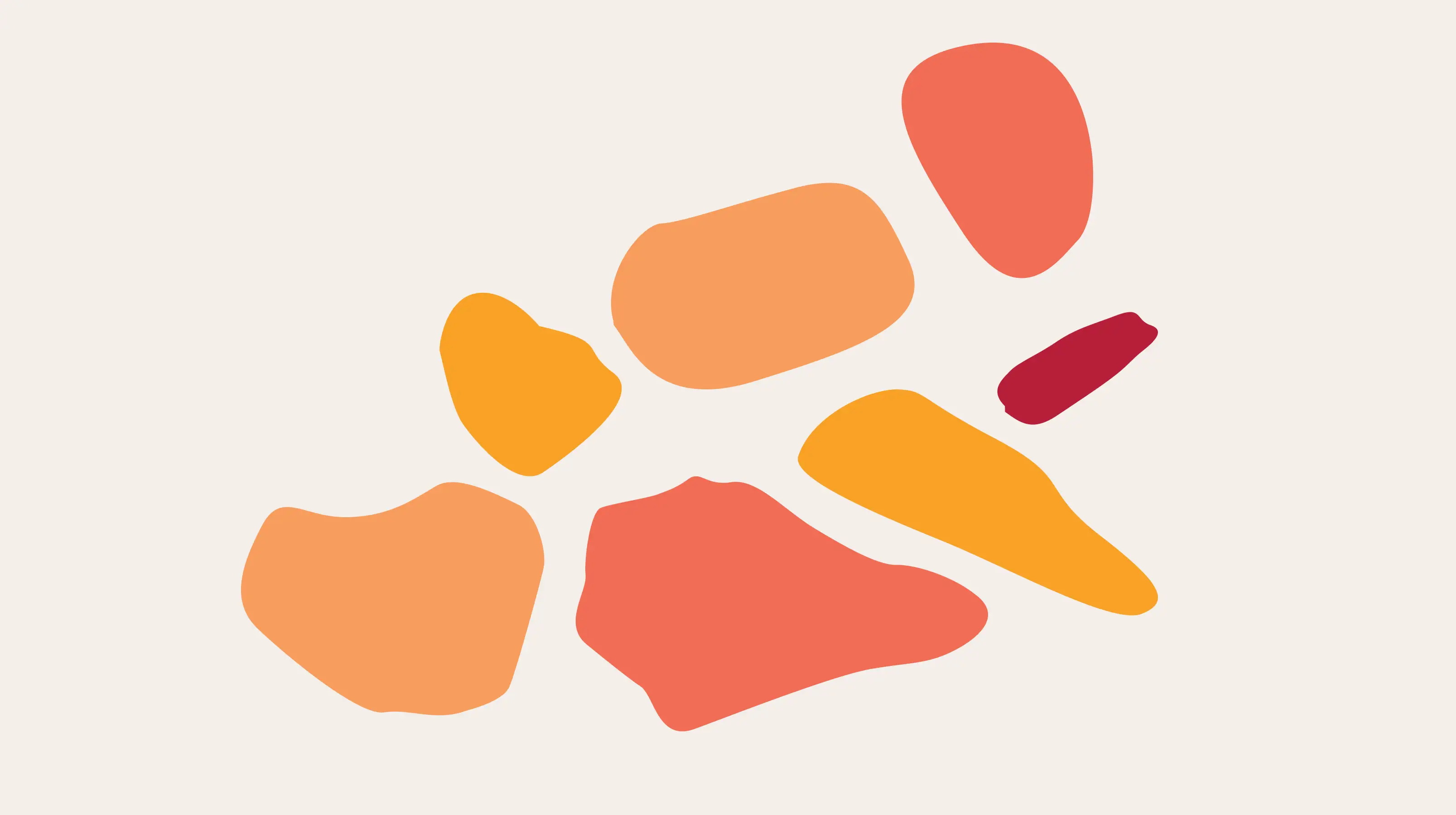
Simple graphic shapes represent the rocks that form the rugged landscape. Rendered in bright colour inspired by the surrounds, these shapes are an itegral part of the visual language.
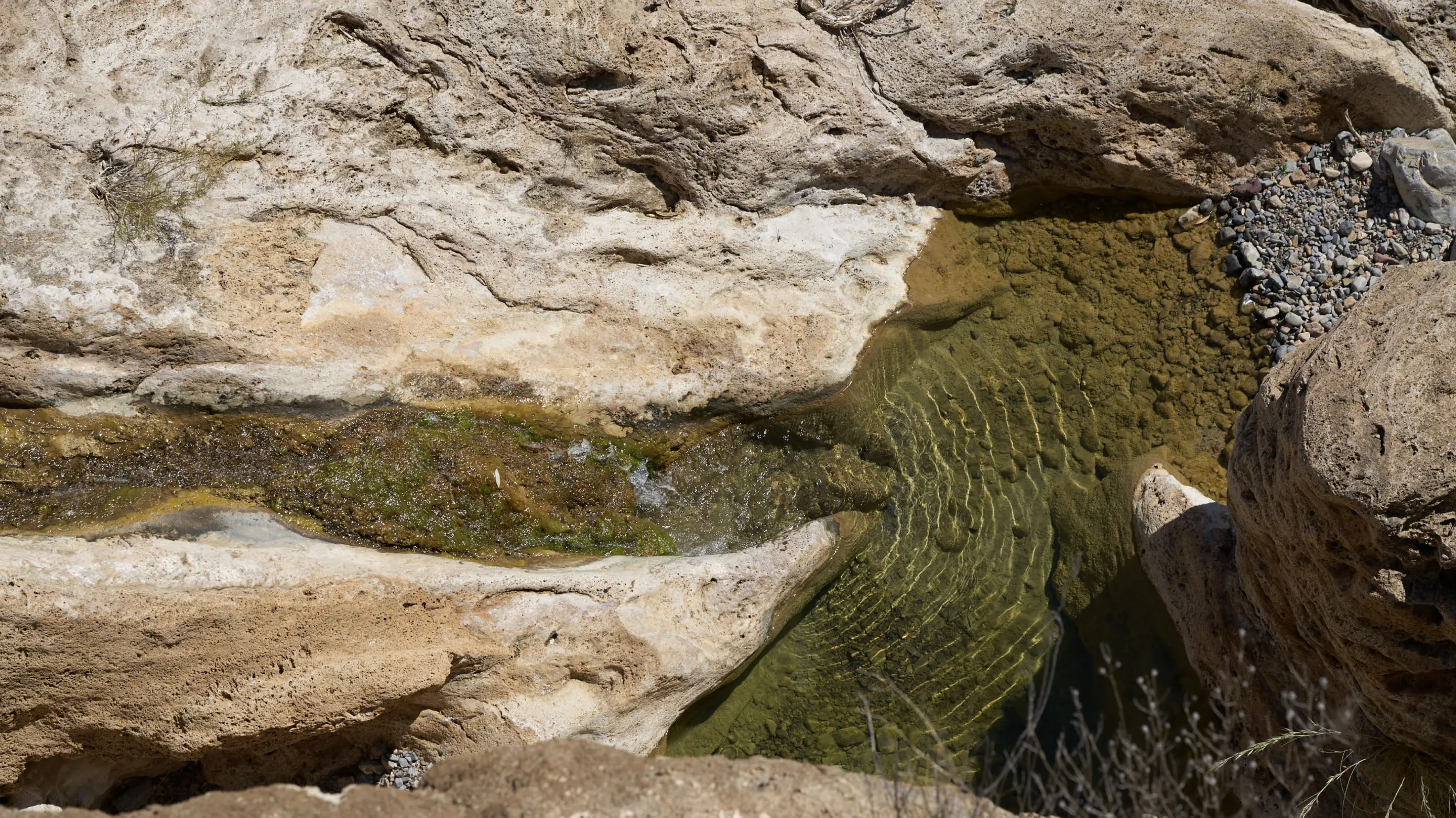
Nepabunna gets it’s name from the waterhole – Nipapanha Awi Urtu. It is located in a valley known as Adata Mardapa. The following symbol represents the waterhole and the many other waterholes in the area which were important landmarks while traveling in the area.


The cave paintings proved a rich well of inspiration. Creating a contemporary expression of marks that were made over 300,000 years ago, was a truly enriching, creative endeavour.
To compliment the simple abstract shapes, we created a hand crafted, bespoke word mark. The letterforms reach for the skies like the vast gum trees and towering cliff faces. Over spacing between the letters talks to the vast open space of the surrounding landscape.


The vibrant colour palette is inspired by the endless blue sky, warm red dirt and ever changing shades of textural rock faces.
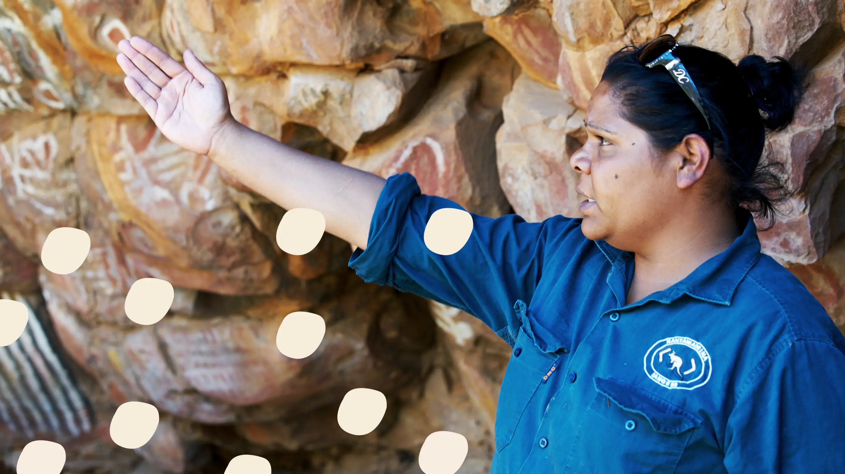
By overlaying these historic symbols on imagery of the Adnyamathanha people of today, we created a link to their past. This is an incredibly important part of their heritage. An ancient symbolic language that they want to retain as part of their culture.
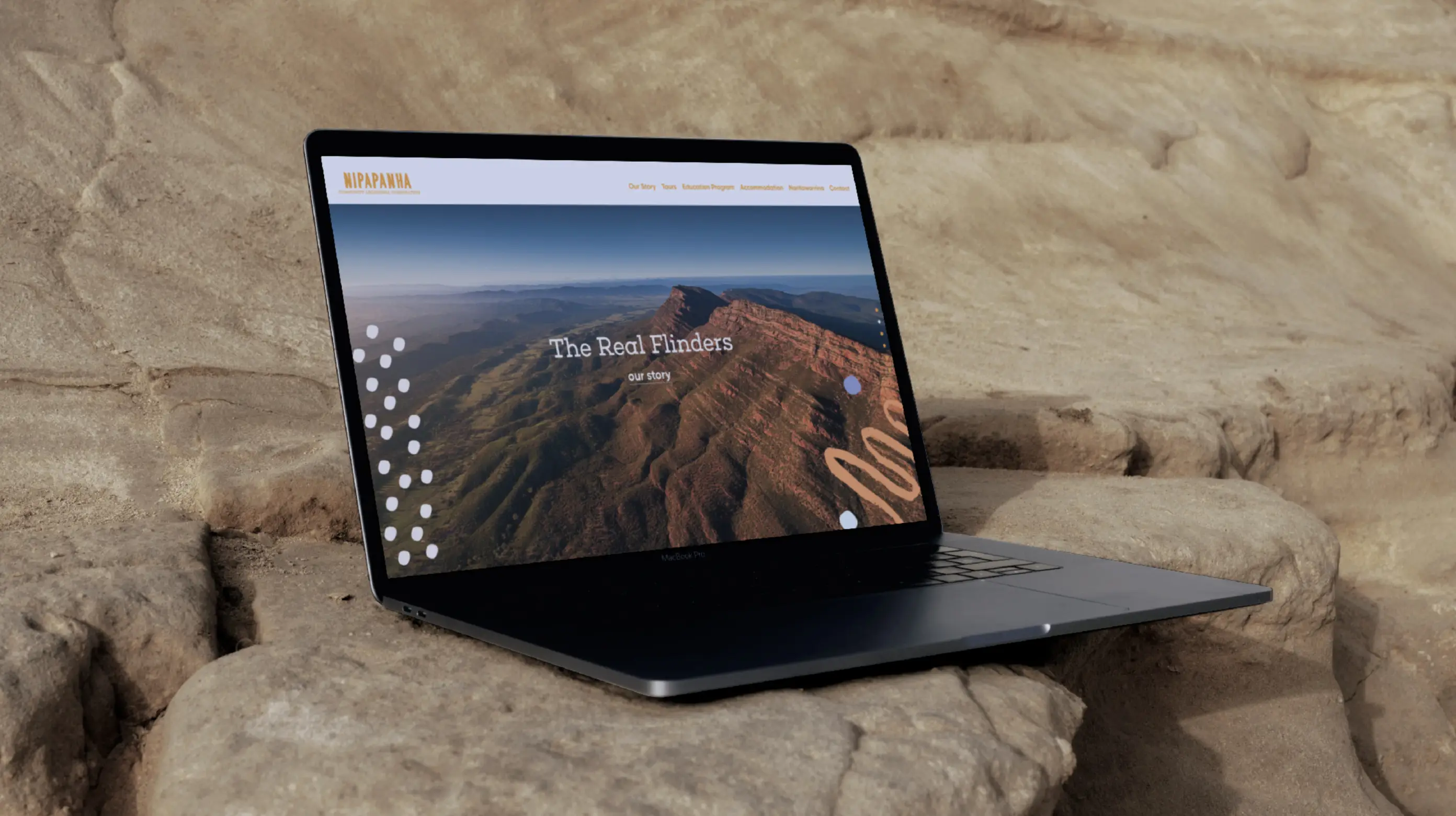
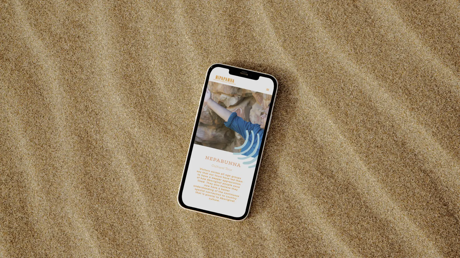
The website brings together all of the elements in a simple design. Minimal parallax functionality adds depth and subtle movement to the experience.
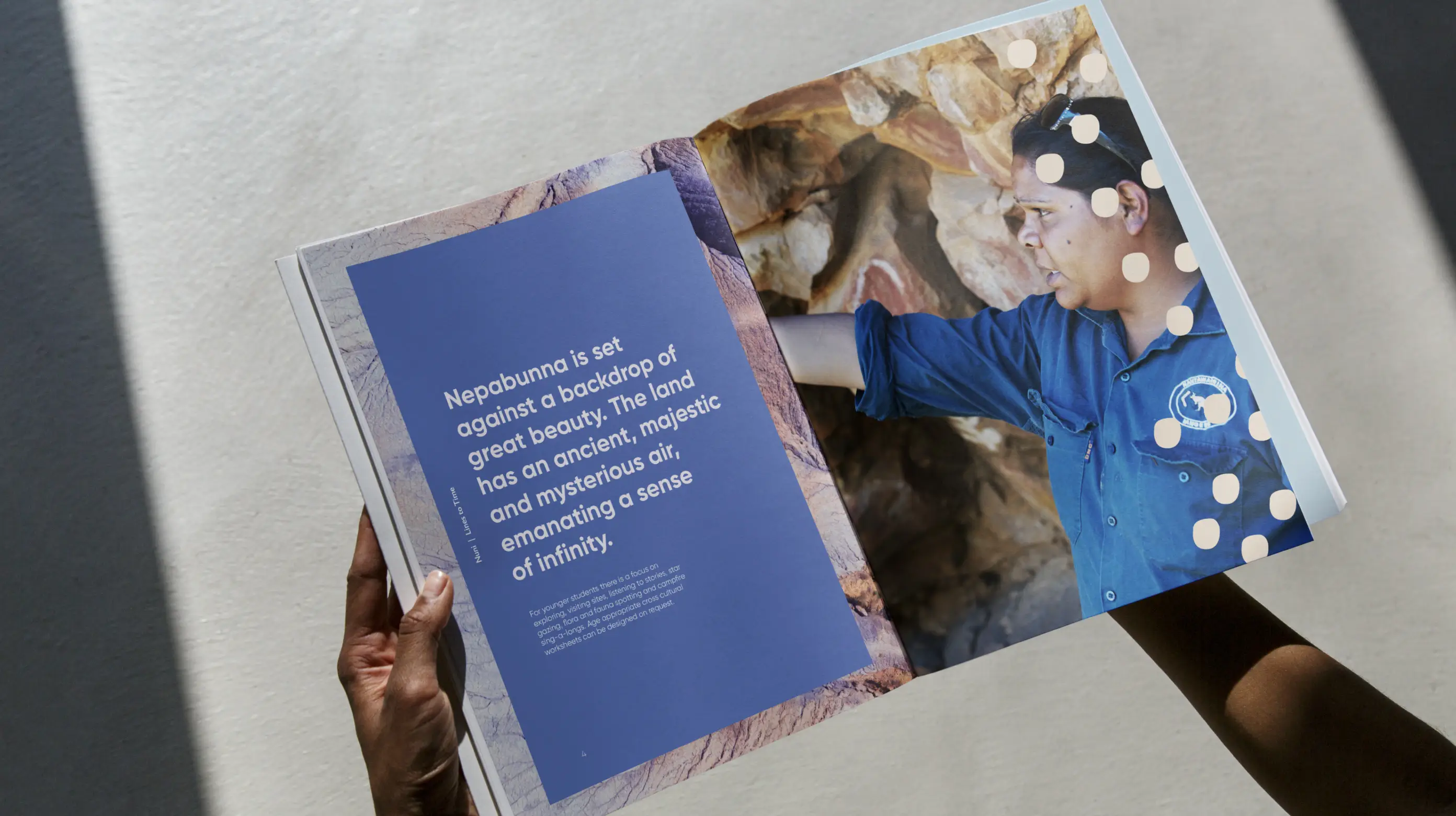
‘Lines to time’ is the theme of the Nepapahna education program. Students are given the opportunity to hear stories and visit sites, which are central to the Adnyamathanha people’s spiritual beliefs around the creation and passing on of life lessons from one generation to another.
Nuni means ‘to show’ or ‘to teach’ in the Adnyamathanha language. Students will learn about the contemporary lives of the Adnyamathanha people, the flora and fauna, bush tucker, the importance of protecting the environment, and the significance of certain geographical features. As their guides are locals, they will be able to interact with the community.

The colour palette is directly inspired by the changing colour of sky and the influence this tone has on the surrounding mountains.
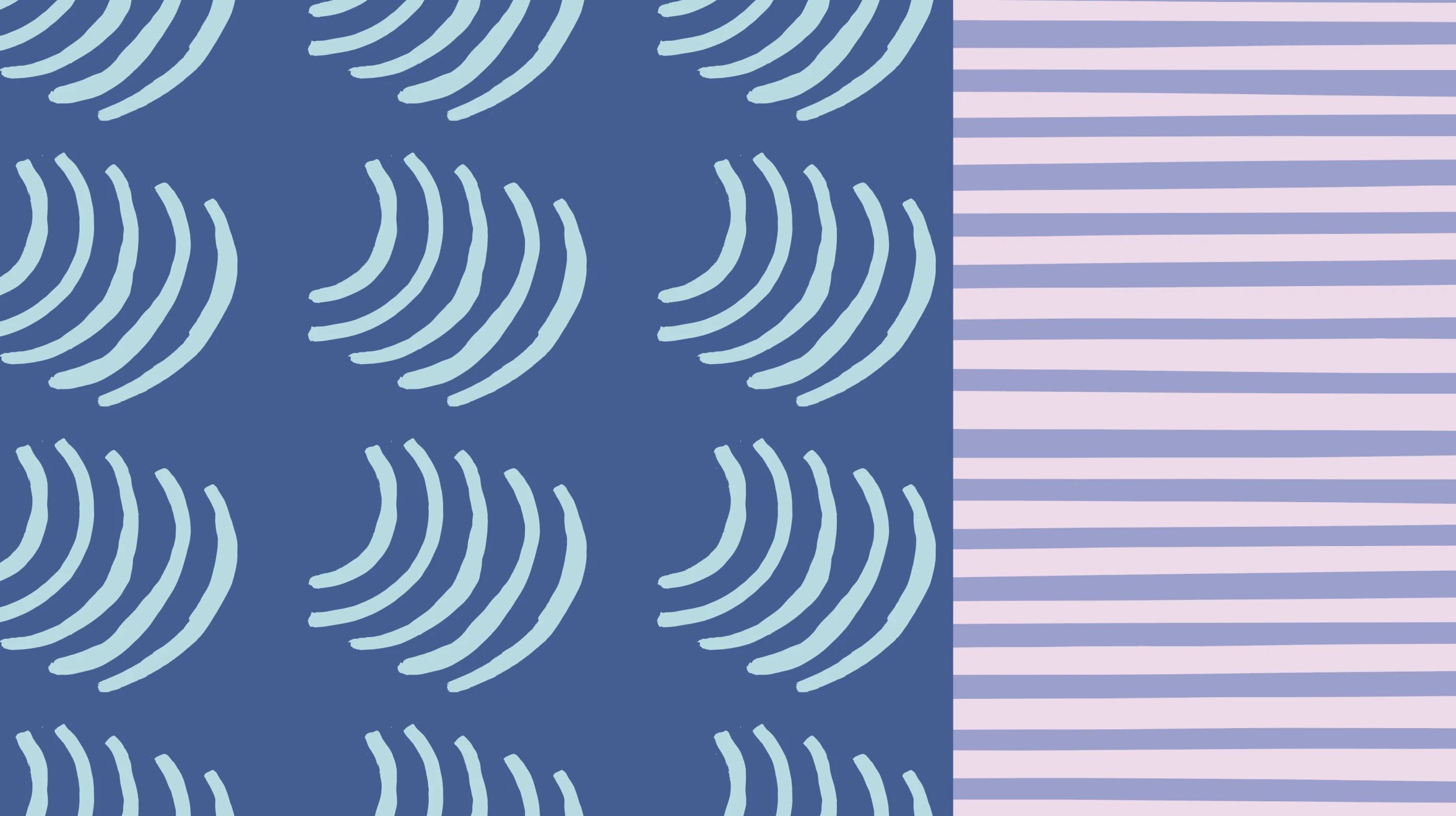
We linked the Nuni project to the overarching Nipapanha brand through the use of the illustrative elements. Expaning the style with the creation of repeat patterns for a more graphic effect.
Related Projects
Goolwa Pipi Co
Telling the story of a brand 19,000 years in the making.
PROJECT: BRAND IDENTITY / WEBSITE / UI