Brand Identity –
Goolwa Pipi Co.
19,000 Years On Country.
Team
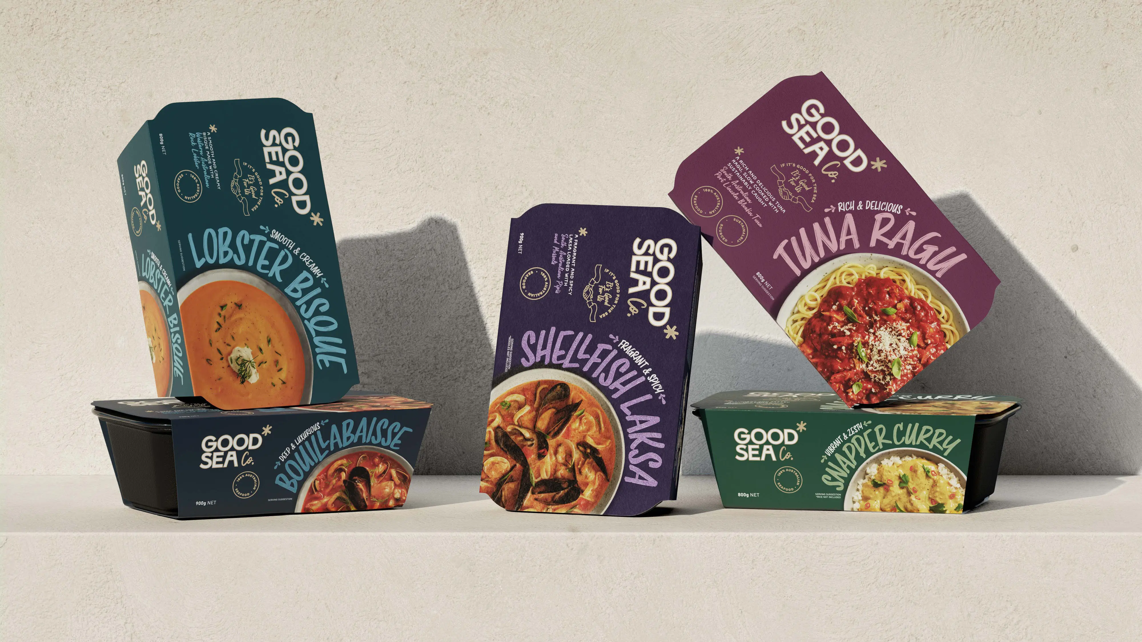
Client – Goolwa Pipi Co. →
Brand Identity, Strategy, Packaging, Website & Video – Studio Home
Food Photography – Jacqui Way →
Lifestyle Photography – Allan Mawer
Development – He Wang
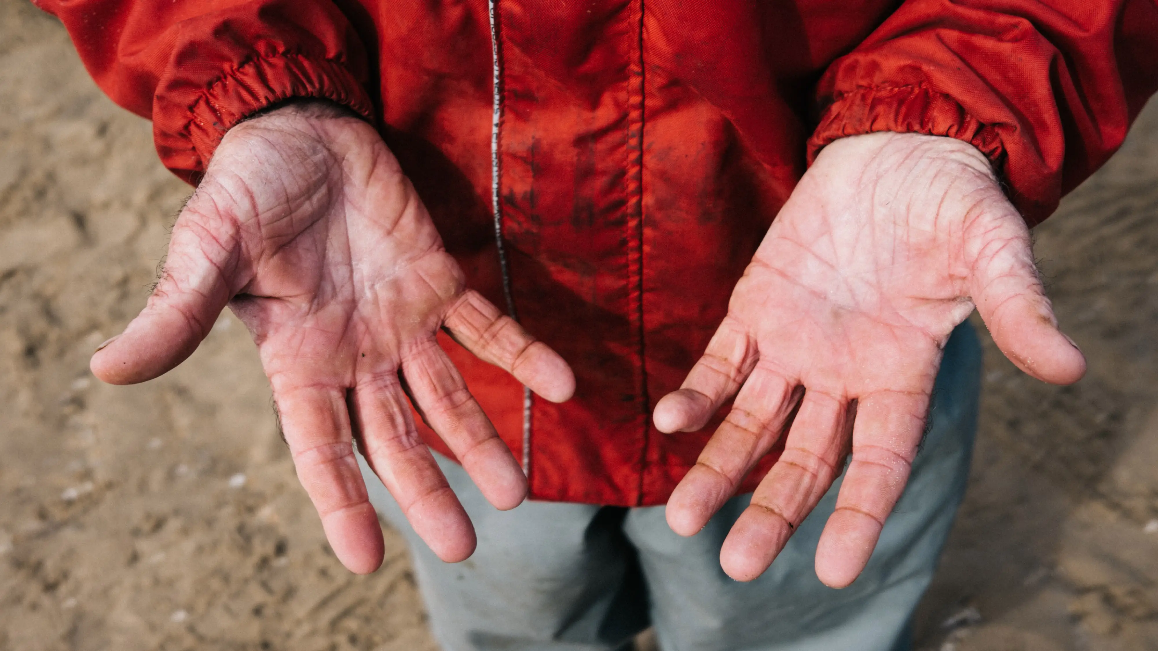
The humble pipi has been harvested from the cold, pristine ocean off the South Australian Coorong National Park by the Ngarrindjerri people for over 19,000 years. And Goolwa Pipi Co. still harvests this versatile mollusc with the same hand-harvesting techniques today. We were tasked to create a strategy and brand identity to tell with rich, historic story
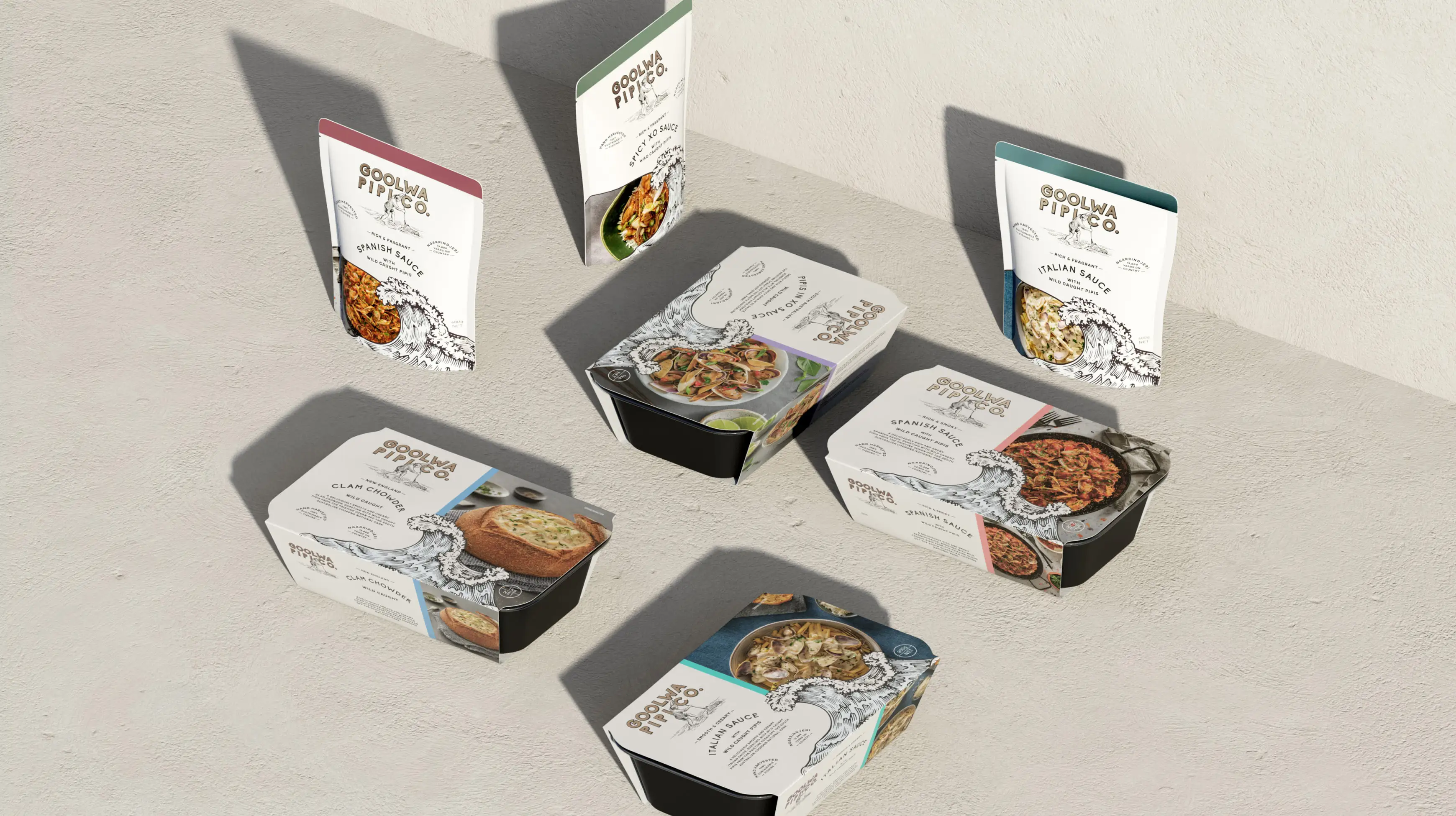
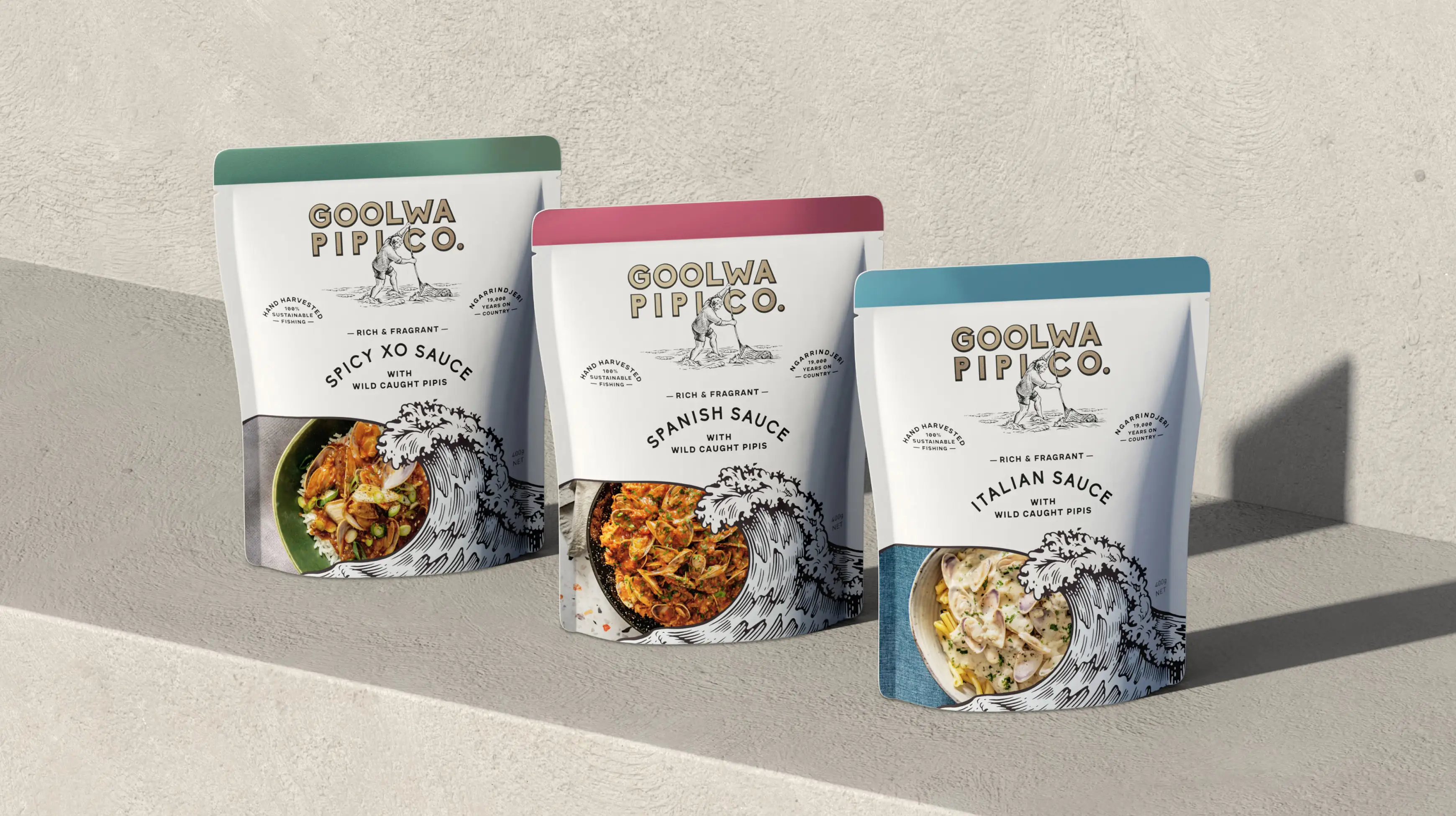
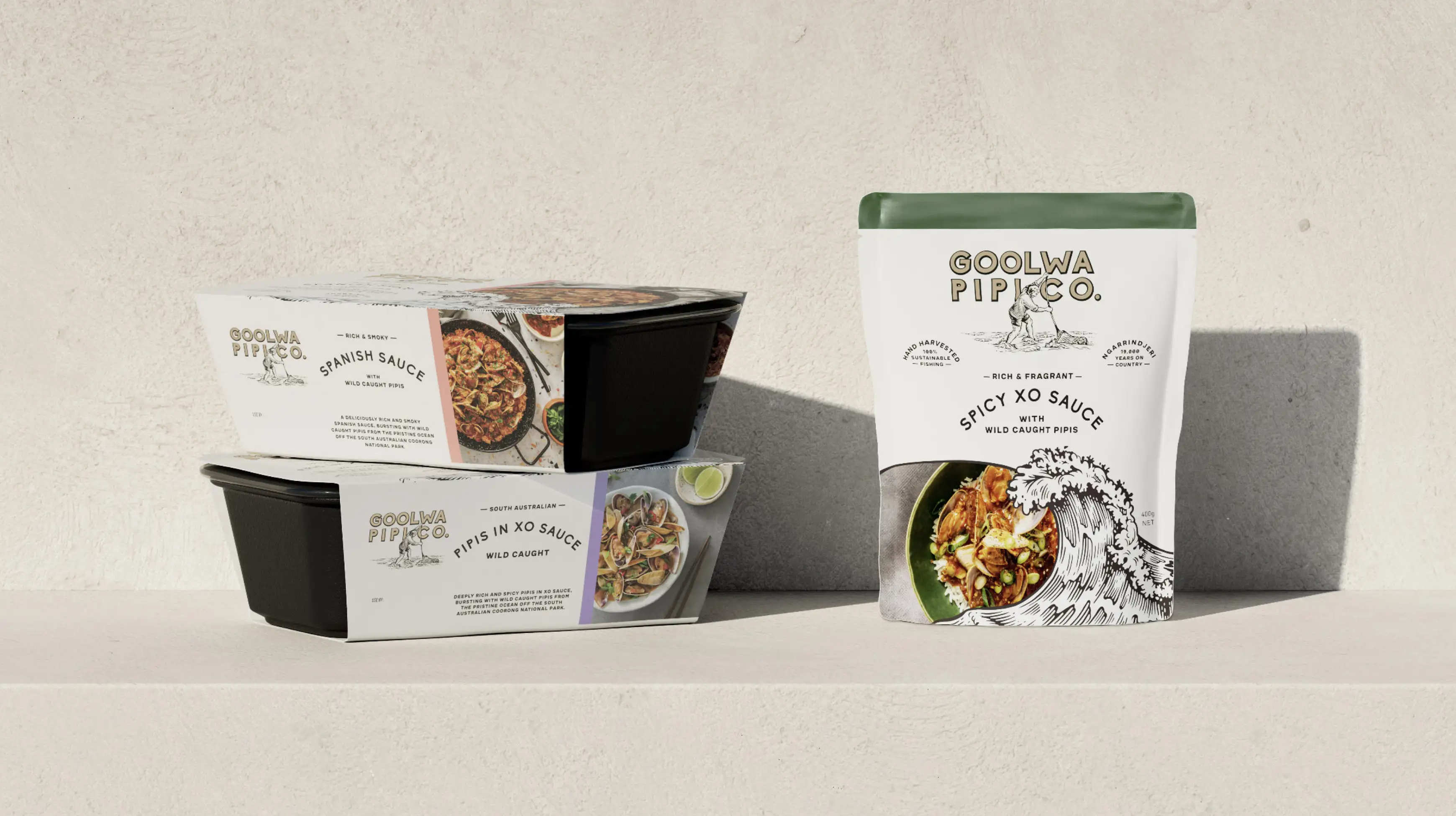
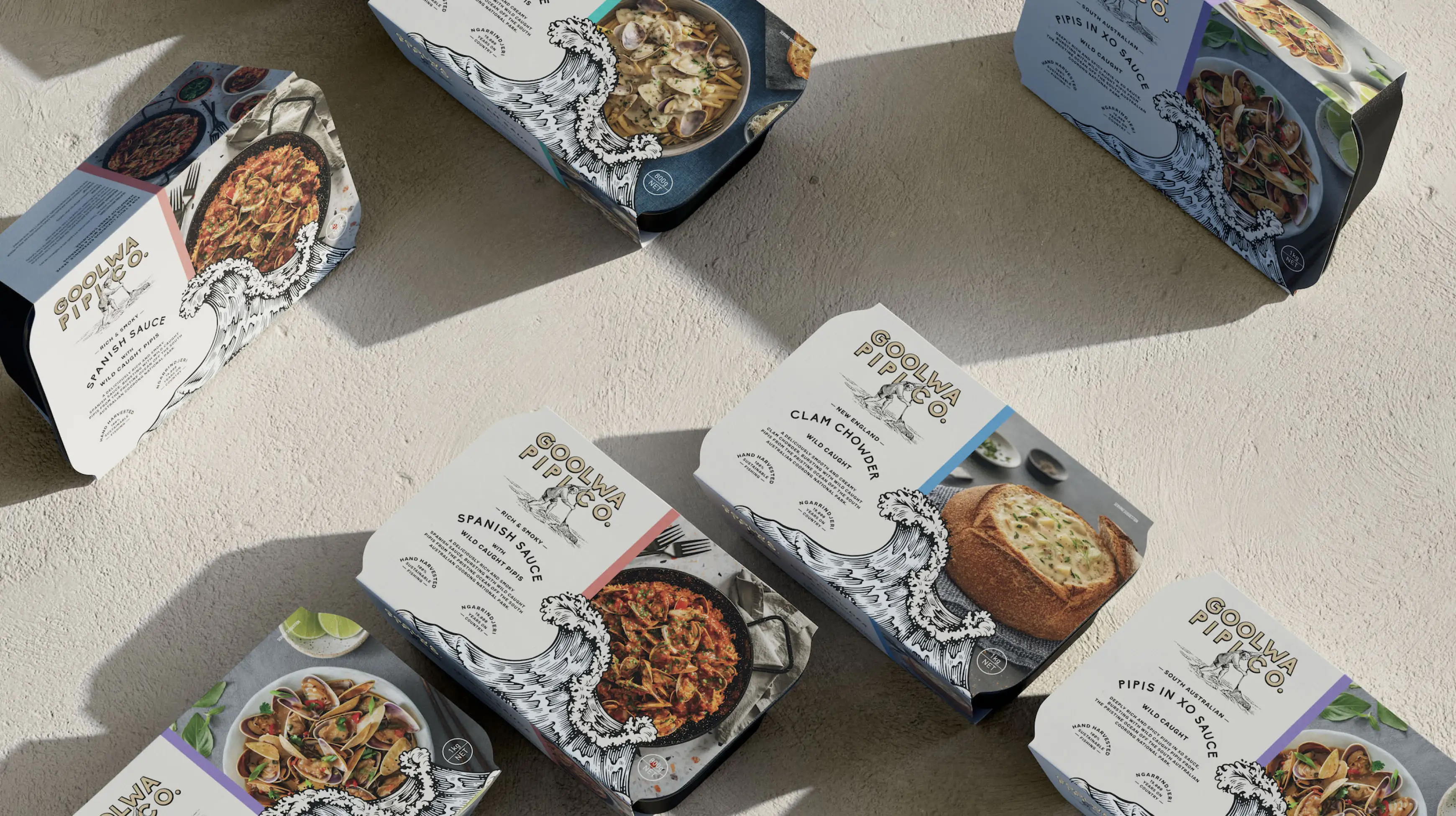
Our strategy is centred around Goolwa Pipi Co’s point-of-difference; their sustainable hand-harvesting process. We developed a robust new brand identity anchored around the brave rakers and the wild waves from which they harvest the beautiful Goolwa Pipi. This includes a refined visual style and distinctive brand elements that translate across all products and channels.
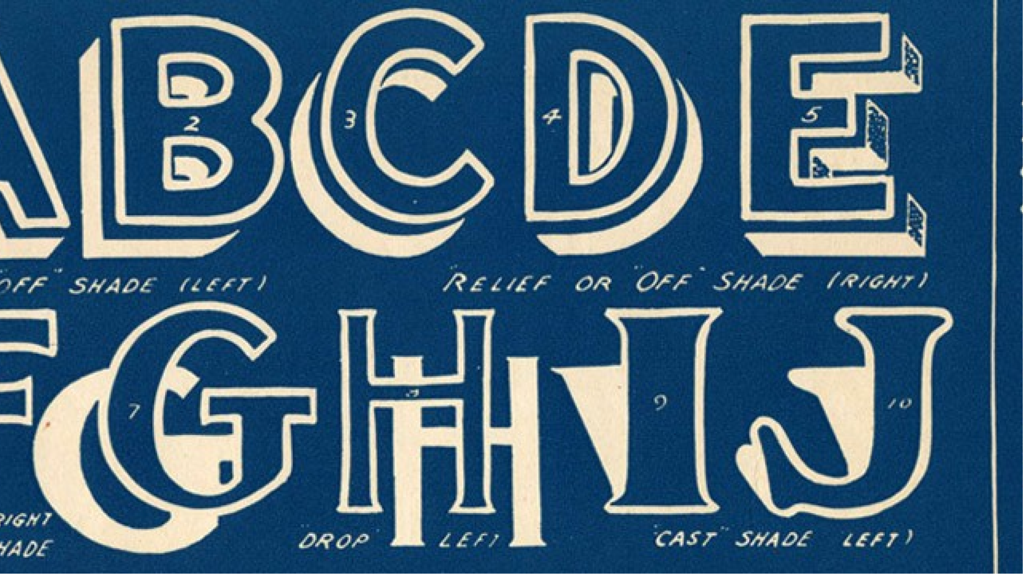
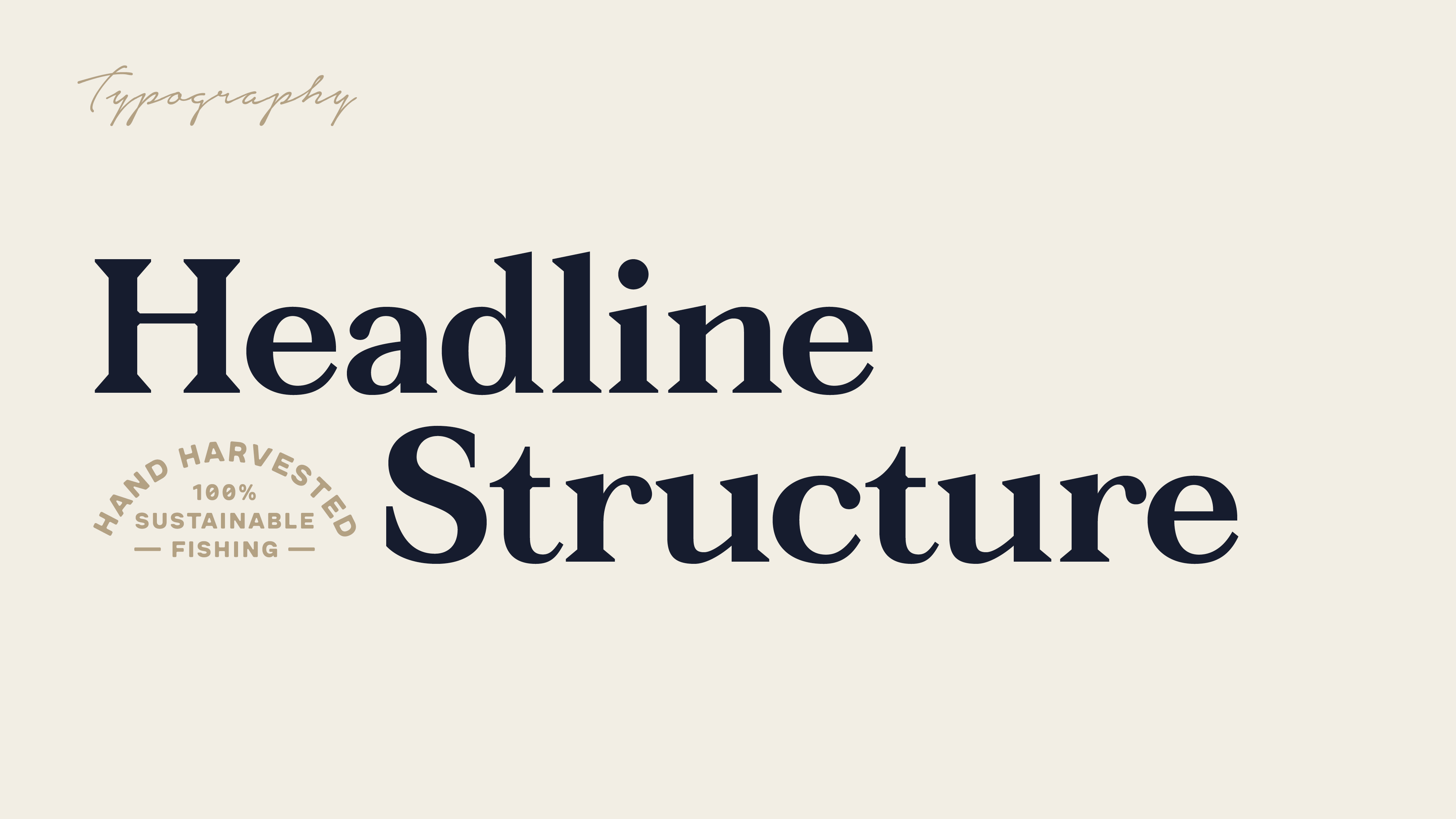
The logotype is inspired by traditional sign writing techniques. We created a modern interpretation of this handcrafted style as a way to embrace Goolwa Pipi Co’s rich history. This style becoming an integral part of the overall brand identity.
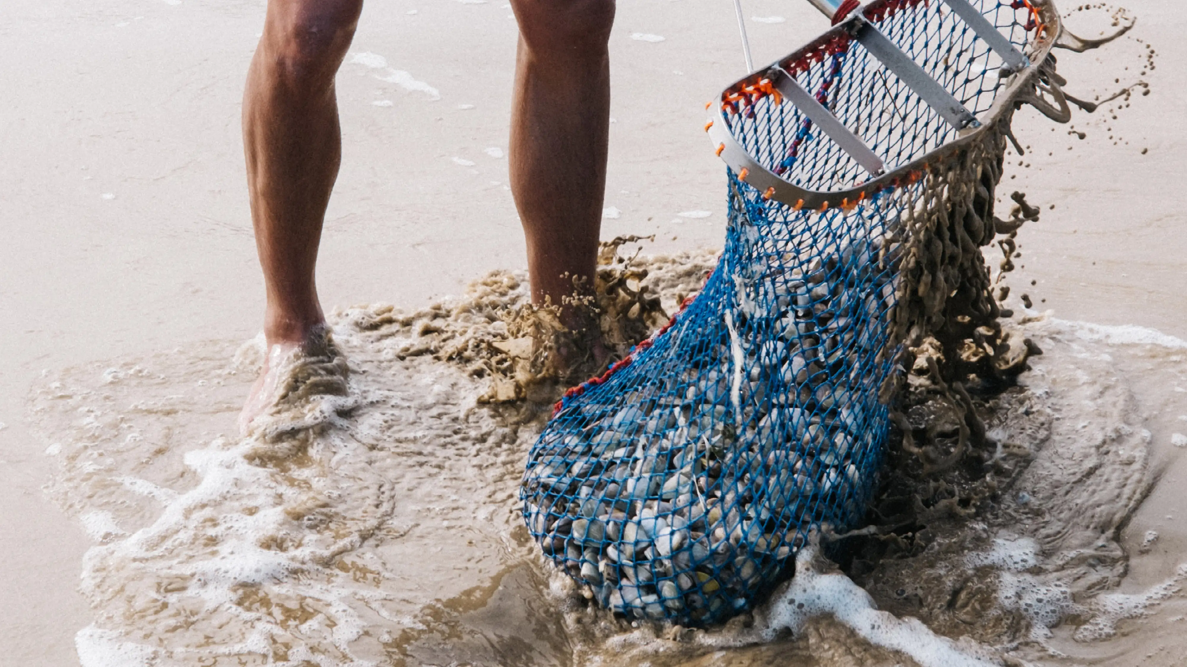
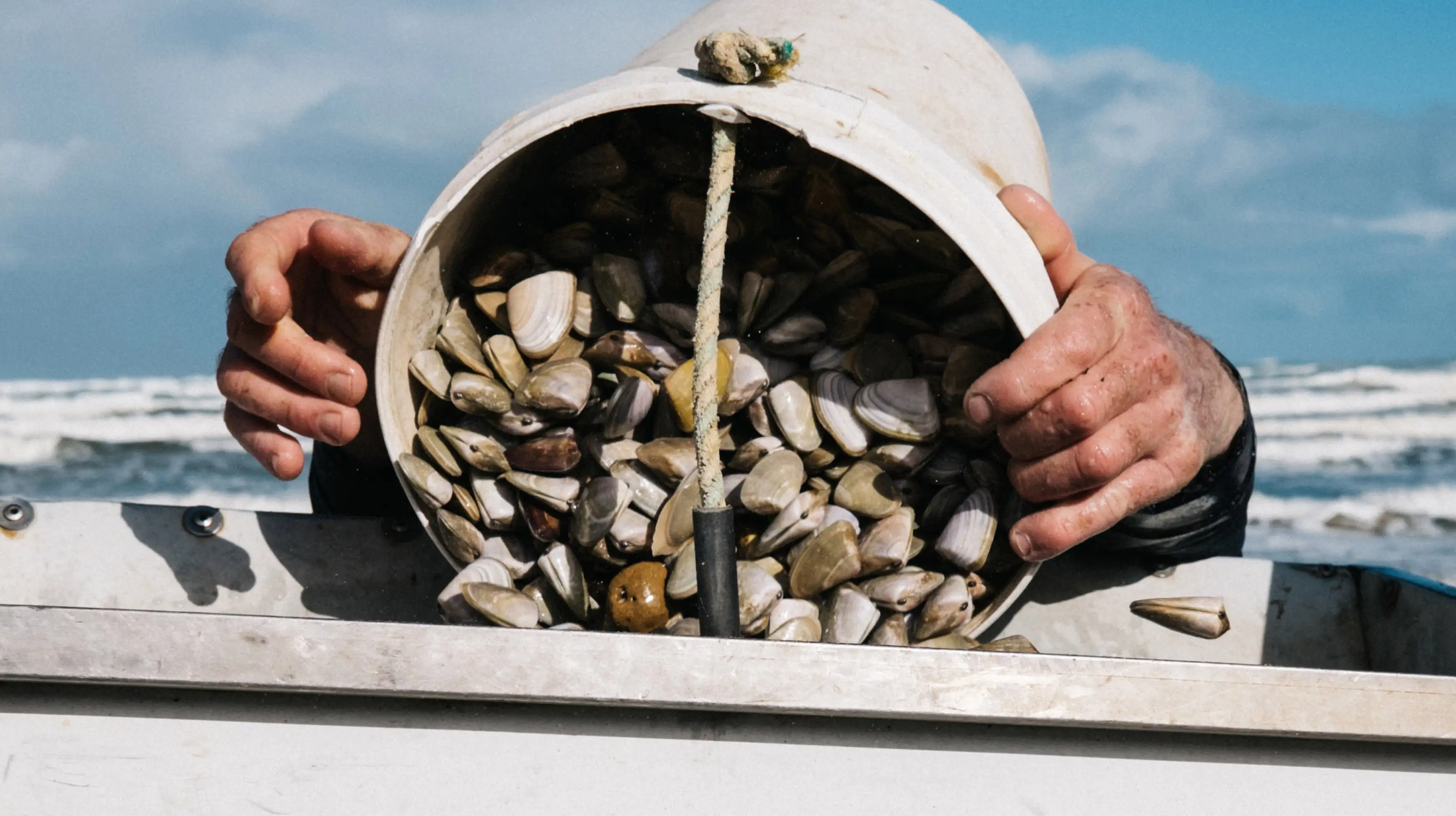
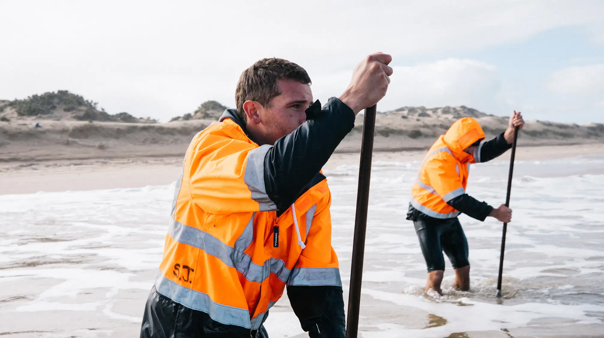
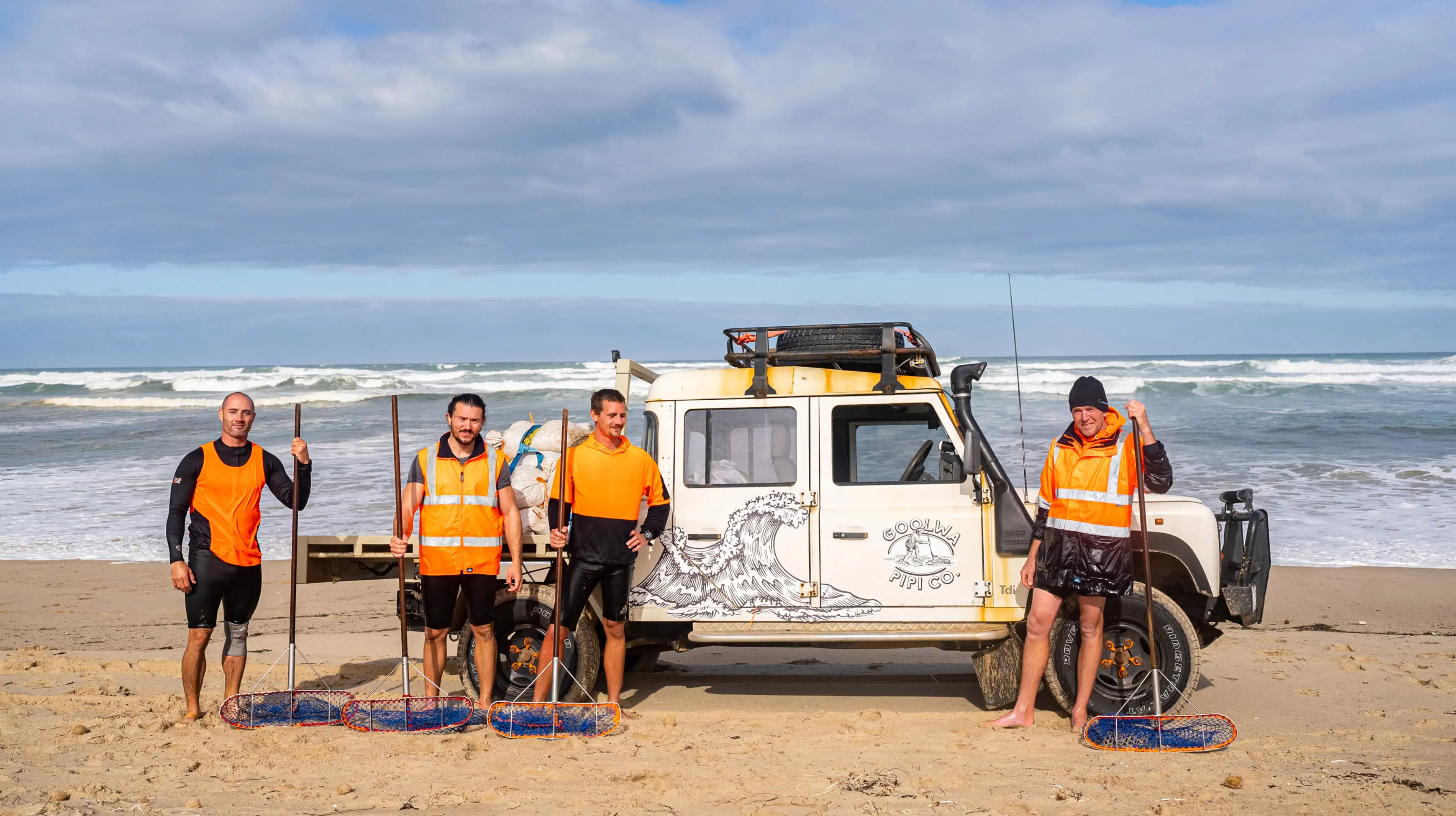
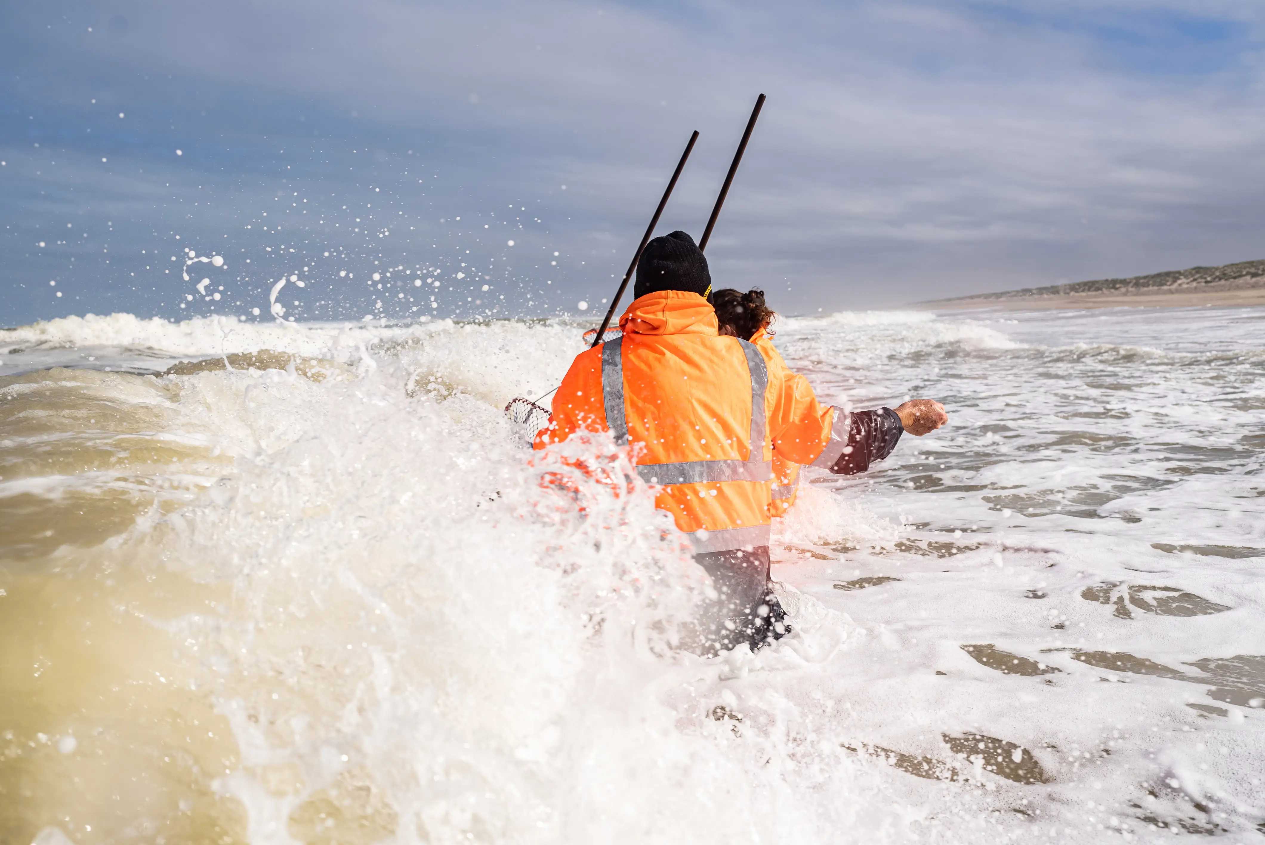
Adelaide based photographer Al Mawer captured the hand-harvesting process through a series of beautiful images. Capturing rugged nature of the conditions and hard as nails attitude of the harvesters, perfectly.
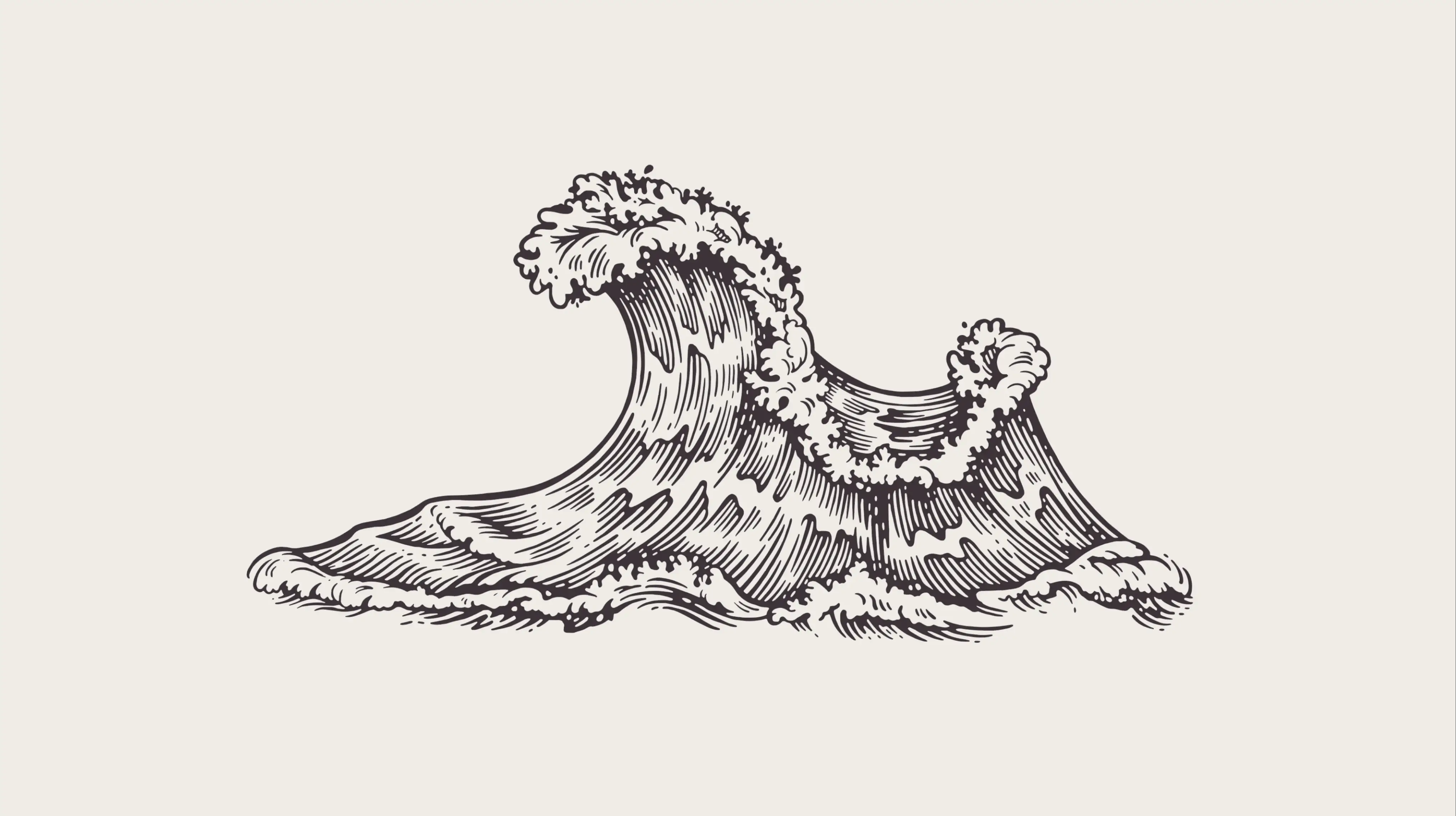
The wild waves are an iconic part of the Coorong landscape, with many a 4WD vehicle falling foul to their powerful and relentless pull. We created a visual language that sees these majestic waves becoming a consistent element across all consumer touch points.
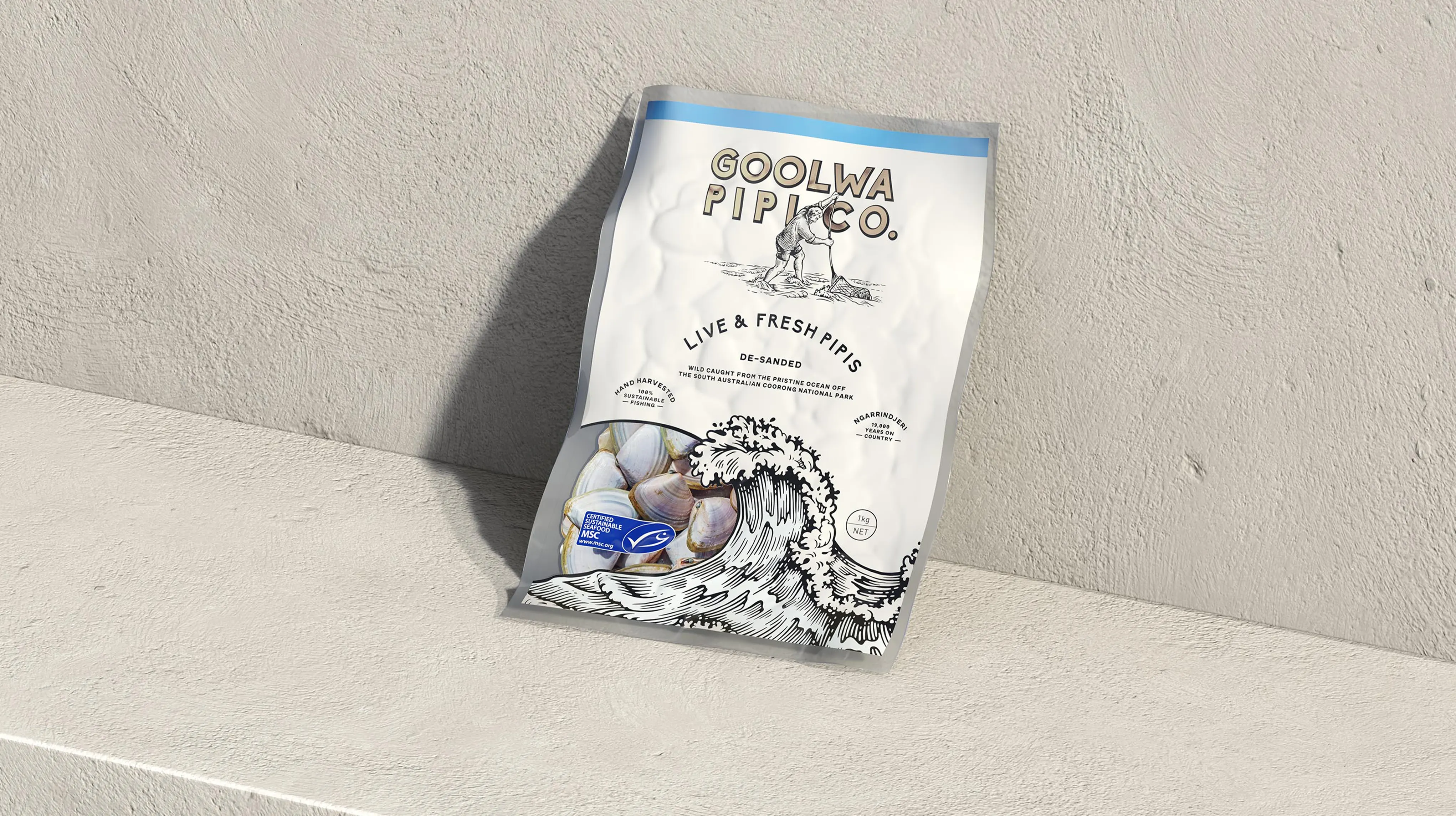
The packaging suite is a true and confident reflection of the brand. The raker is placed proudly at the top of all packs and the design is anchored by the placement of the wave as it crashes through the design, creating movement and drama.
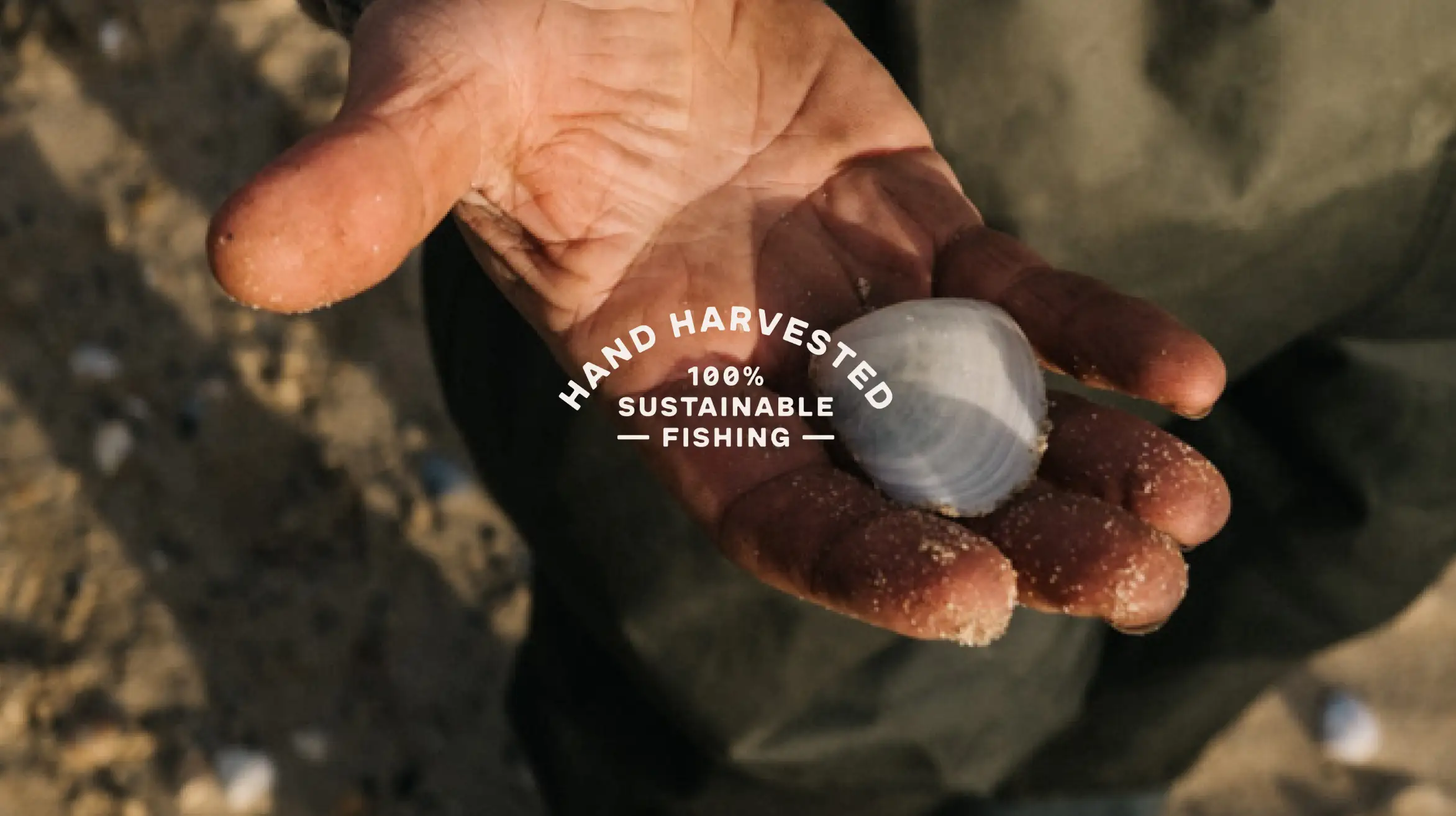
Goolwa Pipi Co. harvest every single pipi by hand. It’s this unwavering dedication to sustainble fishing practices that sets them apart from their competitors.
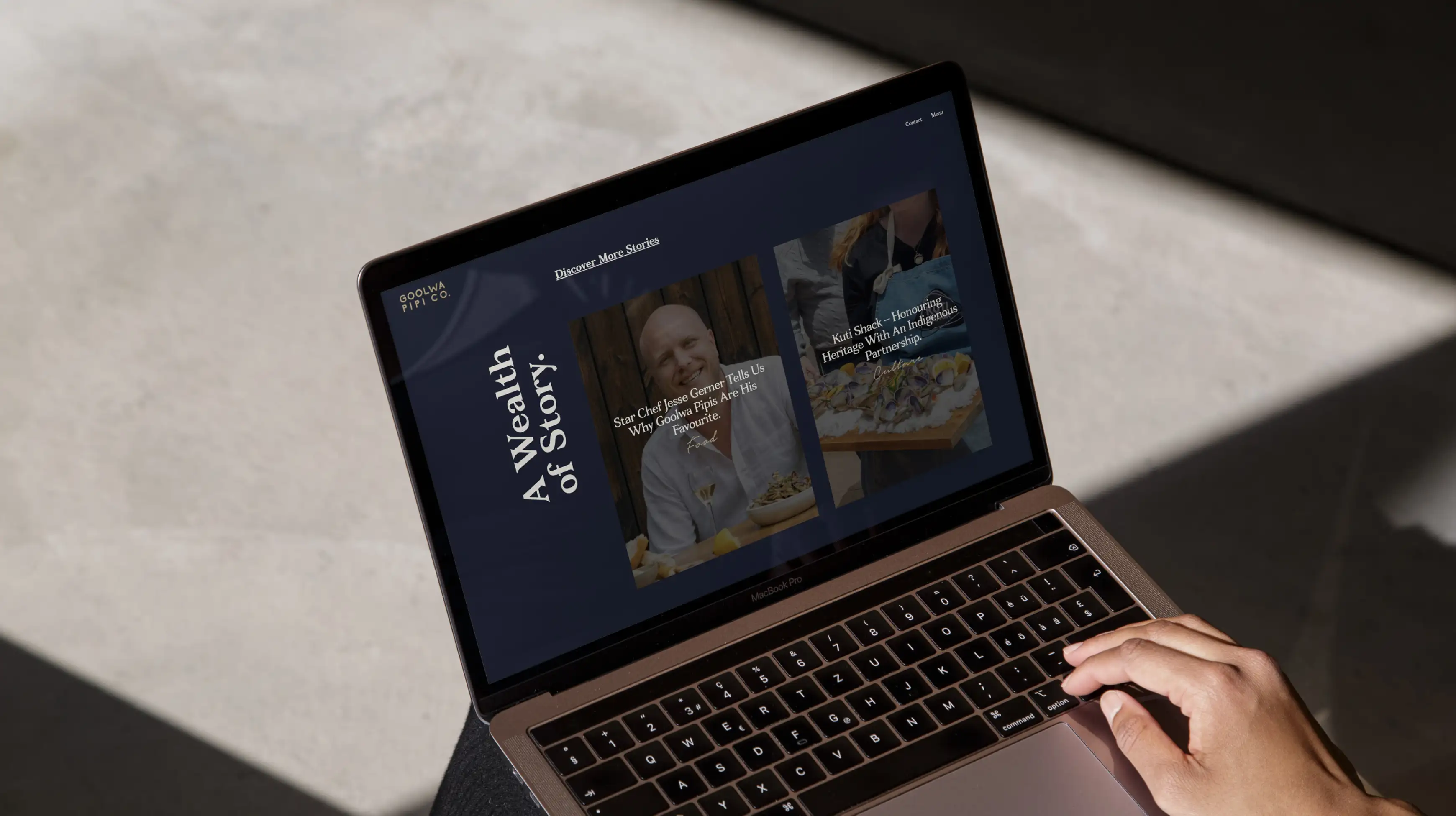
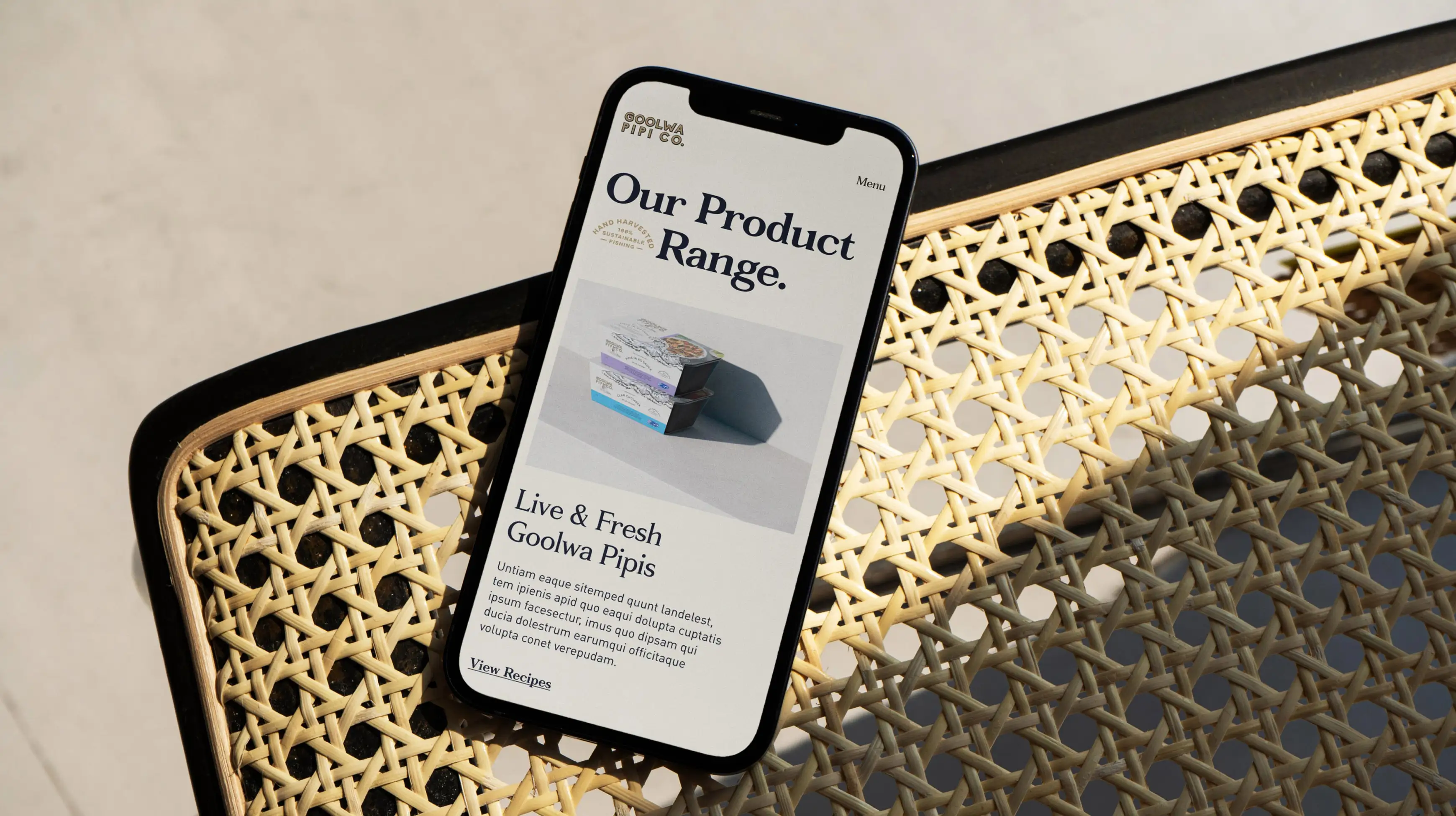
The website is a celebration of Goolwa pipi Co’s connection to land and a rich history that started some 19,000 years ago.
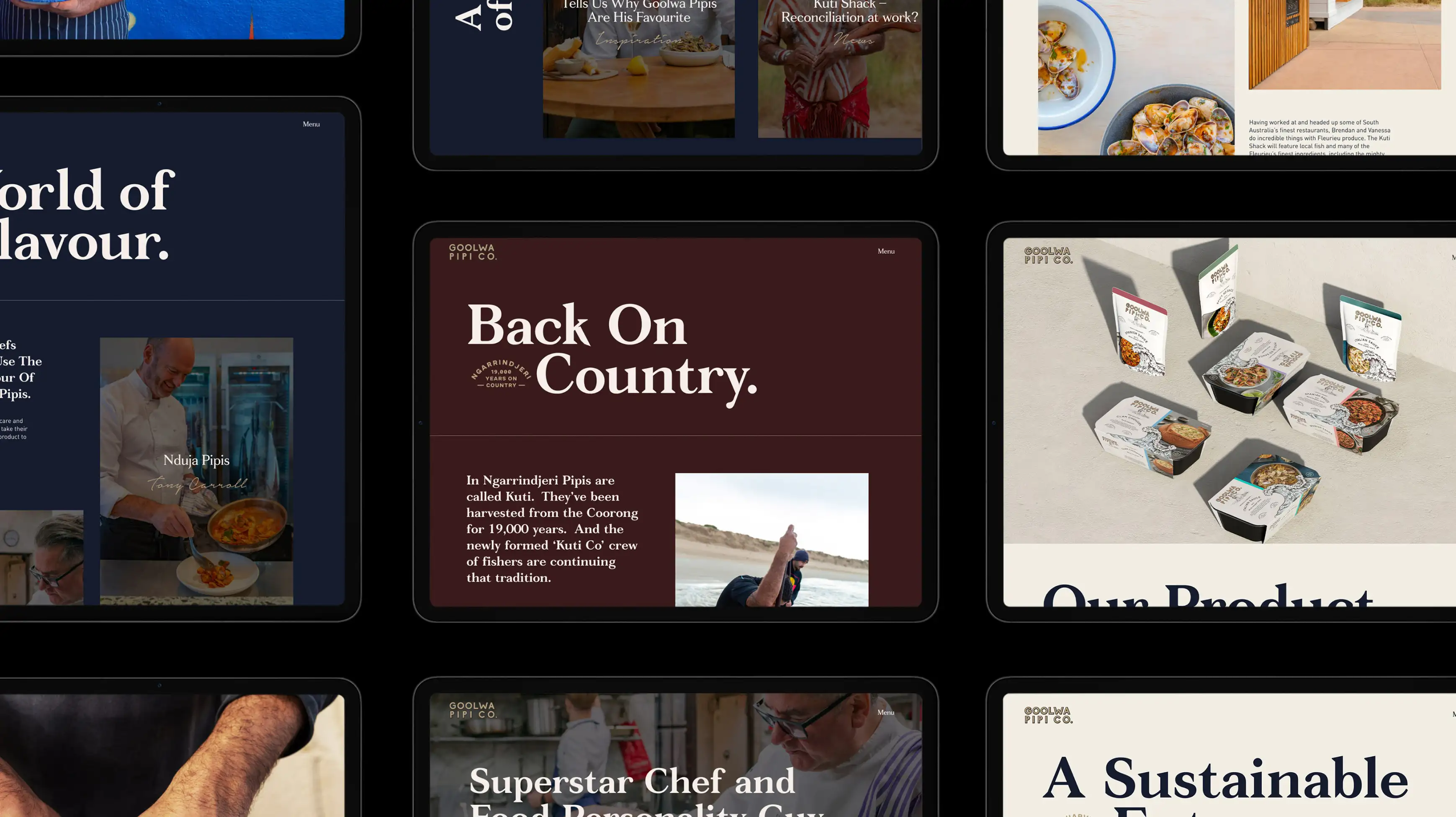
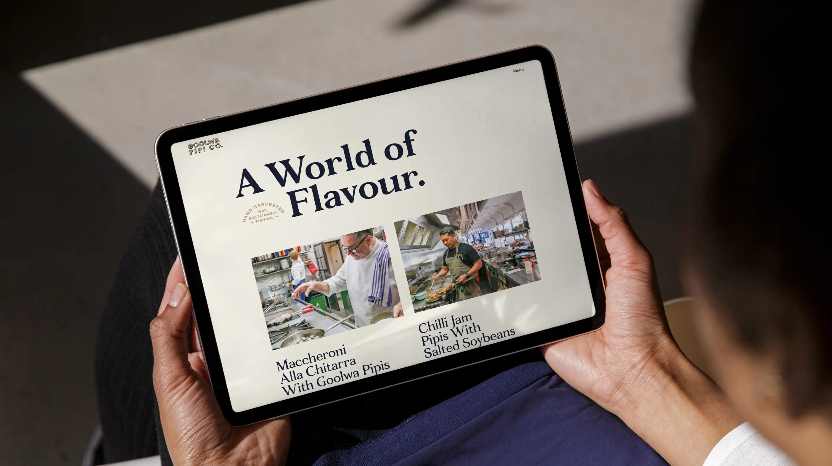
The design brings together old and new, with the use of bold serif headlines, contemporary layouts and striking imagery.
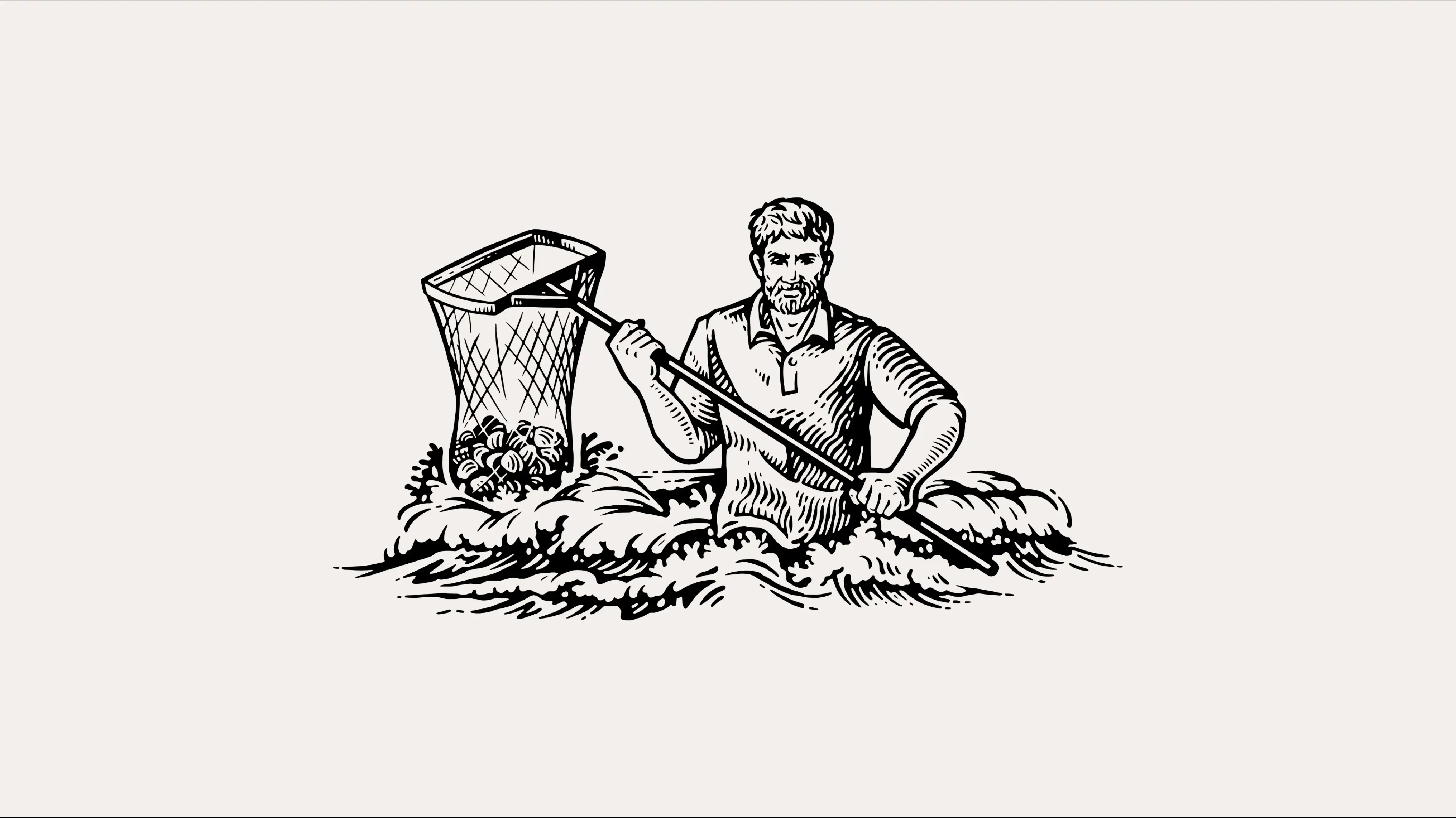
A suite of illustrations tell the Goolwa Pipi Co. story. The traditional etching style talks to the history of the brand, echoing the meticulous care, attention and respect they pay to their sustainable fishing practices.
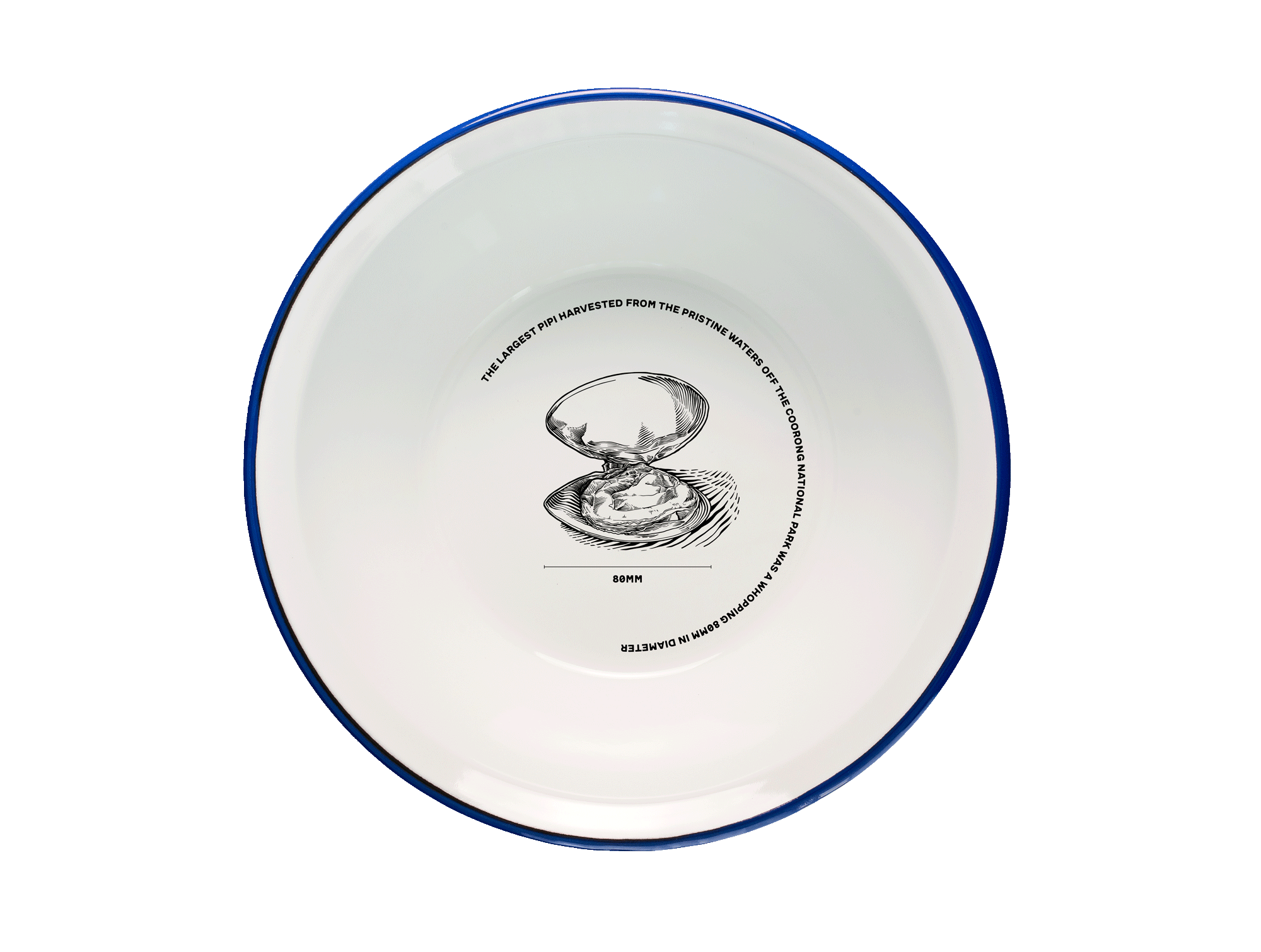
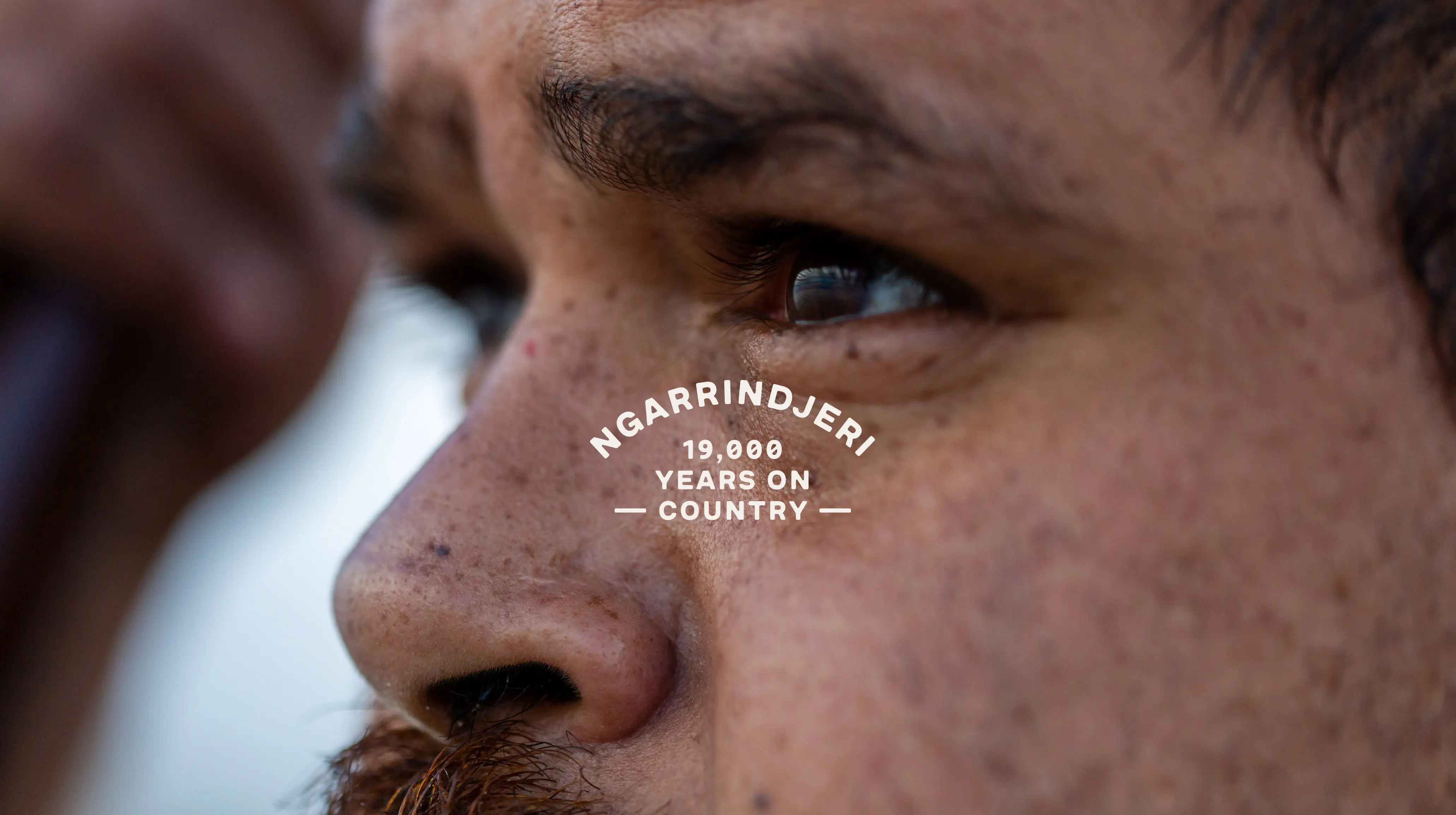
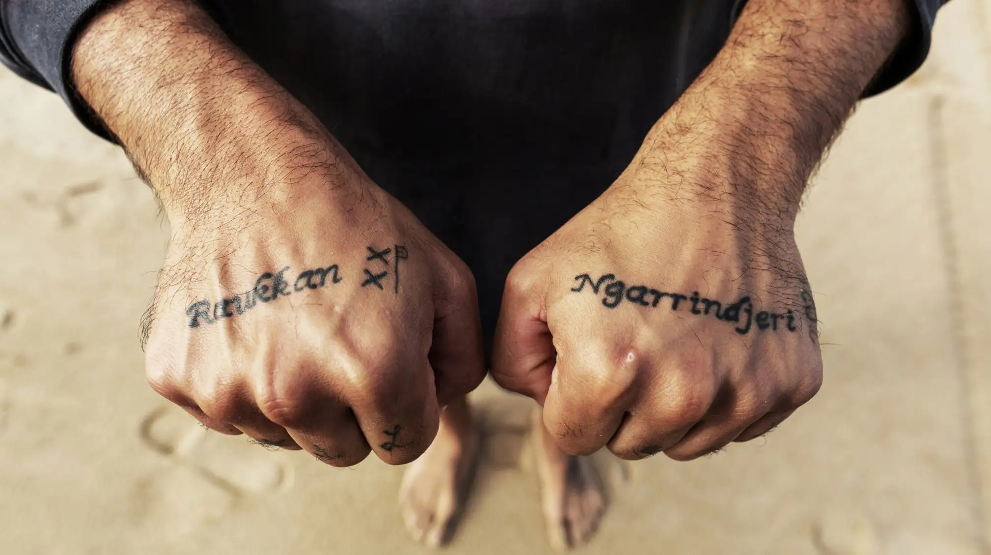
In Ngarrindjeri pipis Are Called ‘Kuti’. They’ve Been Harvested From The Coorong For 19,000 Years. The brand identity shows respect to this history and ongoing partnership with prominent placement on the website and packaging.
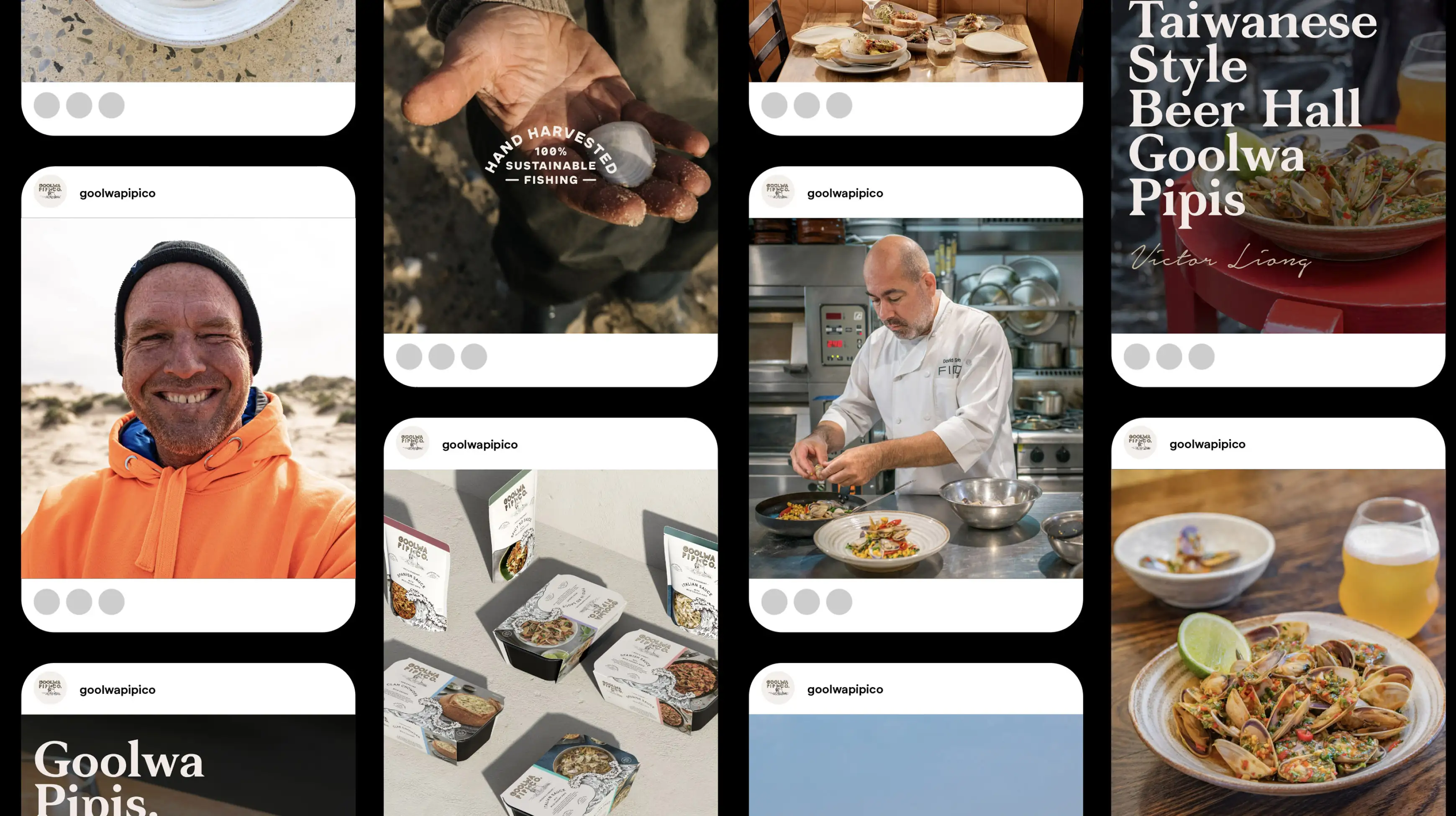
We work with the Goolwa Pipi Co team to create monthly social posts that reflect the core strategic pillars. This includes, food and recipe inspiration, team bios, product provenance and education about sustainable fishing practices.
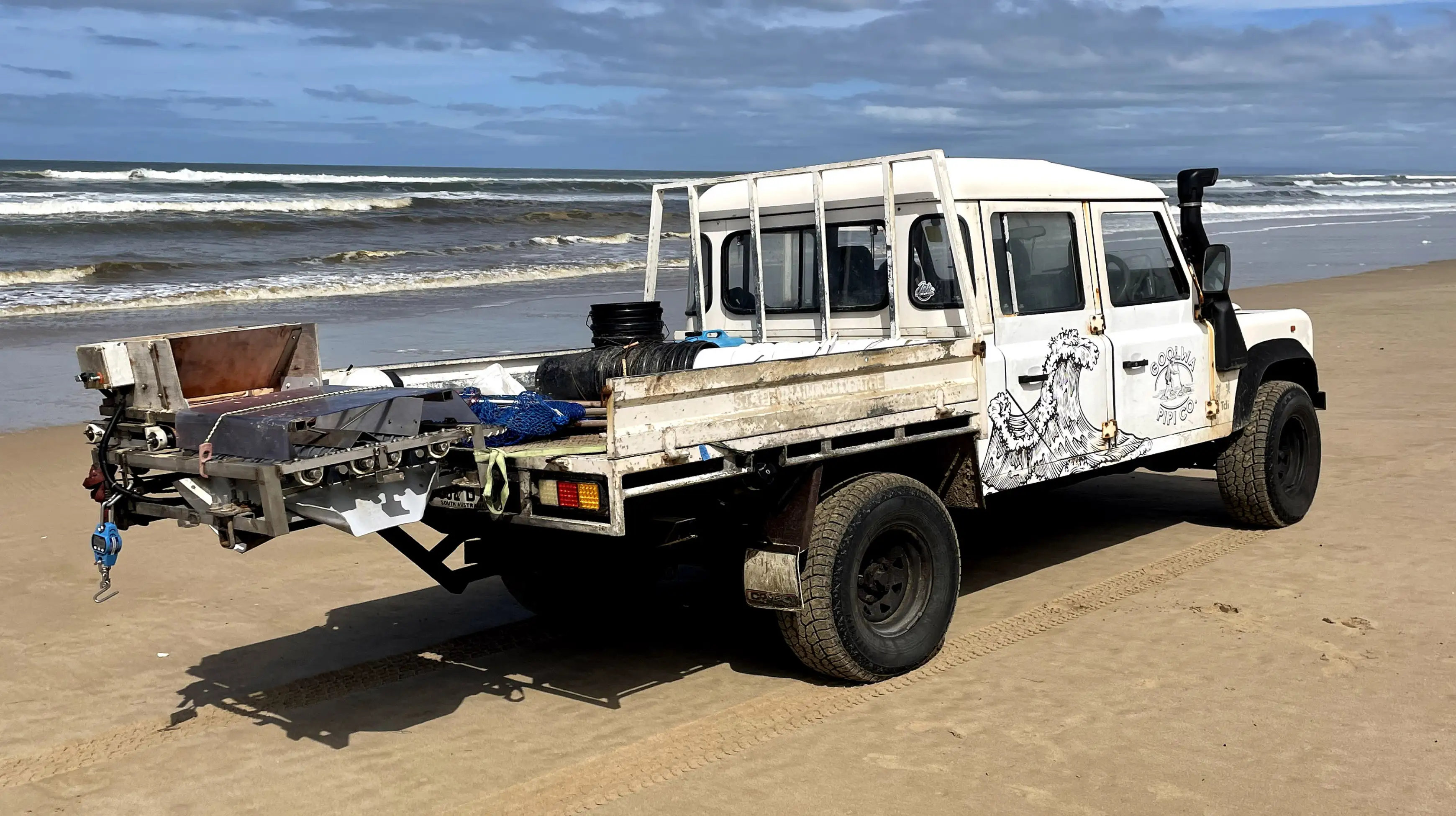
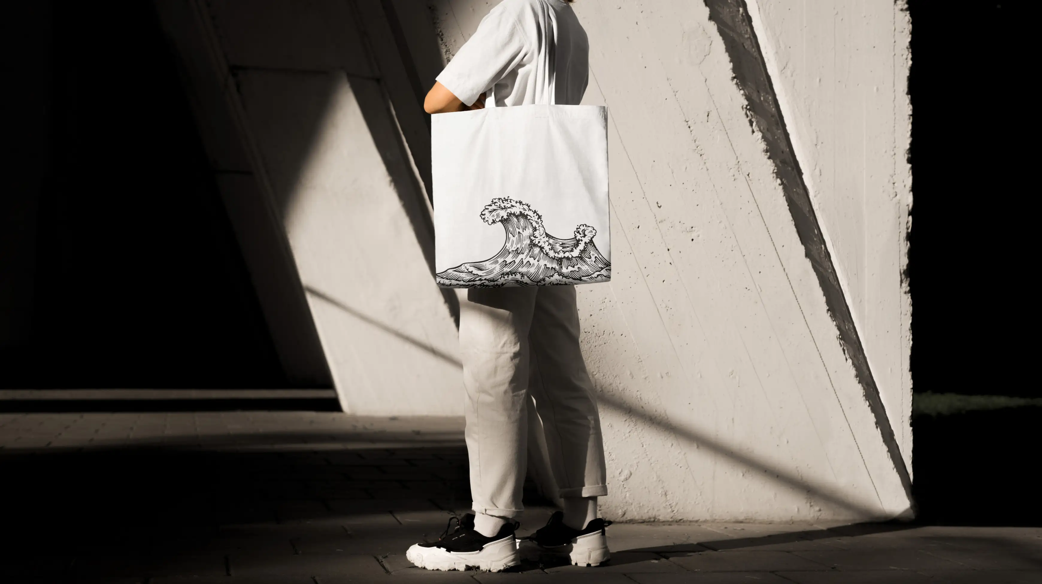
The wave flows through all design applications creating a distinctive aesthetic that is bold, energetic and instantly recognisable. From merchandise to vehicle livery, the wave is pushing the brand forward.
“Gareth encouraged us to distill our message to a single USP, the ‘raker’ that celebrates the thing that differentiates us from other clam fishing companies. We are delighted with the end result, as are our wholesale partners.”
Tom Robinson, Director
Related Projects
Nipapanha
Creating an identity and engaging visual language for ‘The People Of The Rocks’.
PROJECT: BRAND IDENTITY / WEBSITE / UI