
Big Red Group
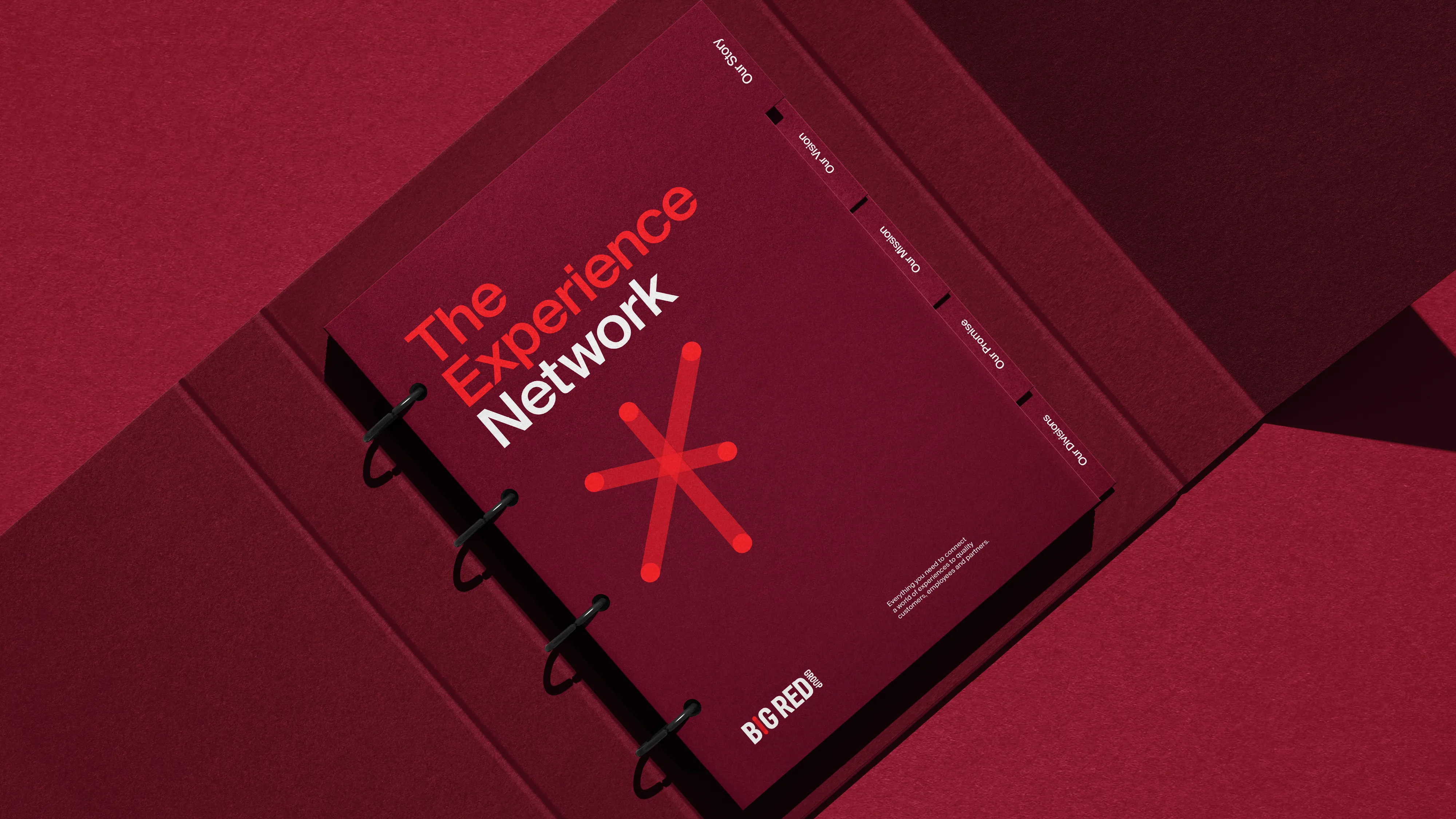
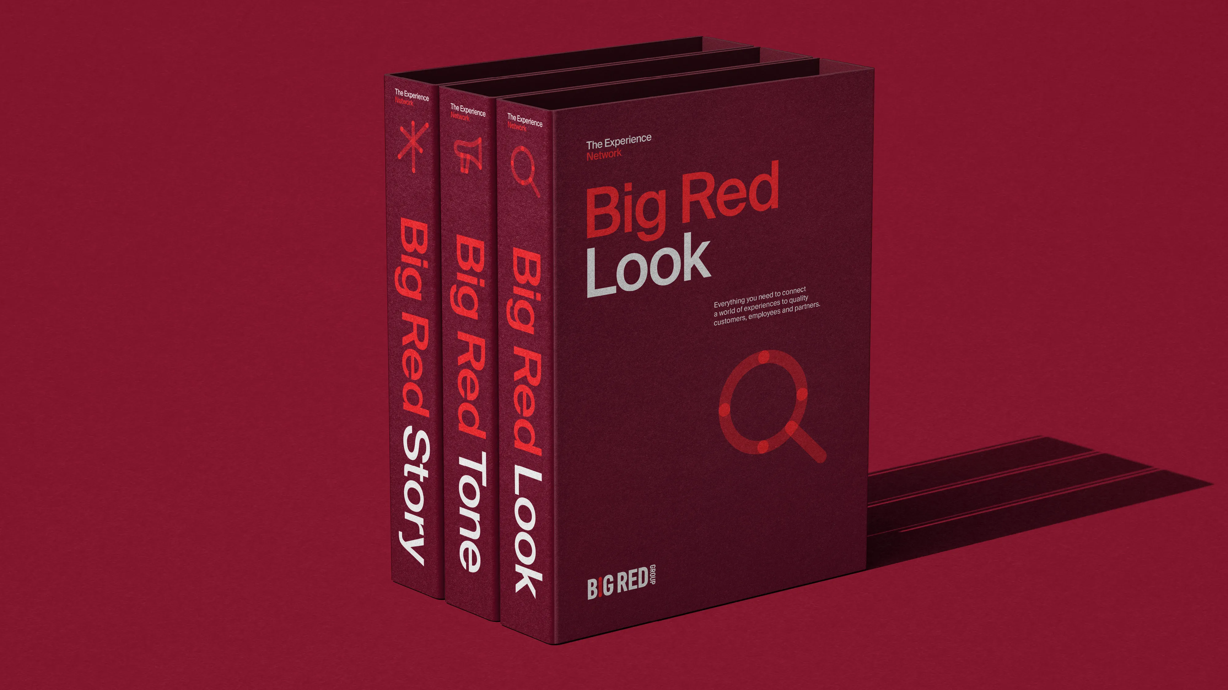
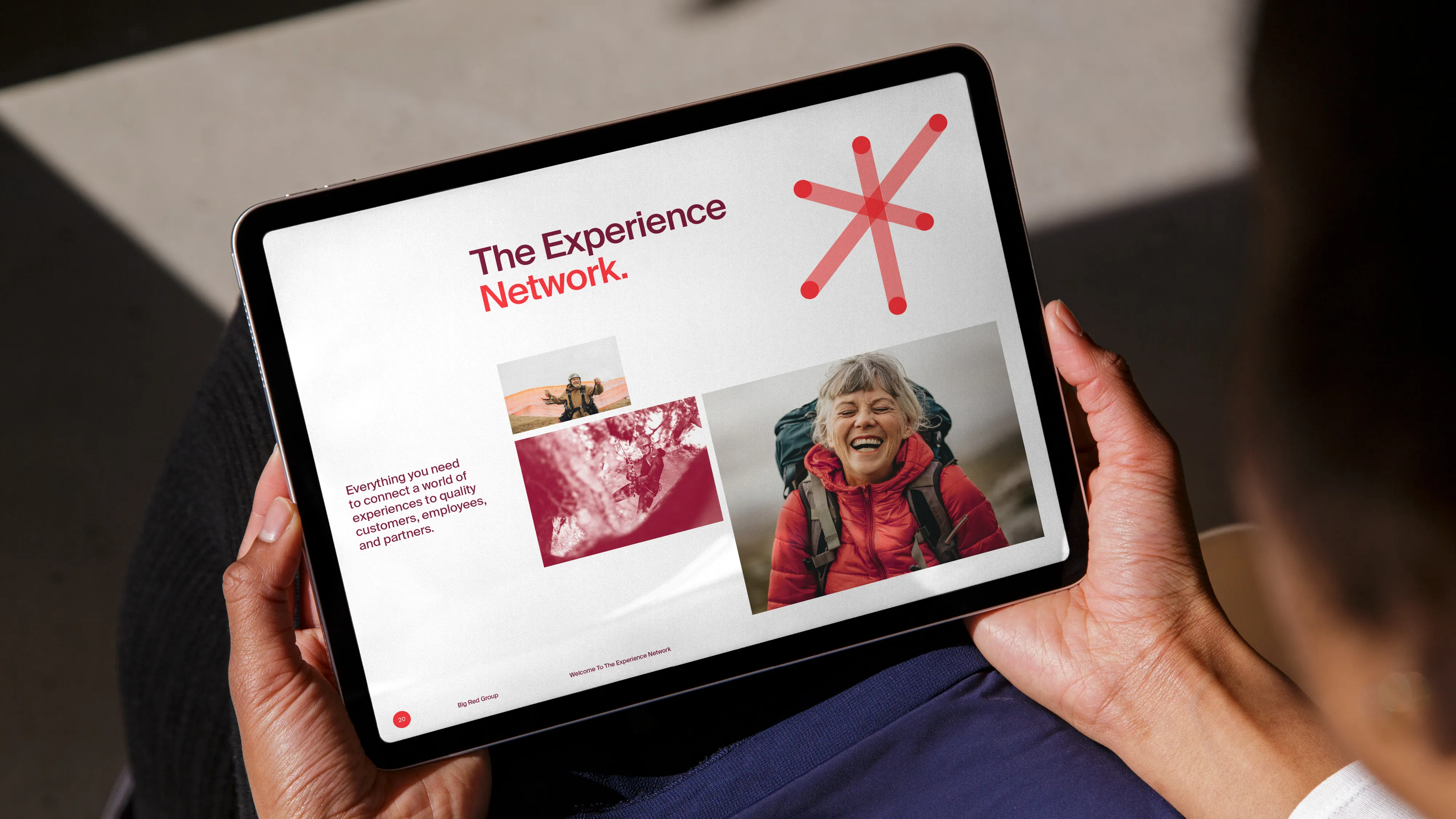
The Experience Network
Team
Client – Big Red group
Brand Identity, Visual Language, Website Design – We Are Studio Home
Strategy – Mother Tongue Agency / We Are Studio Home
Website Developement – WPEngine
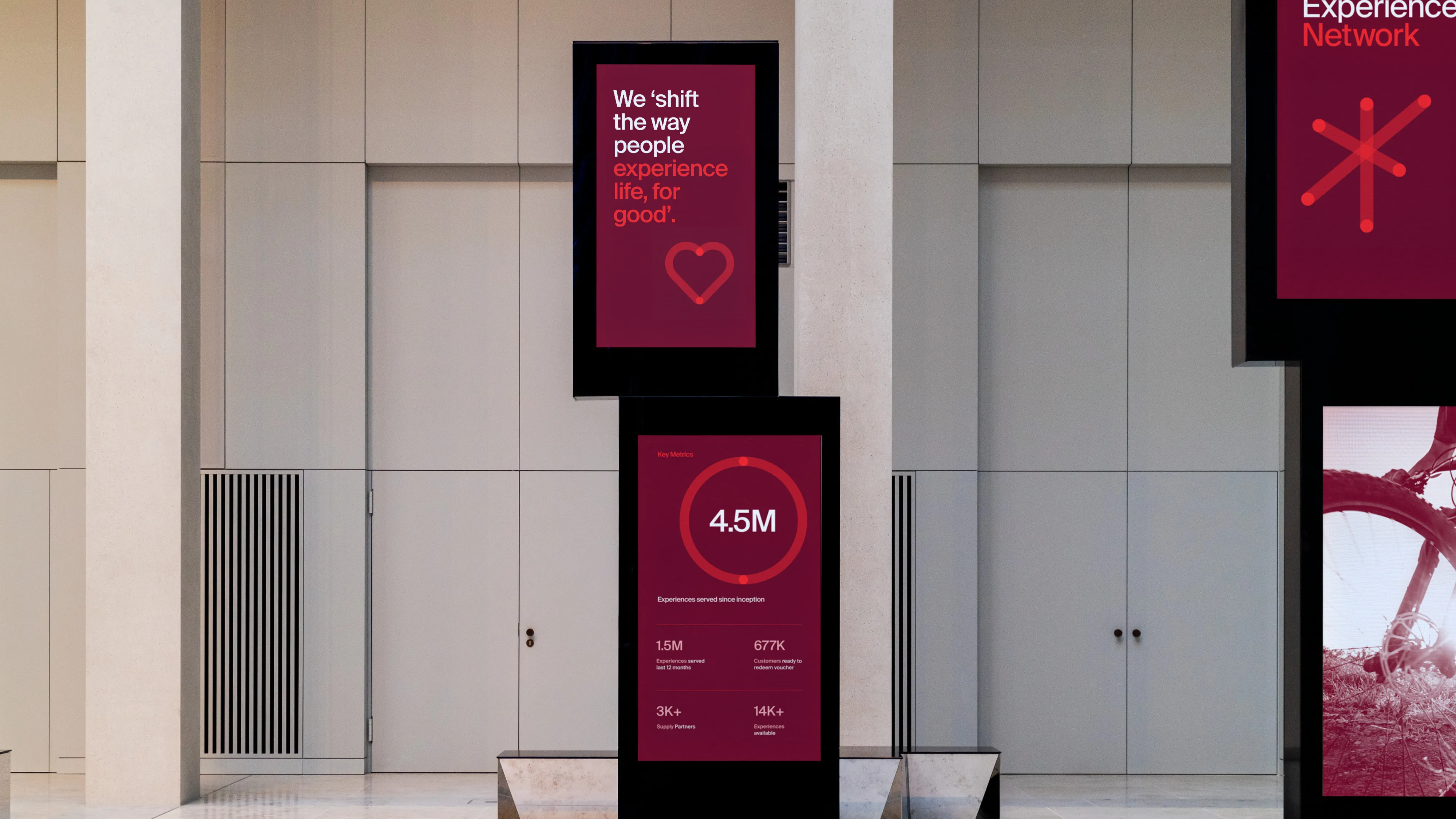
Big Red group is an ever-expanding, multi-faceted network delivering experiences on a global scale to millions of people every day. A powerful connector that provides the industry with comprehensive support and trusted intel, experience operators with quality customers and prospective employees with greater opportunity.

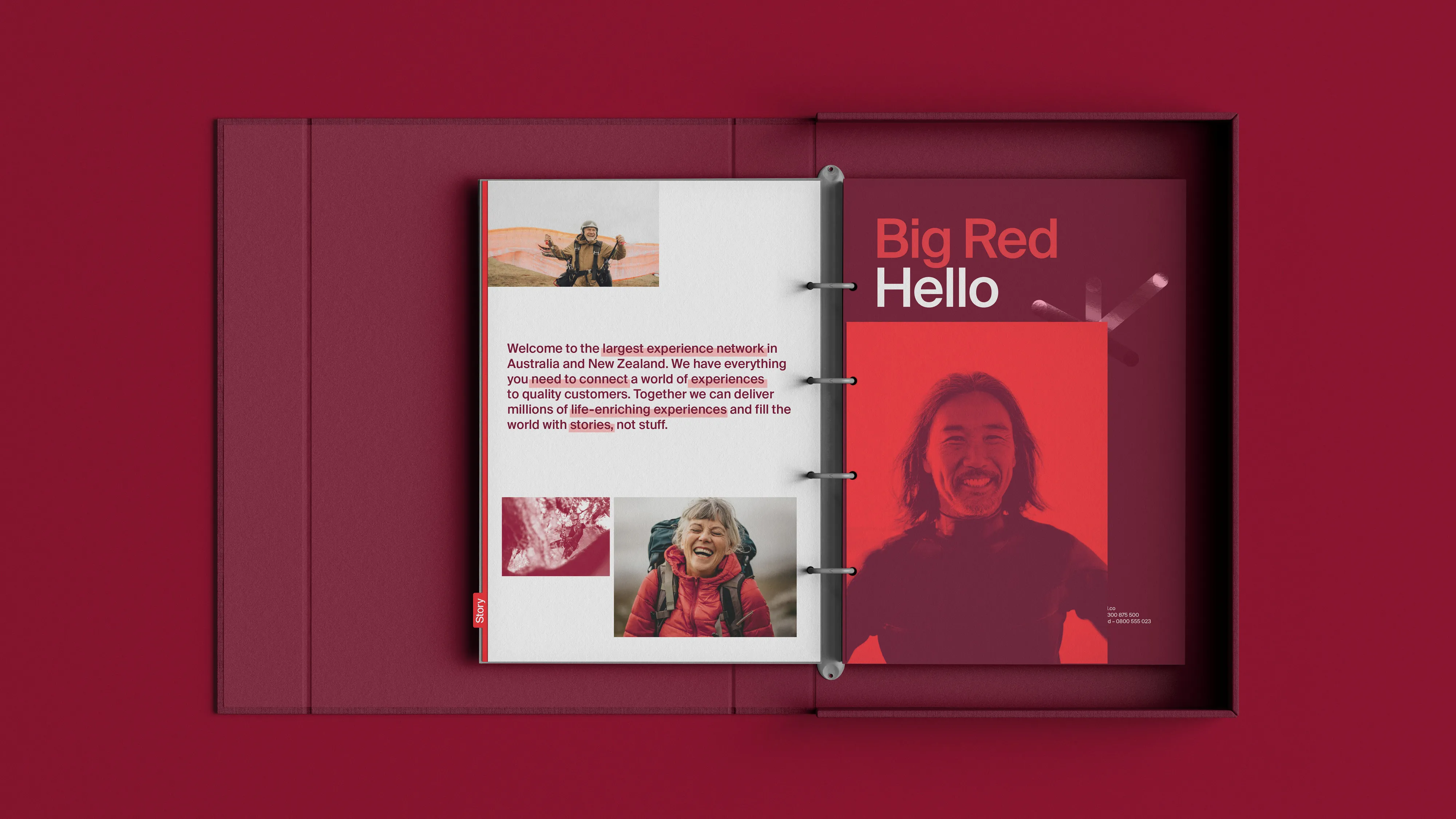
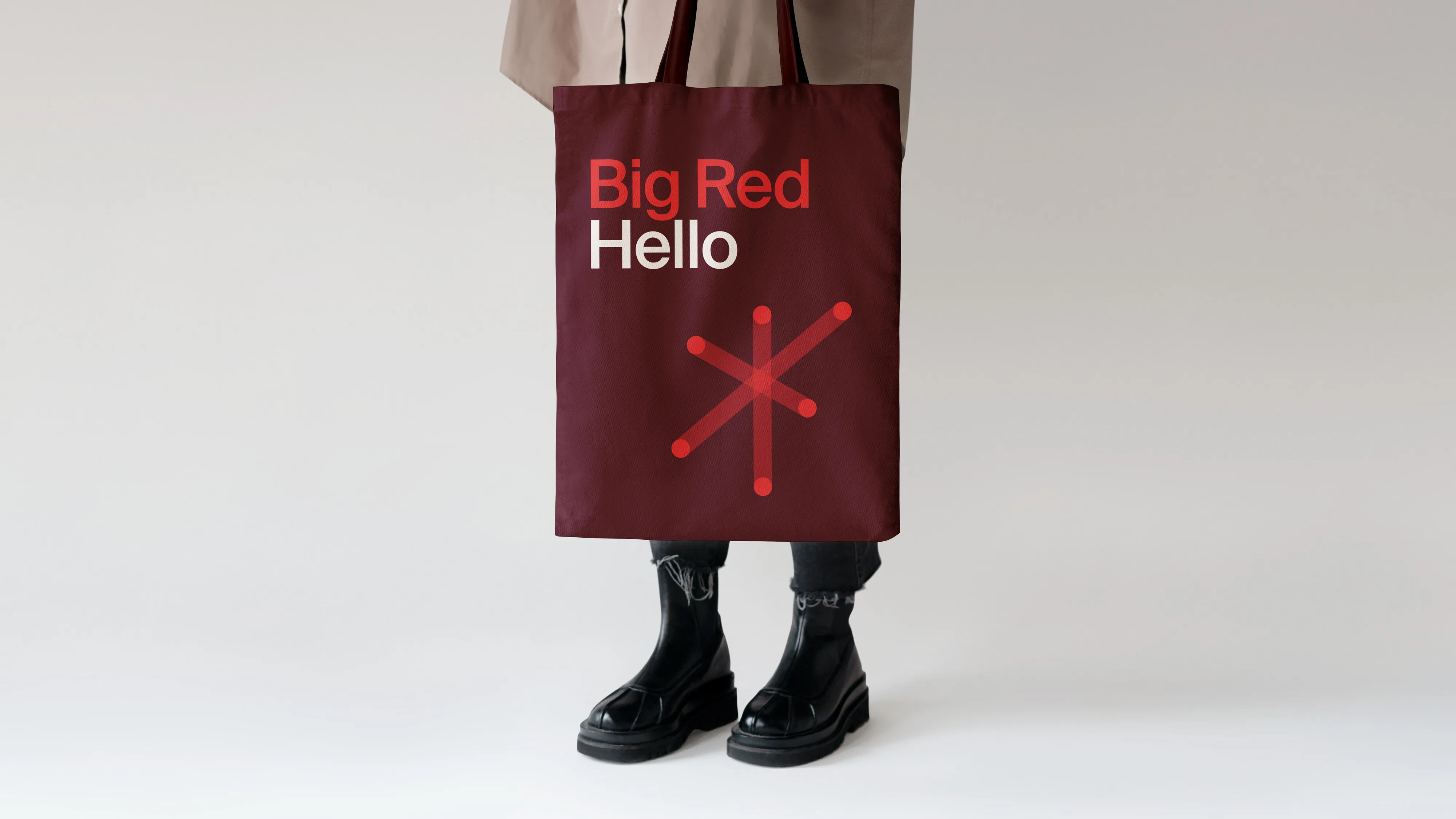
We developed a robust visual identity anchored around the idea of connection. As the world’s leading experience network, Big Red Group connects its customers to millions of experience seekers. We wanted to visualise this in the simplest way possible.
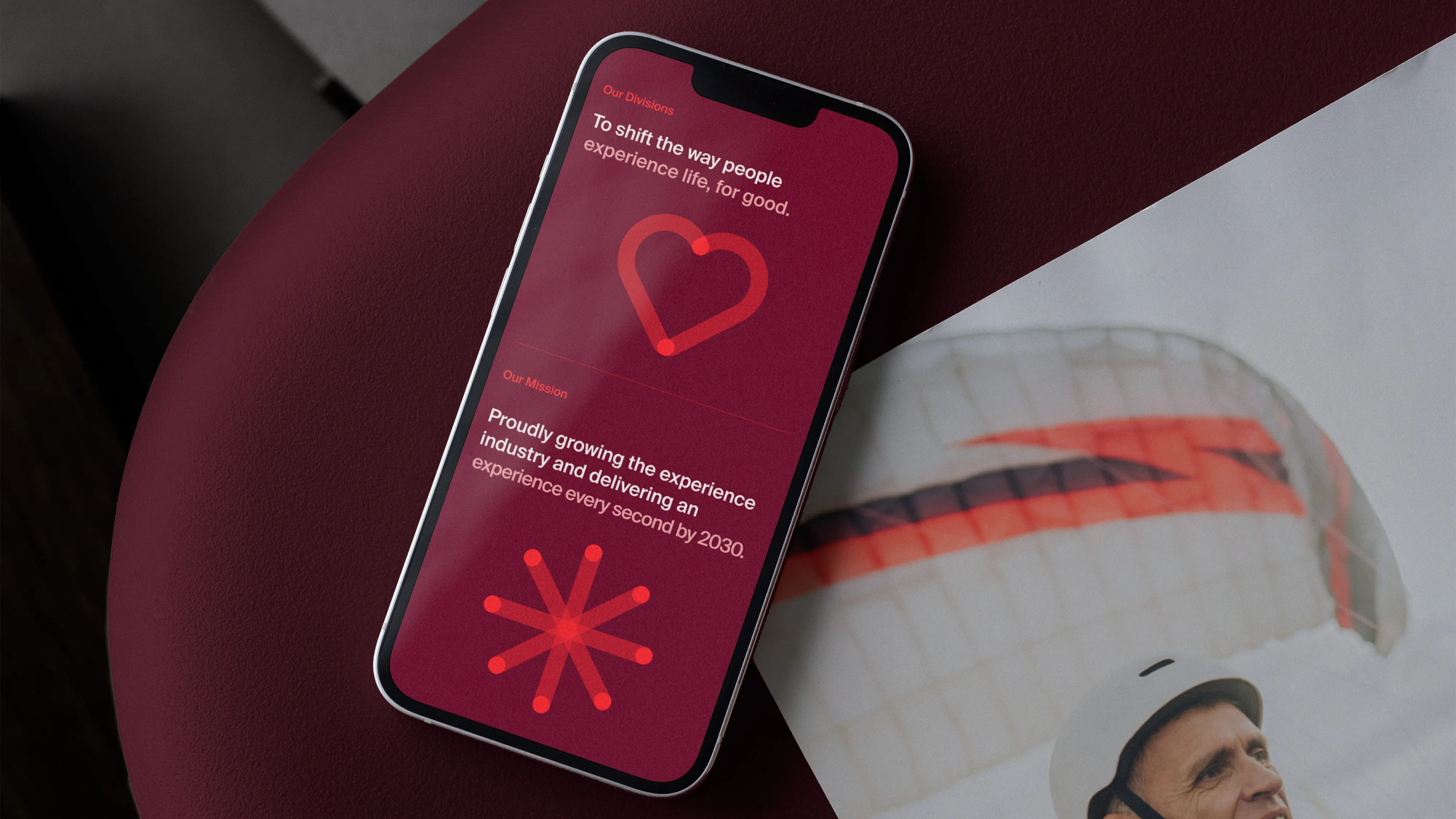
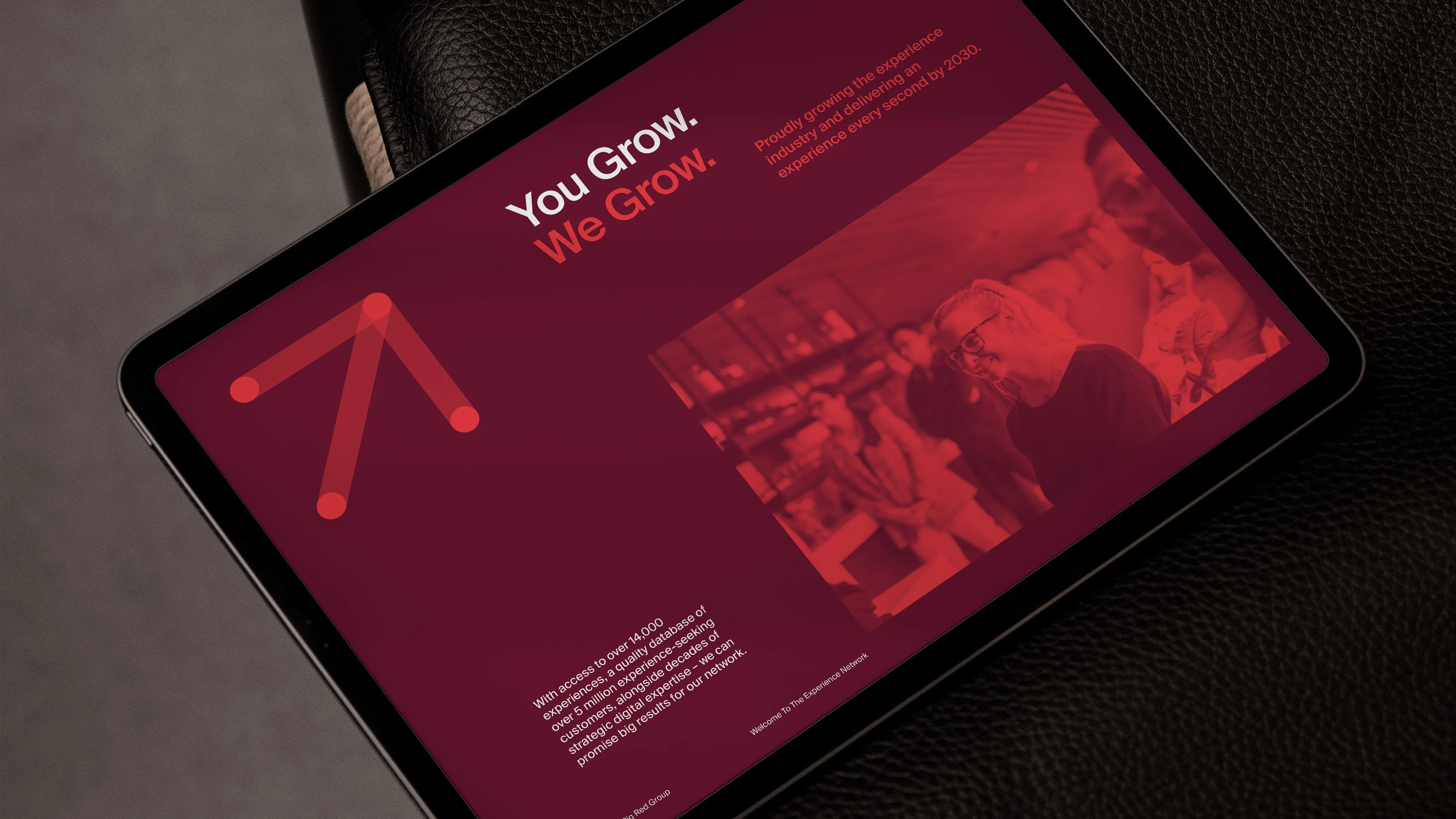
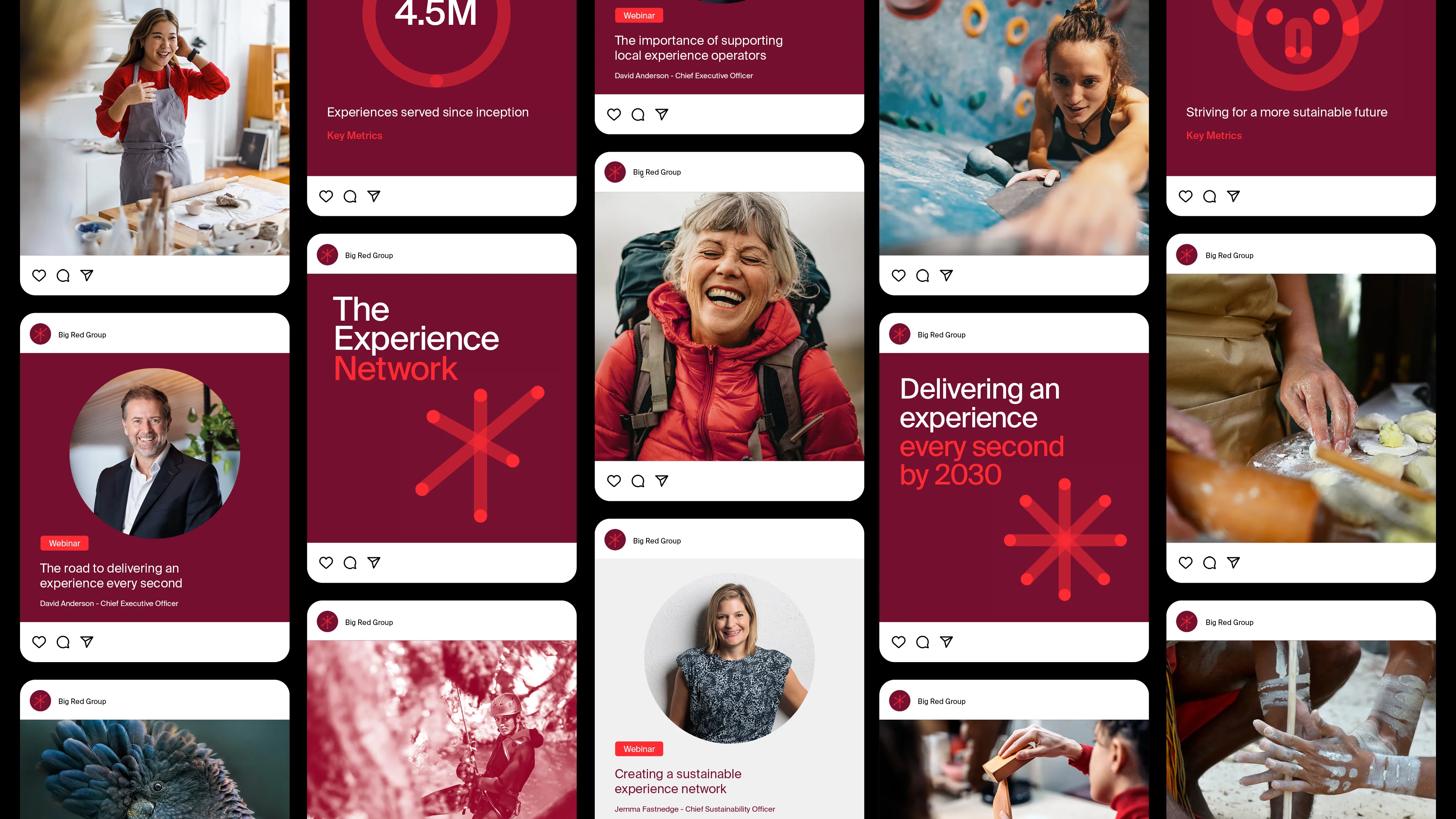
Introducing the ‘Big Red Connector’, a simple mnemonic symbolising Big Red Group’s ability to connect experience operators (a) to millions of customers (b). The mnemonic becoming the backbone of a dynamic icon system, refined visual style and distinctive brand elements that translate across all products and channels.


In close collaboration with Tina Funder and Mother Tongue Agency, we positioned Big Red group as ‘The Experience Network’. With brands such as, Red Balloon, Adrenaline and Experience Oz in their portfolio, the positioning solidifies their place as the market leader.
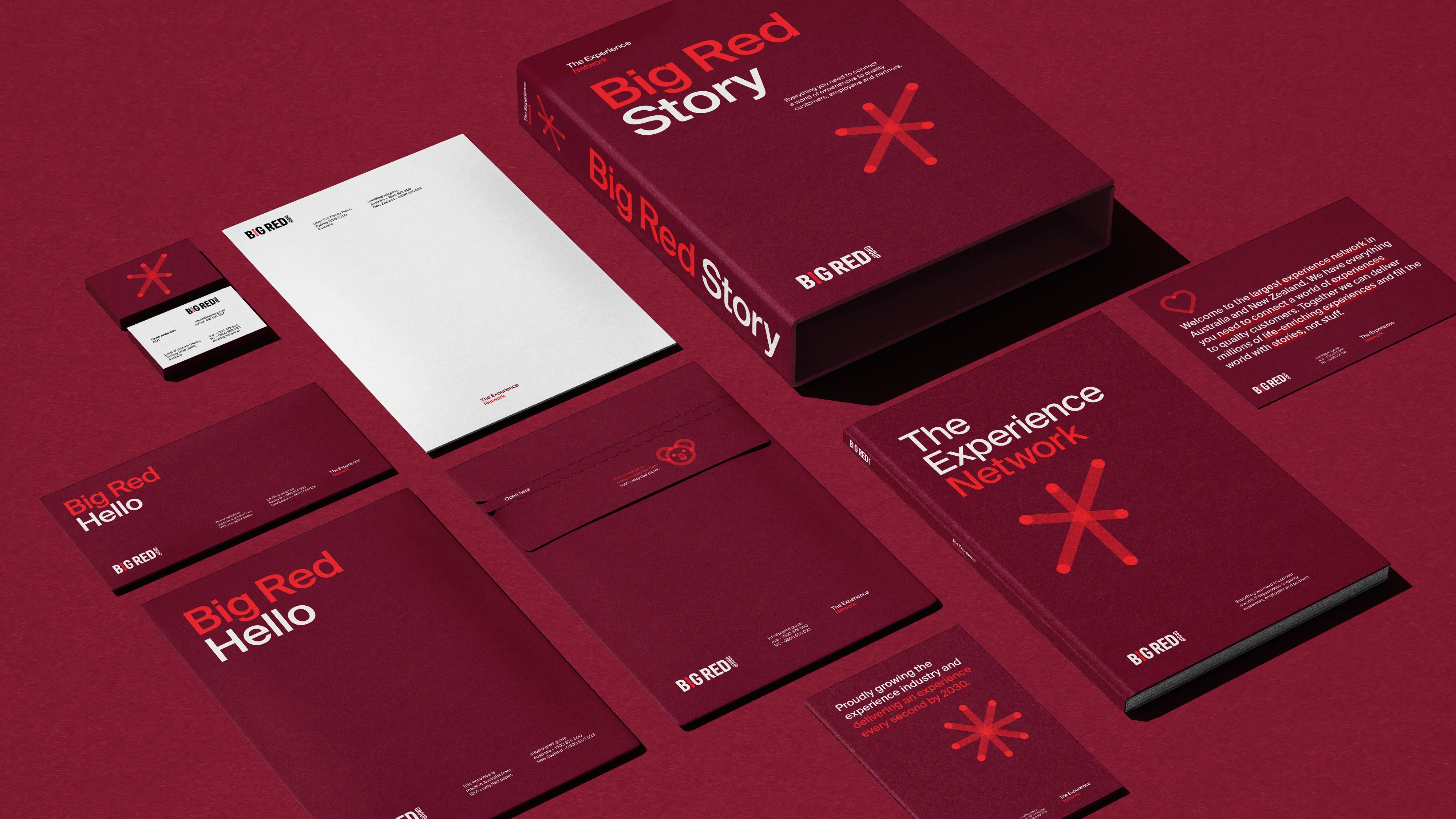
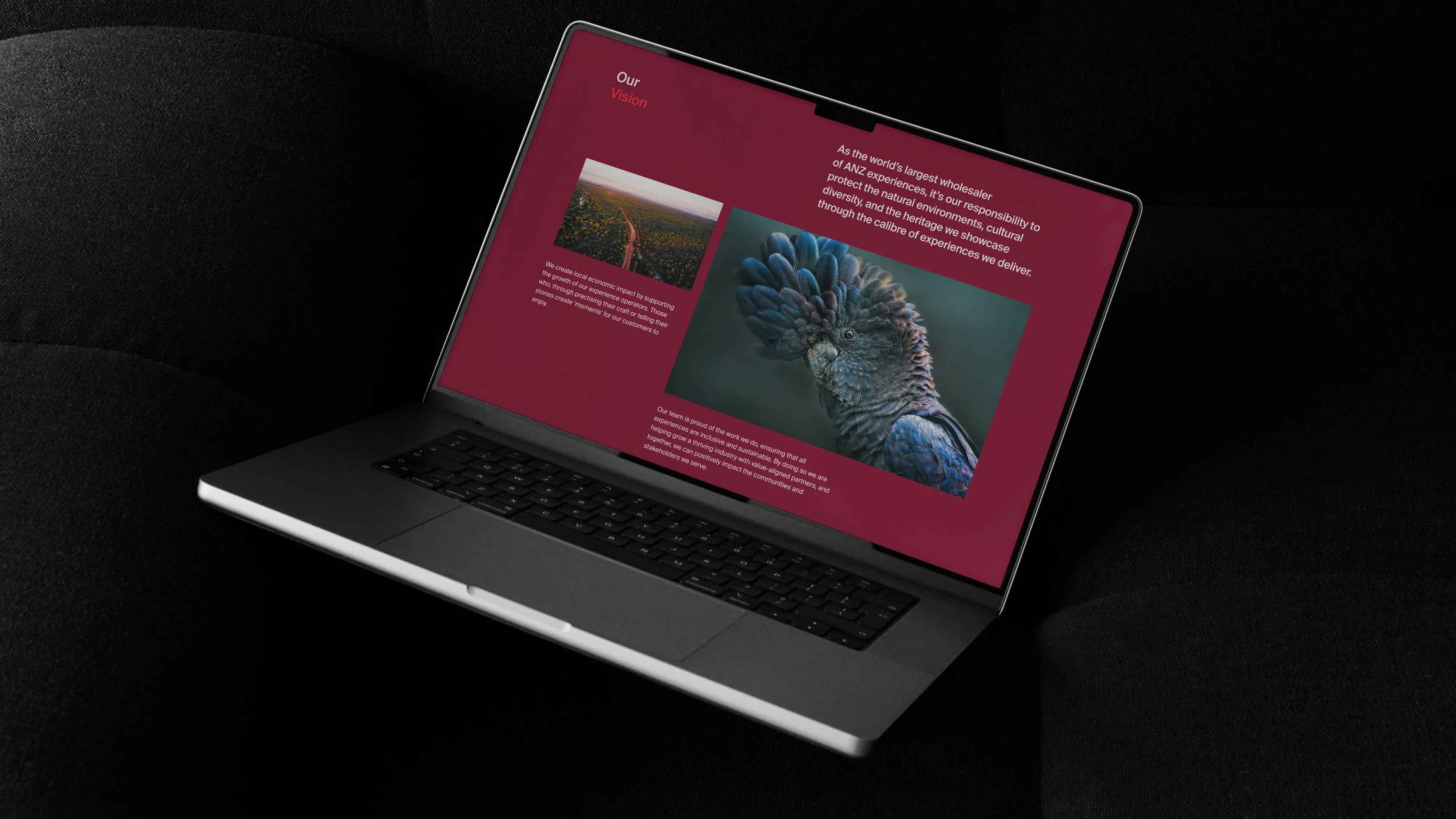
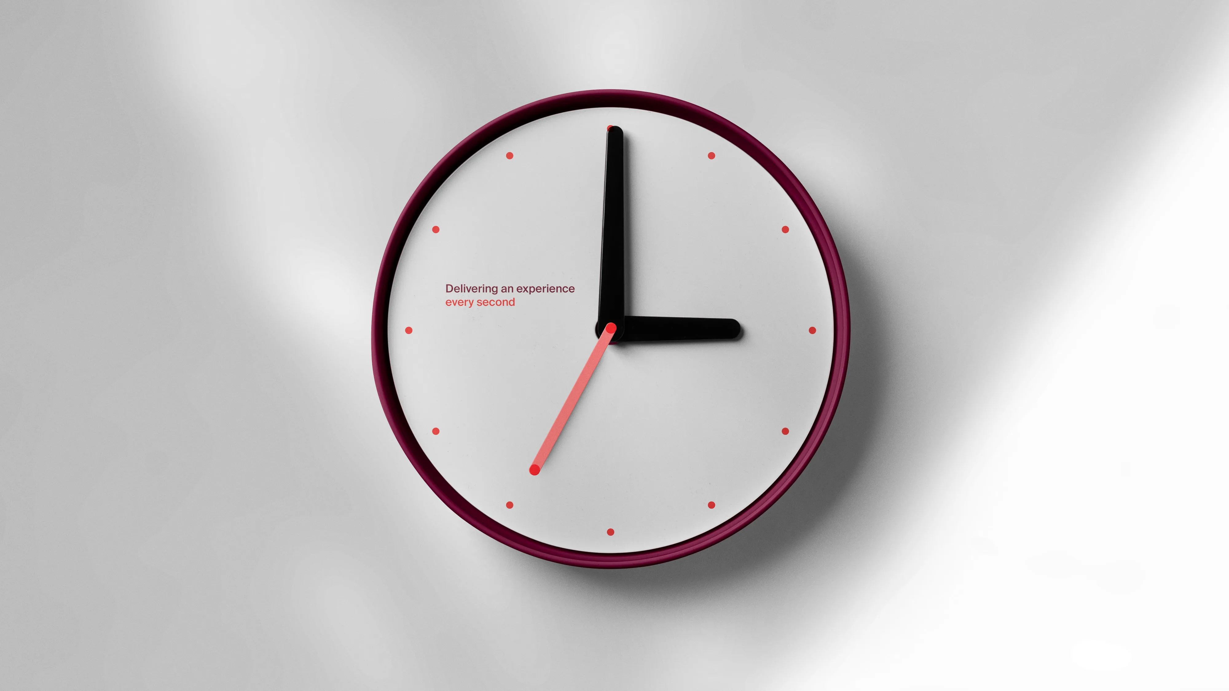
A Big Red Group deserves a Big Red colour palette. We created a distinctive colour system that is underpinned by the use of ‘Confident Claret’, embodying both strength and authority. And ‘Connected Red’, a vibrant tone that injects energy and an active spirit.
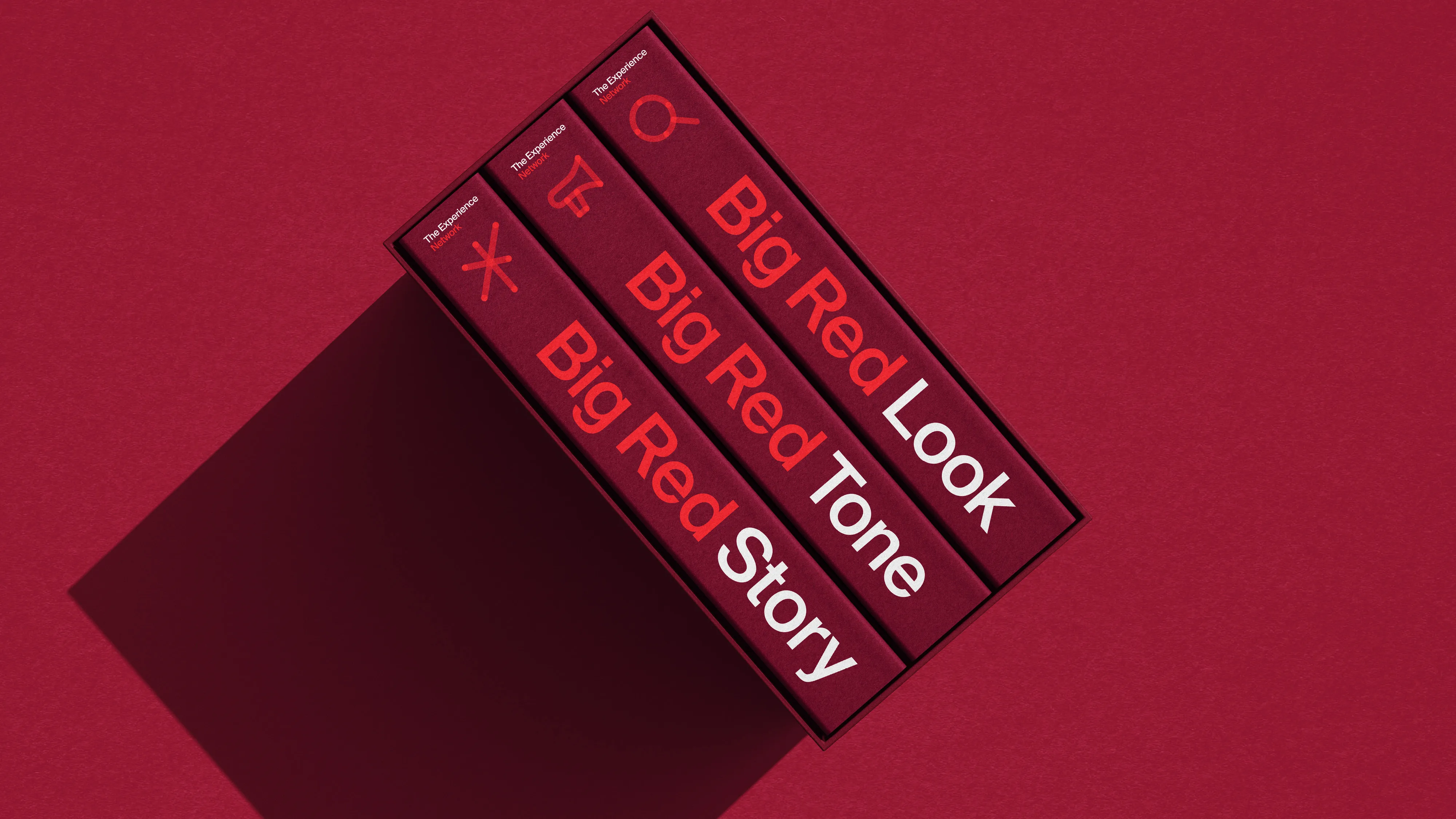
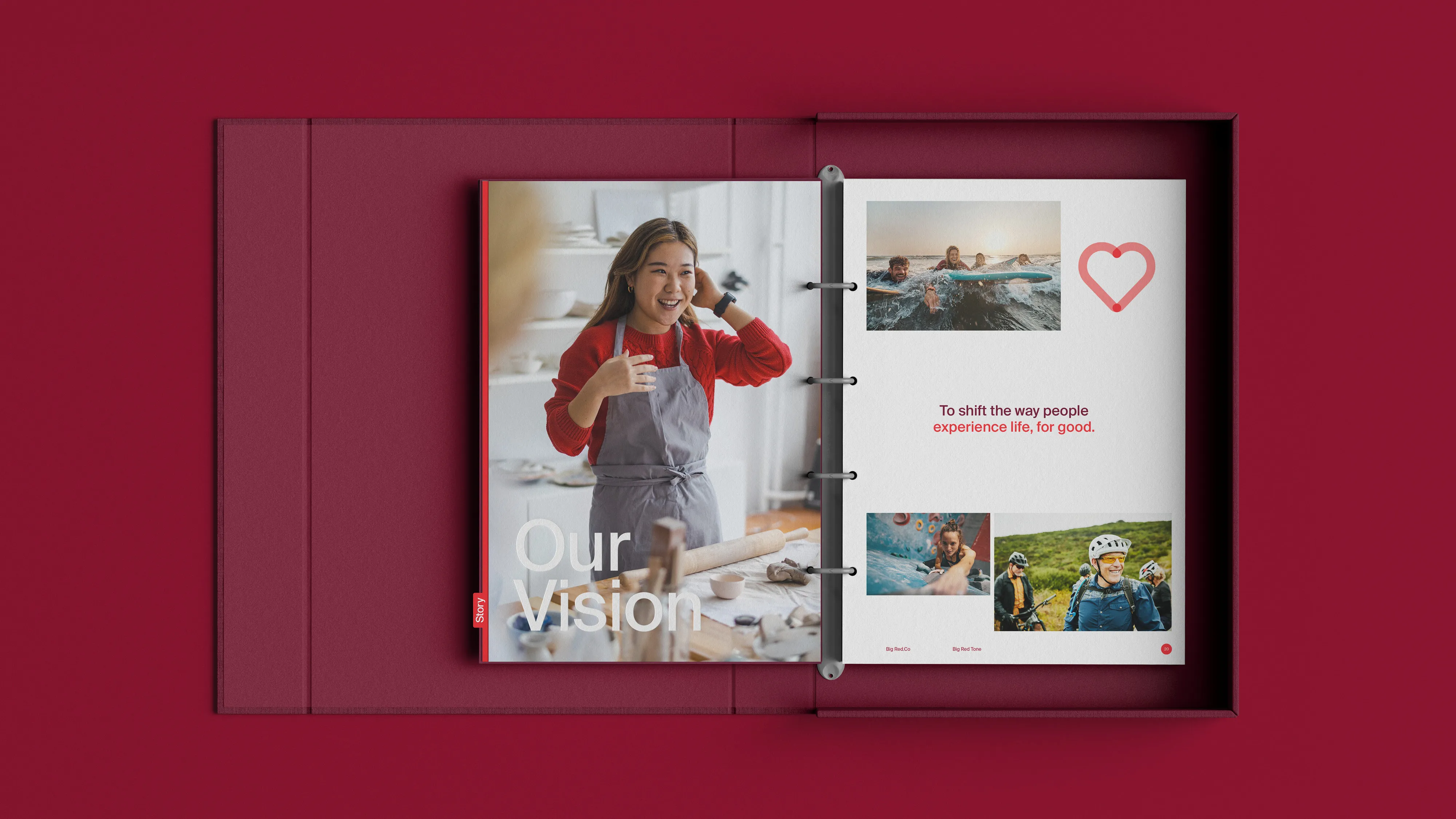
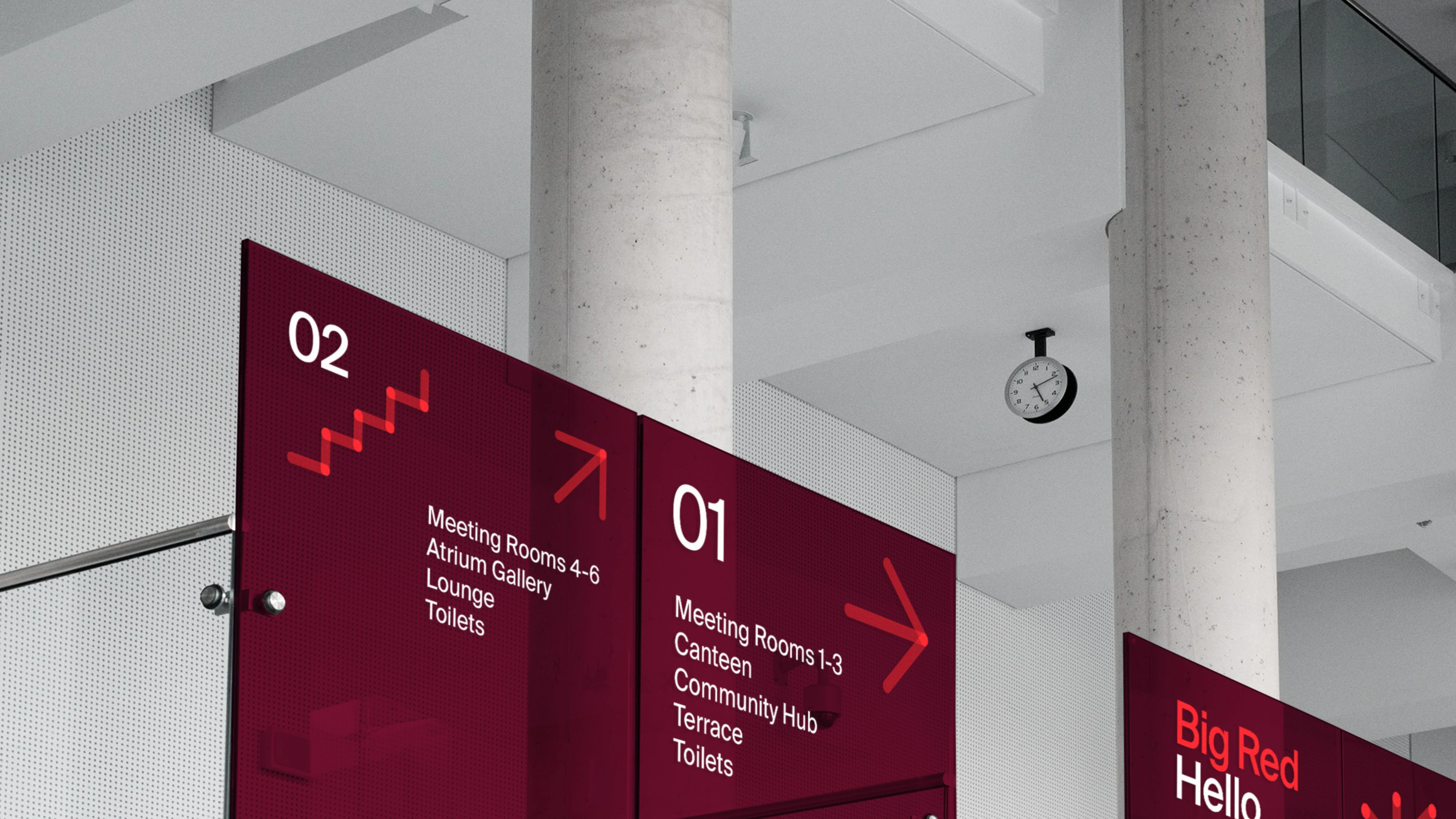
The visual language aims to be bold and direct at every opportunity. We achieved this through the use of succinct language, bold typographic design and the confident use colour blocking and icon placement.
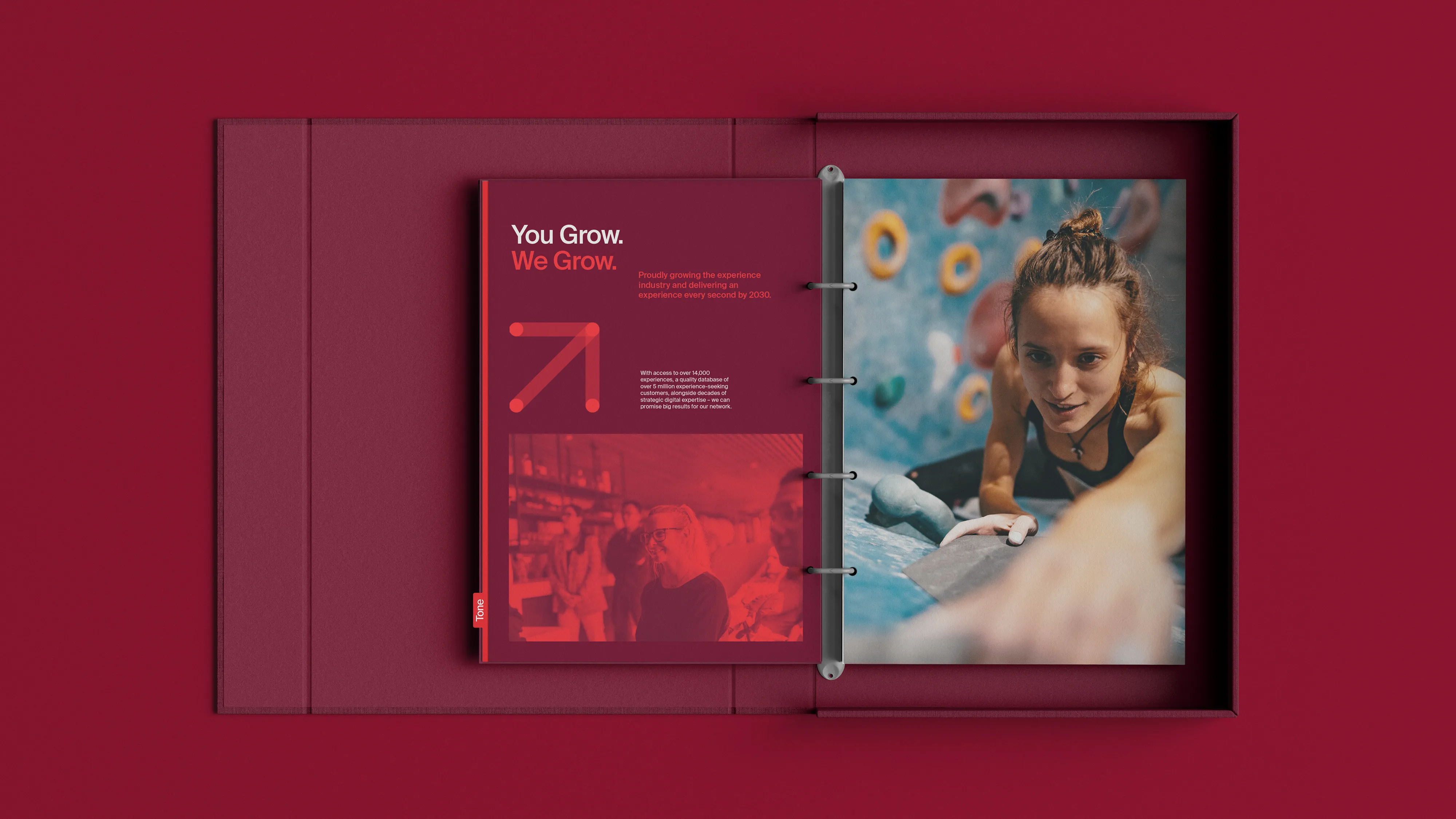
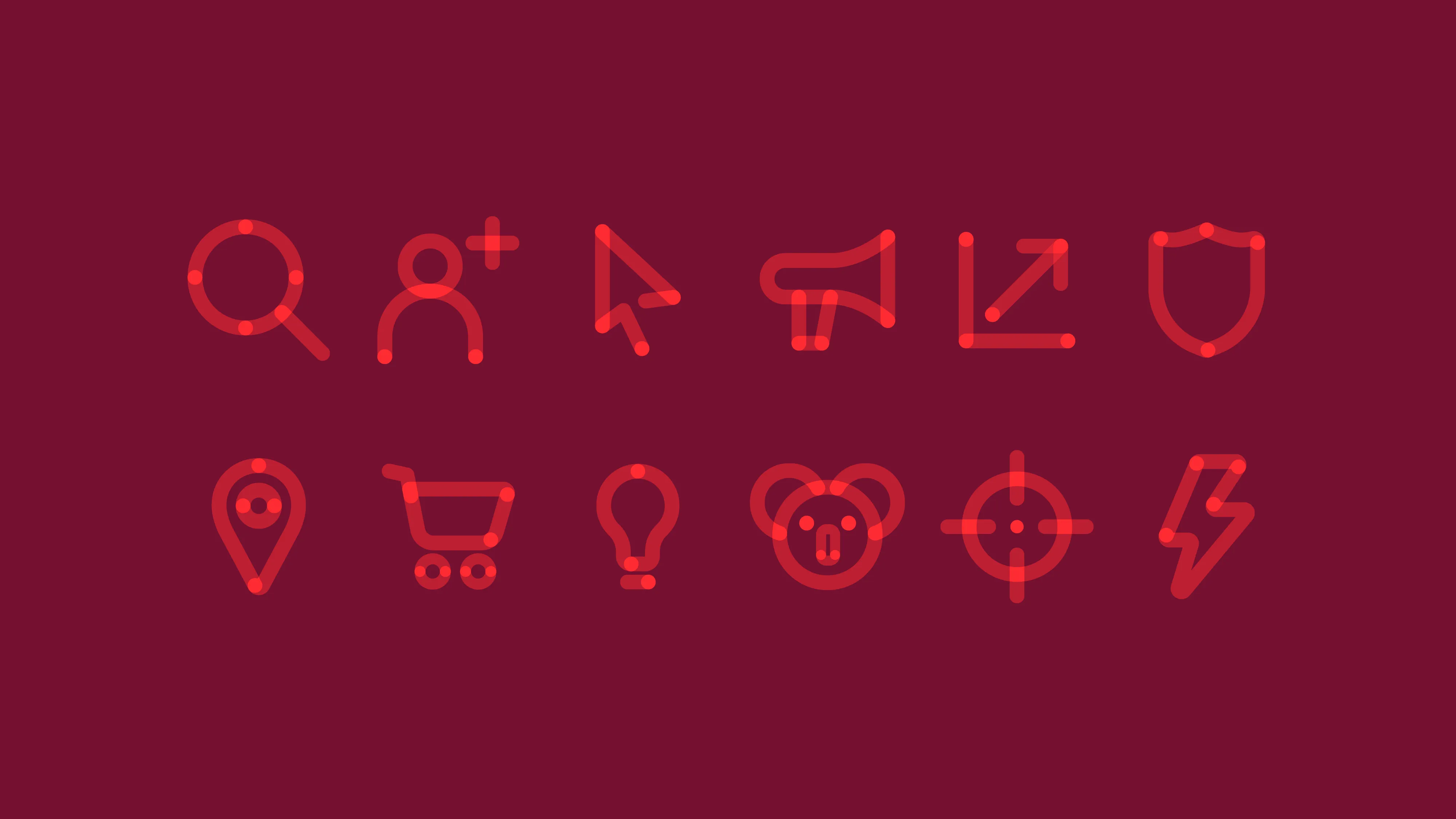

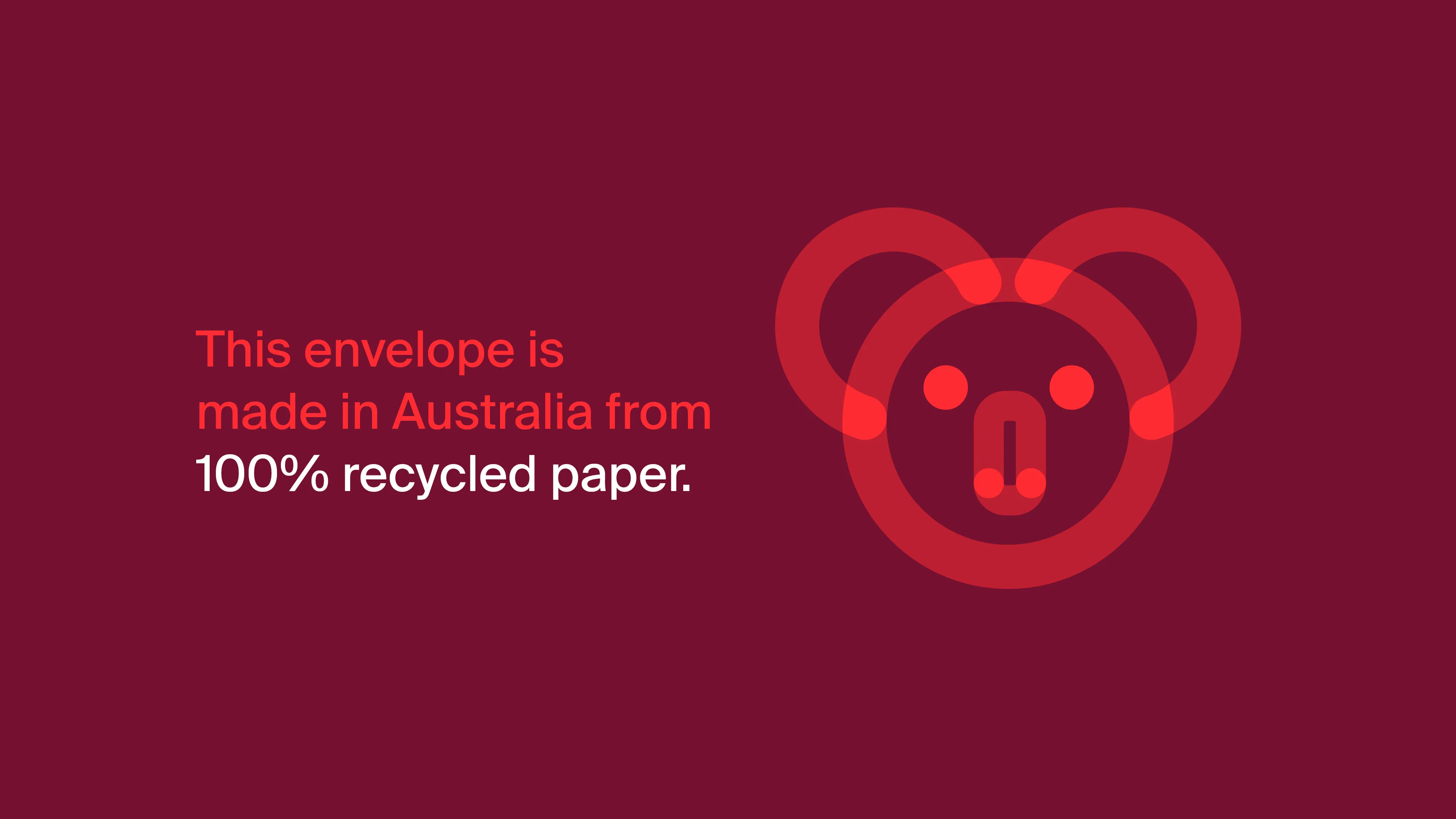
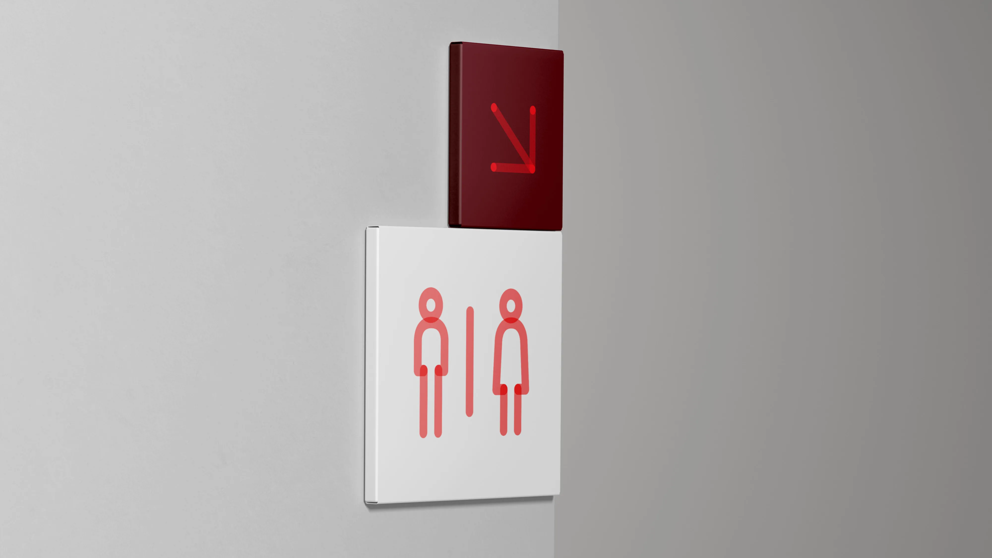
The ‘Big Red Connector’ mnemonic directly influences a distinctive suite of icons. The icon system forming an integral part of the brand, delivering the key messaging with energy and movement.
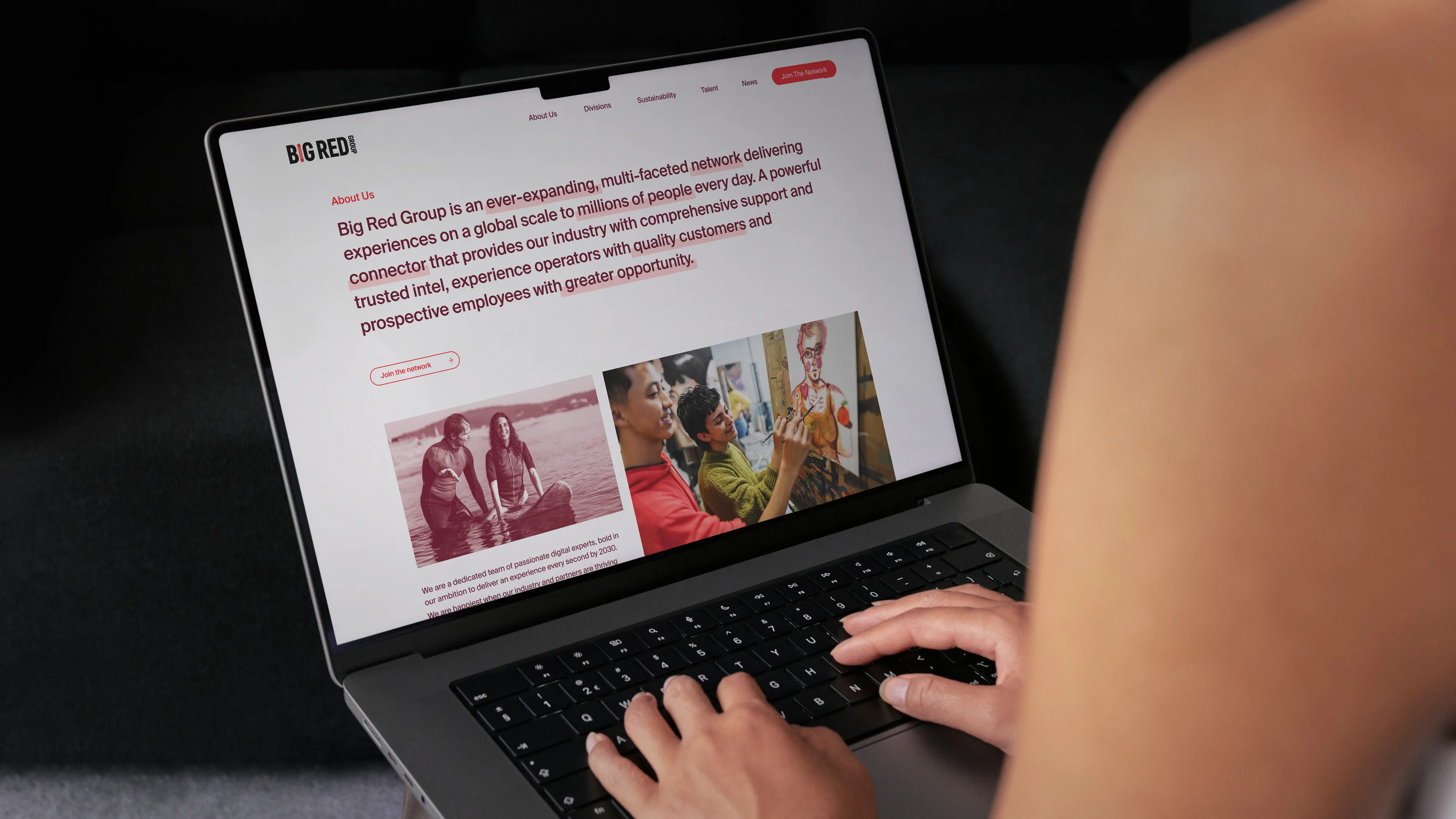
The website utilises bold typographic intros, graphic colour blocking and a defined grid system. Key messaging is clear and easy to navigate with the overall aesthetic instilling a sense of trust and authority.
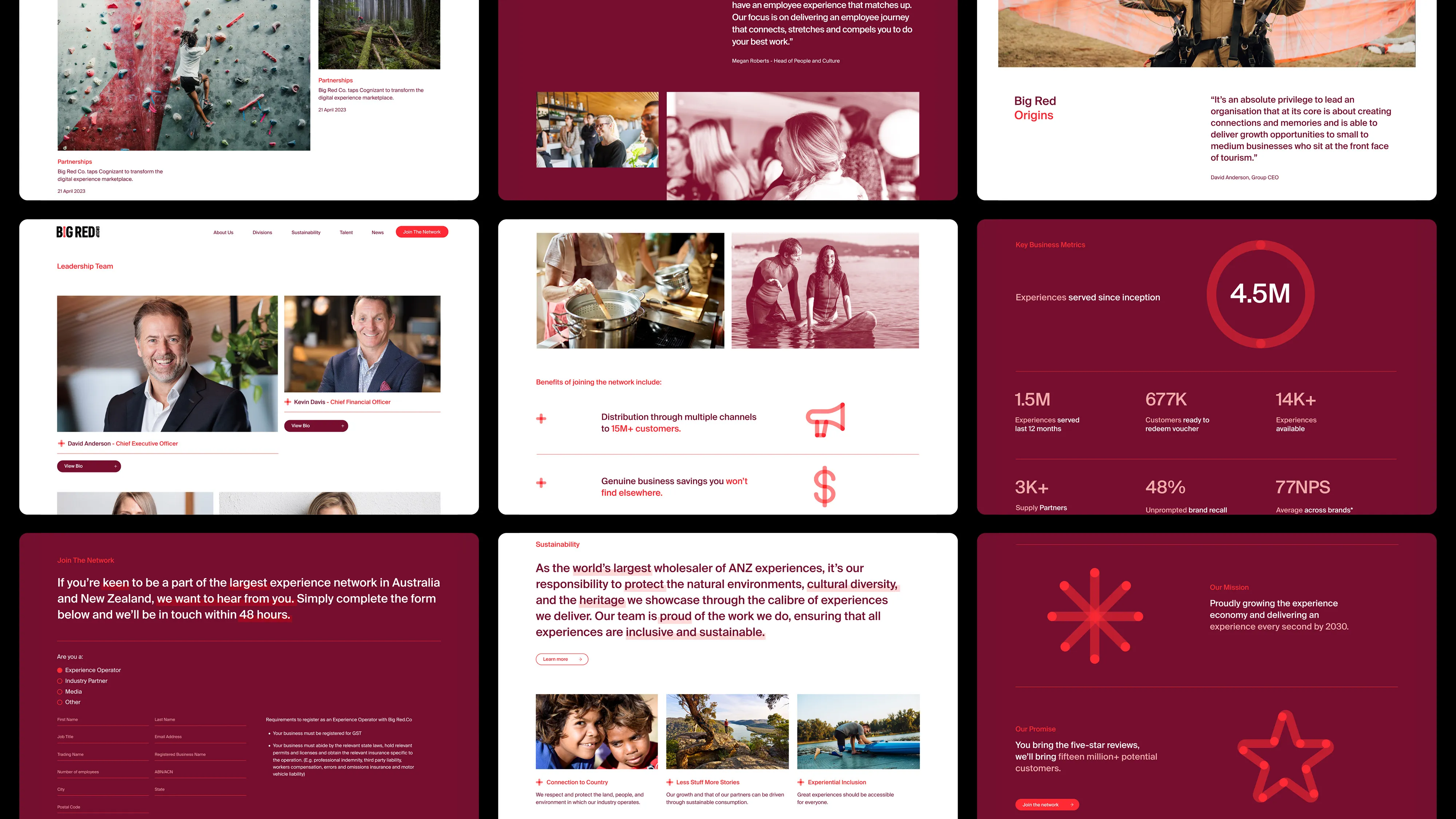
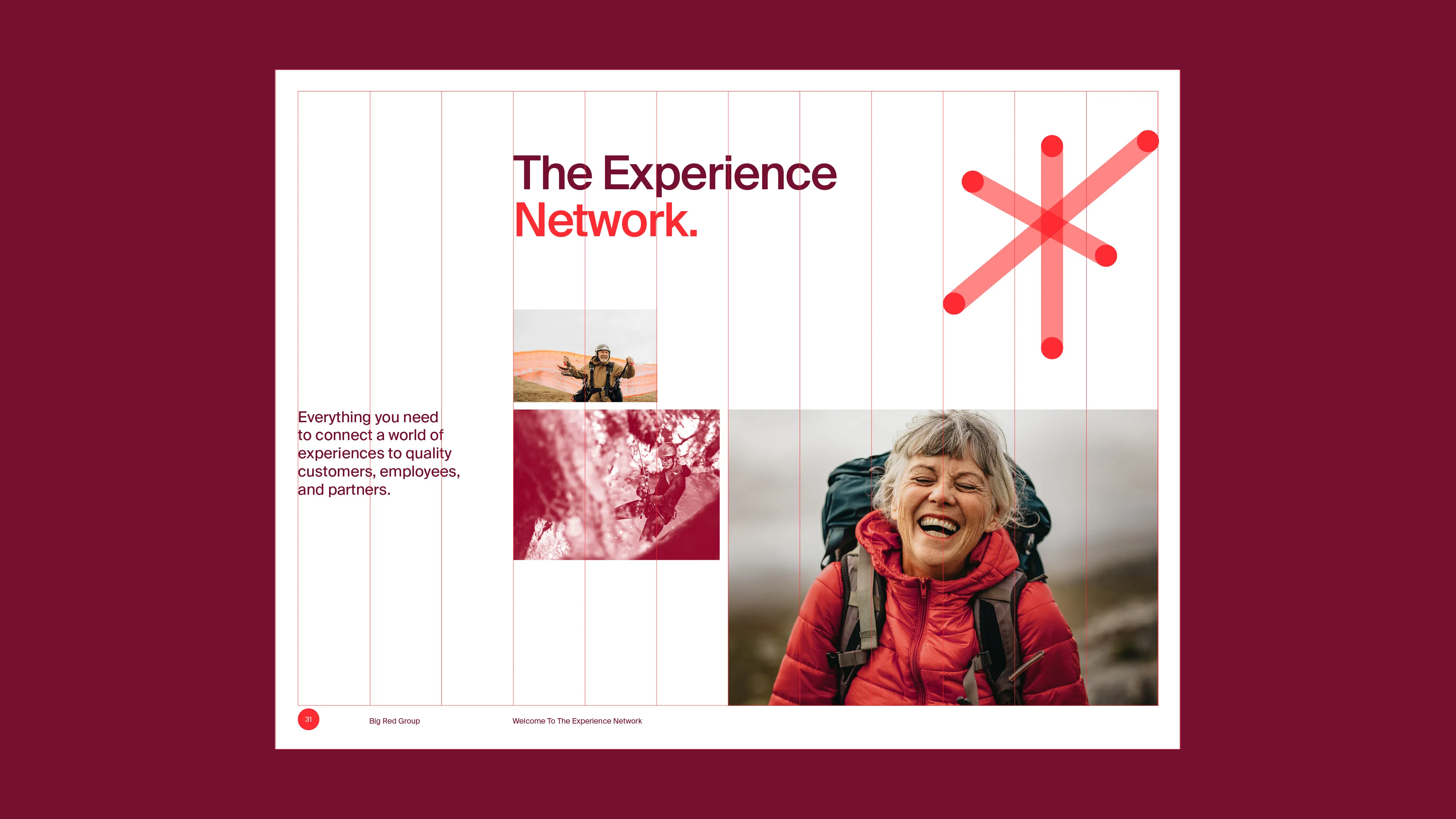
An underlying grid is evident across all digital and print channels. The grid allows elements to appear unstructured and freeform whilst still following a defined framework.
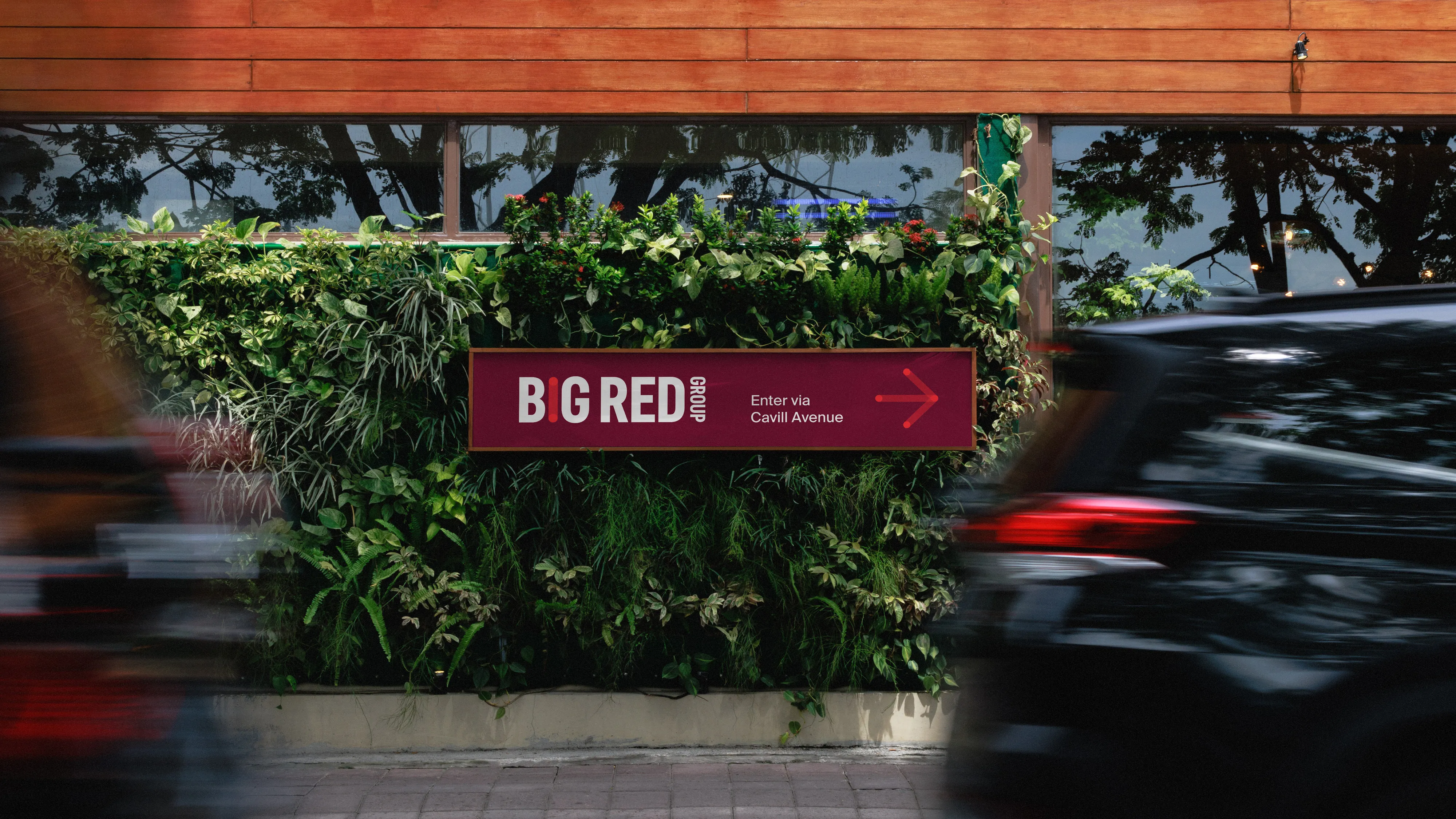
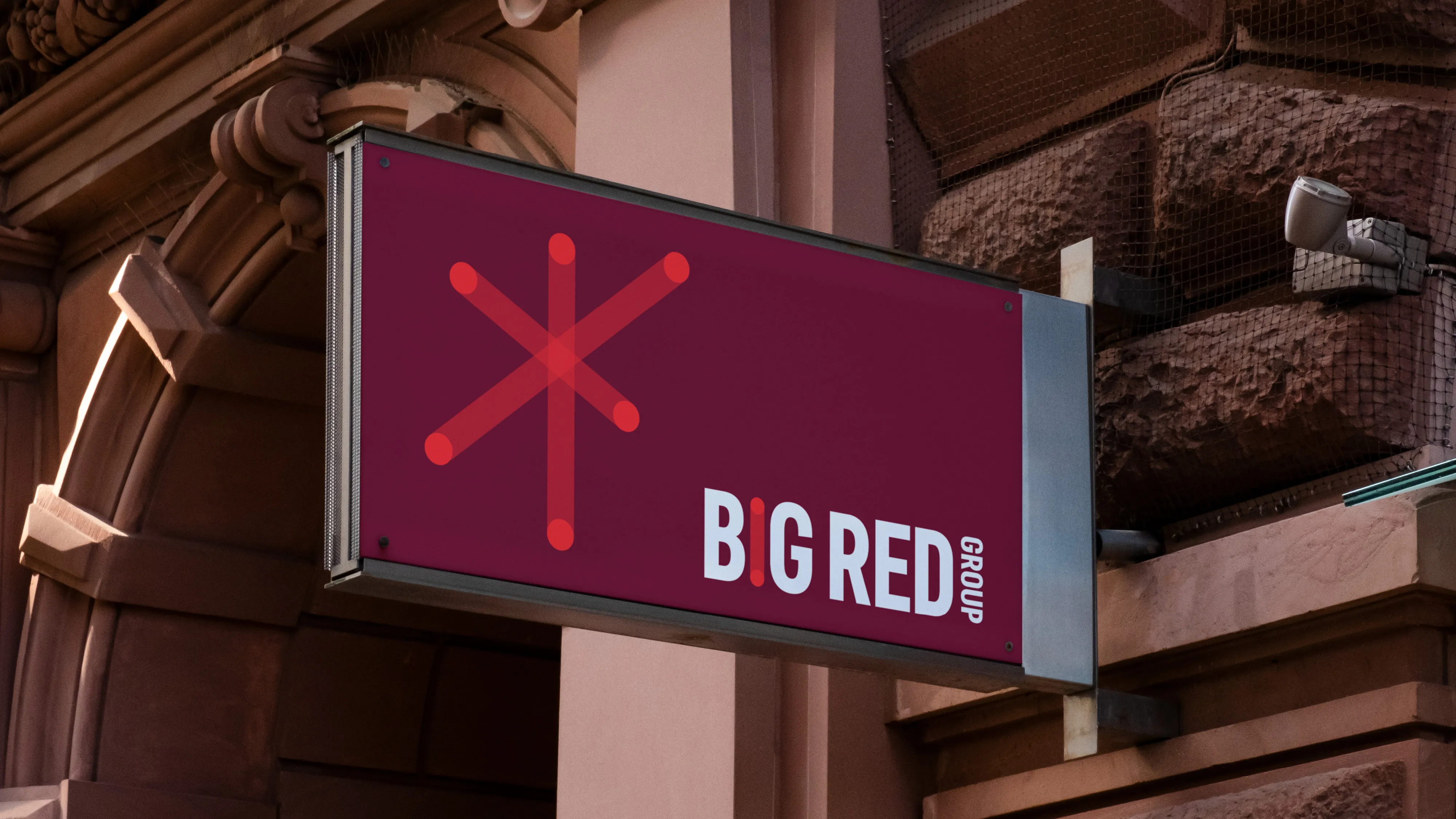
The brand identity translates seamlessly across external signage and internal way finding, with the graphic icon system creating a cohesive and distinctive brand experience.
“Gareth is up there with my all-time favourite people to collaborate with. From brief to actual finished product the process was seamless, exciting, challenging and satisfying. Gareth sets out to challenge you and himself to deliver the ultimate outcome visually. The new brand corporate look and feel for the Big Red Group exceeded my expectations. It fits perfectly with who we are now and our aspirations for the future.”
Jemma Fastnedge – Chief Sustainability Officer, Big Red Group
